Amazon does not need to explain that it sells things. The more interesting question is why a shopper who already uses the website should install the app. The third screenshot starts answering that.
One storefront, one language and a dated capture. This is an independent editorial audit, not a client case study.
Store & market
Apple App Store · United States
Language & device
en-US · iPhone
Captured
30 September 2026
Creative reviewed
First 3 still screenshots; video and other devices excluded
Observed app name · 15/30 characters
Amazon Shopping
Observed subtitle · 26/30 characters
More benefits, fewer steps
Open the source listing ↗. Public text cannot reveal the private keyword field, search volumes, rankings or conversion rates. The recommendations below are proposals to validate.
Three things worth your attention
01
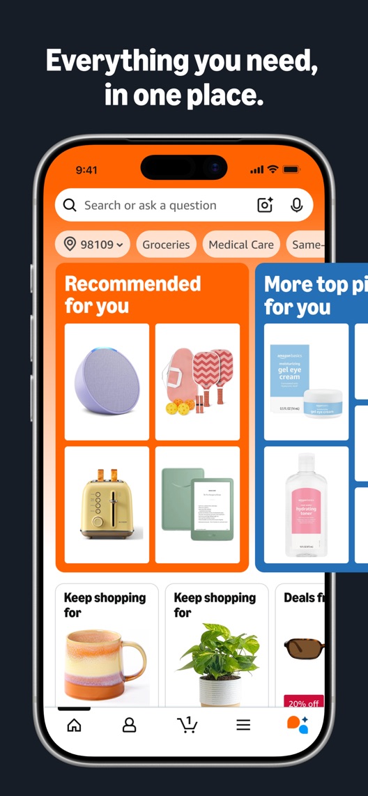
The first frame makes assortment visible.
What I saw. The opening contains search and a dense set of personalised-looking product recommendations.
My read. The category is unmistakable. But a website shopper may already expect assortment and search, so the app-specific reason is less clear.
What I’d do. Keep the broad shopping frame and test whether a practical repeat-use benefit should follow it sooner.
02
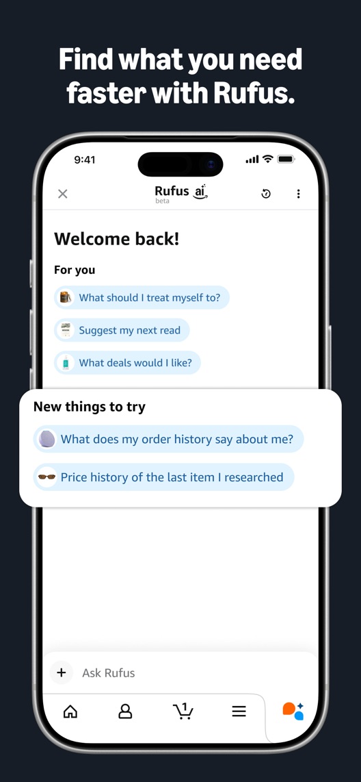
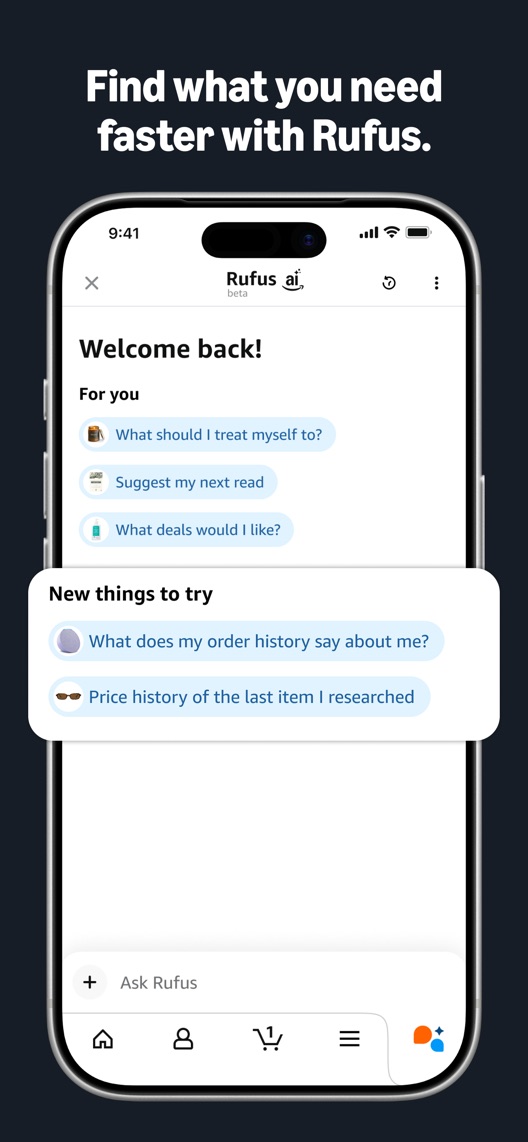
Rufus gets the second position.
What I saw. The second frame presents the named shopping assistant and suggested questions, including product-history and discovery prompts.
My read. It explains that conversation is available, but the captured screen mostly shows prompts rather than an answered shopping decision.
What I’d do. Develop a later concept showing a verified question and useful answer, with no invented product advice or availability claims.
03
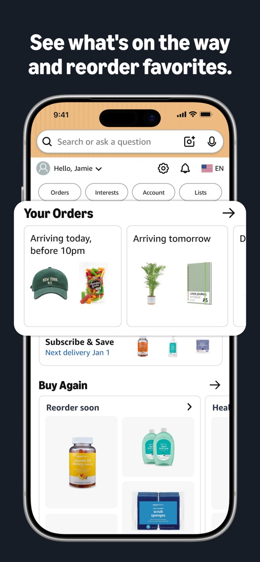
Orders and reordering solve an immediate job.
What I saw. The third frame shows arriving orders and a buy-again area.
My read. This may be a direct reason for an existing customer to install the app. It is a different motivation from browsing for something new.
What I’d do. Compare the current sequence with the order-management frame in second position.
The screenshot teardown
The original creative is preserved. Numbered notes sit beside each frame so observations and recommendations stay separate.
Frame 01
The first image displays search and several types of products in recommendation cards.
It establishes shopping breadth but does not isolate one reason to choose the app over the website.
Test idea: Preserve the category introduction and identify the next frame that answers a specific repeat-use need.
The interface shows order status and repeat-purchase actions.
The value is practical and recognisable for someone already shopping with Amazon. Delivery information shown is illustrative, not a delivery guarantee.
Test idea: Move this existing frame ahead of the assistant in an order-only experiment.
Figure 1. First three still screenshots from the US iPhone listing, captured 30 September 2026. Creative belongs to the app publisher and is reproduced for analysis. Publisher claims inside screenshots are not independently verified.
eBay explicitly covers buying, selling and resale.
The lesson: Marketplace visitors can have different jobs. Amazon’s default opening should be evaluated against buyer intent rather than a seller-oriented competitor use case.
Figure 2. US listing names and subtitles captured 30 September 2026. These are positioning comparisons, not ranking or revenue comparisons.
The keyword questions I’d investigate
Intent candidates grounded in the listing—not fabricated search-volume or difficulty scores.
online shopping / shopping app
Visitor’s job: Browse, compare and buy products.
Evidence: The name and first screenshot directly establish shopping.
Decision: Keep broad relevance but research what additional intent would justify installation over a mobile website.
order tracking / delivery status
Visitor’s job: Check an existing purchase and expected arrival.
Evidence: The third frame shows arriving orders and delivery estimates.
Decision: Investigate existing-customer acquisition separately; do not imply this app tracks arbitrary carriers or purchases from other retailers.
reorder / shopping assistant
Visitor’s job: Repeat a purchase or investigate a new one.
Evidence: Buy-again controls and assistant prompts are visible in separate frames.
Decision: Split these into separate research groups: repeat purchase and open-ended discovery are different jobs, even when they share the same app.
Proposed copy for discussion. These are not current listing fields or tested winners.
Observed listing
Amazon Shopping
More benefits, fewer steps
Proposed alternative
Amazon Shopping
Shop, track orders, buy again
Name 15/30 · Subtitle 29/30 characters
Figure 3. A metadata alternative to review against the current listing.
Keep the unambiguous name and make the subtitle state the tasks shown in the first and third screenshots. This is an alternative to the existing broad benefits language, not a claim of extra ranking power.
The tradeoff: The alternative leaves the assistant and unspecified benefits out of the subtitle. That could underrepresent discovery-oriented acquisition; compare real visitor intent before privileging repeat-use utility.
A three-frame creative brief
Proposed frame 01
Find what you came for
Show: An authentic current search or category journey with accurate product information.
Keep the shopping category clear without inventing a personalised offer.
Proposed frame 02
Keep up with your orders
Show: The current order-status view with understandable illustrative delivery information.
Show a concrete reason an existing buyer might keep the app.
Proposed frame 03
Get help comparing options
Show: A real, verified assistant question and response relevant to a shopping decision.
Demonstrate the assistant’s utility rather than treating the feature name as the benefit.
Figure 4. A proposed storyboard, not a fabricated screenshot or a launched treatment. Validate features and access before production.
What three reviewers can teach us
These three accounts were selected for order visibility, support and reasons to install. They span 2023–2026 and overrepresent problems by design. Support chat is not assumed to be Rufus, and the historical reports do not establish current defects.
Sample: 3 selected accounts from 8 displayed reviews. Dates: 17 February 2023–29 March 2026. No sentiment percentage is calculated.
28 June 2025 · 5/5 stars
“returns and refunds”
A June 2025 reviewer described difficulty understanding order and refund status; the account carries five stars.
What I’d investigate: Investigate current order-status comprehension independently. The text is useful as a question, not proof of a current defect or typical experience.
Frame three addresses a clear existing-customer job.
Deliverable: A 1–3–2 order variant against the current first-three sequence.
Low creative effort
02
Show an assistant result, not only prompts
The captured Rufus frame introduces questions but no completed answer.
Deliverable: A separately verified question-and-answer storyboard for later research.
Product and creative review
03
Separate shopping and support expectations
Reviews can discuss different AI or help surfaces.
Deliverable: A coded review sample distinguishing discovery, order management and customer support.
Focused review research
One test worth running
Does showing order tracking before the shopping assistant improve download conversion for the default listing?
Audience
Eligible US English iPhone default-page visitors; assess known acquisition sources without assuming the store test exposes a reliable existing-customer segment.
Control
Current order: shopping recommendations, assistant prompts, order management.
Treatment
Swap frames two and three only. Keep the first frame, all wording, remaining assets and metadata unchanged.
Method
Use eligible App Store product page optimization for the order comparison. A new assistant-result image is a separate future test so its creative quality cannot confound the reorder.
Primary measure
Platform-reported download conversion for eligible randomized product-page traffic.
Guardrails
In separate recruited-user research, ask whether visitors expect shopping discovery, order management or support. Check that illustrative delivery dates are not read as universal promises.
Decision rule
Predefine a useful lift and sample requirement from the real baseline, then review the complete result at the planned point. If the interval cannot distinguish variants, retain control and investigate intent.
What could muddy the result
Shopping events, holiday delivery demand, Prime-related promotions and assistant feature releases can change the mix of prospective installers.
Solid. The opening shows a real shopping interface, an assistant and order management in a coherent visual system. I would test whether the existing tracking-and-reorder frame deserves second place. The assistant may matter more for discovery; the right order depends on visitor intent, not my preference for either feature.
Level 1
Yeah. It really does!
The basics need a serious rethink.
Level 2
I hope no agency is getting paid for this.
Too many obvious things have been left unfinished.
Level 3
The app deserves better.
There is a useful product here. The listing needs to show it.
Level 4
Fine. If ‘fine’ is the goal.
The essentials are there, but there is little to get excited about.
Level 5
Getting there. Keep going.
Good ideas, with a few important gaps still to close.
Level 6Amazon Shopping is here
Solid. Put the pitchfork down.
A strong foundation. Look for specific improvements, not a complete restart.
Level 7
Whoever did this knows their stuff.
Clear positioning, thoughtful choices and very few loose ends.
Level 8
Okay, now you’re showing off.
An unusually clear, convincing storefront worth learning from.
An editorial verdict on the captured storefront, not a measured ASO score or an assessment of an agency’s private work.
Your ASO assignment
Write the reason an existing website customer would install your app today.
Identify the screenshot that demonstrates that reason and make an order-only variant.
Separate discovery-assistant feedback from support feedback before turning review themes into creative.
No private analytics, search-rank dataset or internal keyword field was supplied. Review quotations are short excerpts; explanations are our summaries. App names and screenshots belong to their respective owners. We are not affiliated with Amazon Shopping. Read our editorial methodology.