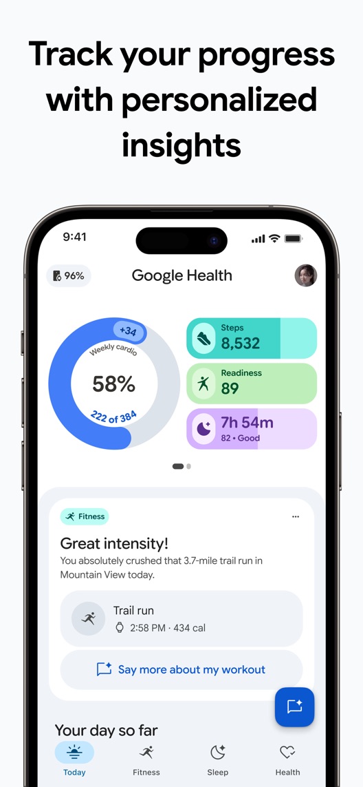
Looking for the Fitbit app? Its current US listing is Google Health (Fitbit), and the description explains the name change. The first three screens now introduce personalised insights, fitness and sleep, with a mismatch between one headline and the interface underneath it.
One storefront, one language and a dated capture. This is an independent editorial audit, not a client case study.
Store & market
Apple App Store · United States
Language & device
en-US · iPhone
Captured
30 September 2026
Creative reviewed
First 3 still screenshots; video and other devices excluded
Observed app name · 22/30 characters
Google Health (Fitbit)
Observed subtitle · 30/30 characters
Your personalized health coach
Open the source listing ↗. Public text cannot reveal the private keyword field, search volumes, rankings or conversion rates. The recommendations below are proposals to validate.
Three things worth your attention
01
The name connects old and new identities.
What I saw. The observed app name includes Google Health and Fitbit, and the description states that the Fitbit app is now Google Health.
My read. This helps someone searching for the familiar brand recognise the successor. Removing Fitbit for a cleaner title could make that transition less clear.
What I’d do. Preserve the identity bridge while researching whether returning and new visitors understand the current product.
02
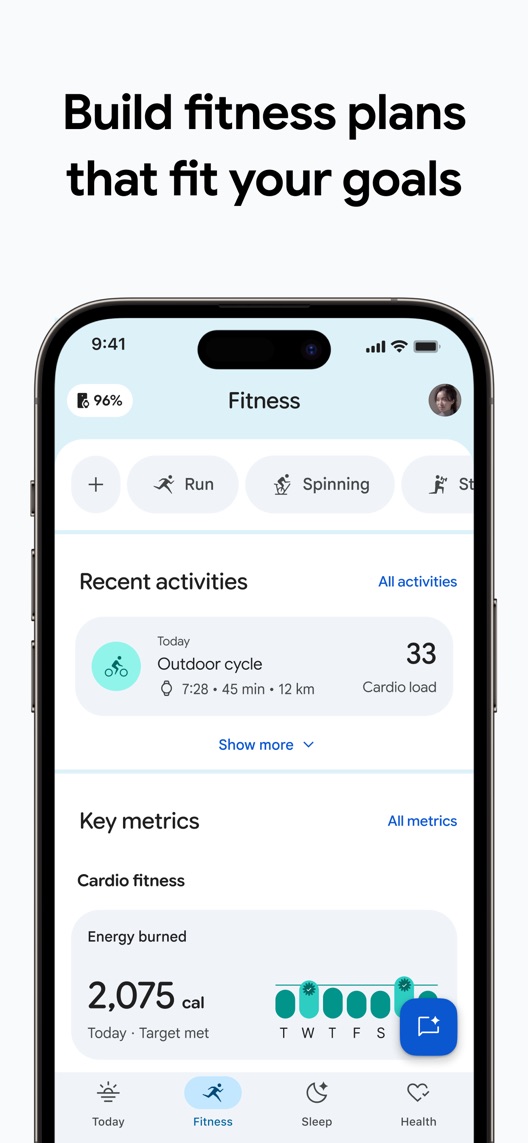
The fitness headline promises a plan, but the screen shows tracking.
What I saw. The second frame refers to fitness plans while the visible interface contains recent activity, cardio load and energy metrics.
My read. The screen may support the wider product story, but it does not directly demonstrate creating or adjusting a plan.
What I’d do. Verify the current plan workflow and pair the headline with that interface, or narrow the headline to the tracking view actually shown.
03
Sleep is a concrete benefit with measurement limits.
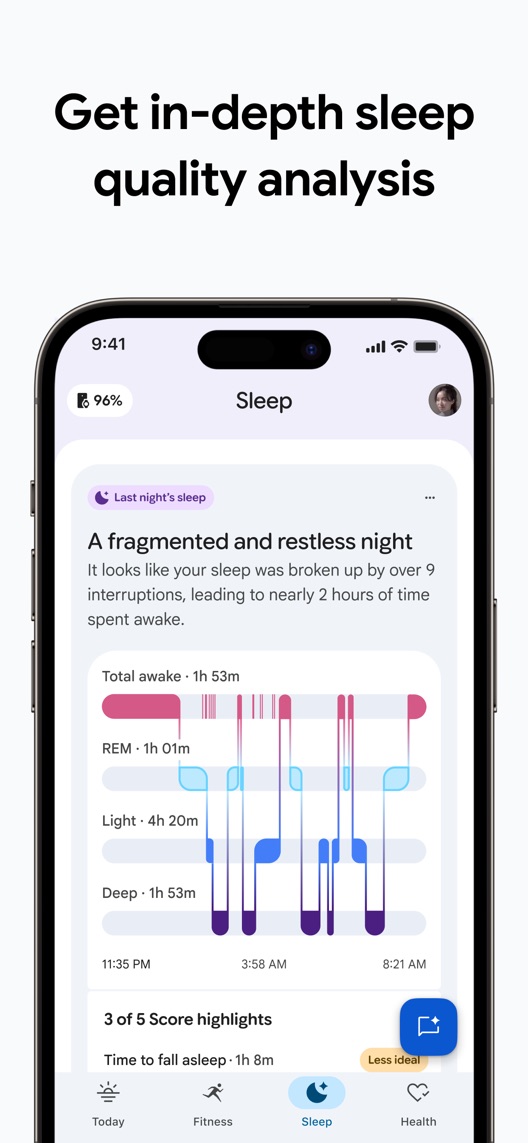
What I saw. The third frame presents a sleep narrative and a chart of sleep stages.
My read. This explains the reporting job, but it does not prove clinical accuracy or establish a diagnosis. Device, plan and regional access still need checking.
What I’d do. Keep acquisition copy about understanding tracked patterns and verify the conditions for every displayed insight.
The screenshot teardown
The original creative is preserved. Numbered notes sit beside each frame so observations and recommendations stay separate.
Frame 01
Several metrics and a commentary card appear in the Today view under the Google Health name.
The dashboard demonstrates breadth, while viewers still need to understand which data sources and access conditions supply the pictured information.
Test idea: Check device and plan requirements before promising the same dashboard to every downloader.
A narrative interpretation accompanies the plotted sleep record.
This is a specific reporting example; it is not evidence that every device or account produces identical information or that the analysis is diagnostic.
Test idea: Verify supported inputs and access, and avoid turning an illustrative sleep record into a medical-outcome claim.
Figure 1. First three still screenshots from the US iPhone listing, captured 30 September 2026. Creative belongs to the app publisher and is reproduced for analysis. Publisher claims inside screenshots are not independently verified.
Strava names running, cycling, walking and sharing with friends.
The lesson: It makes activities explicit. Google Health’s broader fitness-and-sleep proposition should show concrete jobs rather than compete on vague motivation alone.
Oura uses its brand name with a broad health-and-fitness subtitle.
The lesson: The metadata does not establish feature equivalence. Compare device-dependent reporting jobs and verify access before drawing product comparisons.
Figure 2. US listing names and subtitles captured 30 September 2026. These are positioning comparisons, not ranking or revenue comparisons.
The keyword questions I’d investigate
Intent candidates grounded in the listing—not fabricated search-volume or difficulty scores.
Fitbit app / Google Health
Visitor’s job: Find the current app associated with an existing device or account.
Evidence: Both names appear in the current listing and its transition explanation.
Decision: Keep legacy-brand recognition visible and investigate migration-related confusion separately from new-user acquisition.
fitness tracker / activity progress
Visitor’s job: Review activity and understand changes over time.
Evidence: The first two screenshots show metrics and recent activities.
Decision: Validate the supported inputs and visitor’s device context before making a universal tracking claim.
sleep tracking / sleep insights
Visitor’s job: Review a recorded night and recognise patterns.
Evidence: The third screenshot shows a sleep narrative and stage chart.
Decision: Research this as a wellness-reporting intent; do not promise diagnosis, treatment or a measured improvement in sleep.
Proposed copy for discussion. These are not current listing fields or tested winners.
Observed listing
Google Health (Fitbit)
Your personalized health coach
Proposed alternative
Google Health (Fitbit)
Fitness and sleep insights
Name 22/30 · Subtitle 26/30 characters
Figure 3. A metadata alternative to review against the current listing.
Preserve the full current identity and name the two reporting jobs demonstrated most clearly. The alternative avoids a stronger coaching promise while device and plan access are being checked.
The tradeoff: The current subtitle positions a personalised coach, which may be central to the updated product. A tracking-led alternative could understate that direction; validate qualified intent and current coaching access before changing it.
A three-frame creative brief
Proposed frame 01
See your day in one place
Show: A current dashboard with verified sources and accurate access information for each highlighted metric.
Introduce the reporting job while helping existing Fitbit users recognise the new identity.
Proposed frame 02
Review your activity progress
Show: The current fitness history and metrics view with a literal tracking headline.
Match the visible interface directly instead of implying that it shows plan creation.
Proposed frame 03
Explore your sleep patterns
Show: A verified sleep report with clearly illustrative data and appropriate measurement scope.
Explain the wellness insight without suggesting clinical certainty or guaranteed outcomes.
Figure 4. A proposed storyboard, not a fabricated screenshot or a launched treatment. Validate features and access before production.
What three reviewers can teach us
Two accounts predate the Google Health transition; the third contains several updates and mixes software praise with device and warranty complaints. They were selected to distinguish longstanding tracking motivations from the new experience, not to estimate current accuracy, satisfaction or hardware reliability.
Sample: 3 selected accounts from 8 displayed reviews. Dates: 23 March 2019–21 August 2026. No sentiment percentage is calculated.
23 March 2019 · 4/5 stars
“track your own performance”
A March 2019 Fitbit-device owner valued motivation and tracking while questioning measurements.
What I’d investigate: This predates the new identity by years. It is a historical motivation lead, not a current accuracy assessment or feature list.
An August 2026 account includes a June update praising the new conversational experience alongside hardware and warranty complaints.
What I’d investigate: Separate the updated software reaction from hardware-service history, and do not infer typical device lifespan or outcomes from one account.
The current plan promise is not directly demonstrated by the visible tracking interface.
Deliverable: One headline-only alternative describing activity progress.
Low creative effort
02
Verify the access matrix
Metrics and personalised insights can depend on more than installing the app.
Deliverable: A dated device, region, input and plan checklist for each pictured capability.
Product verification
03
Preserve recognition through the transition
Legacy Fitbit searches and new Google Health discovery are different journeys.
Deliverable: A comprehension study with existing-device owners and new prospects, reported separately.
Focused research
One test worth running
Does a literal activity-progress headline on the second frame improve conversion compared with the current fitness-plan headline?
Audience
Eligible US English iPhone default-page visitors; interpret the result alongside existing Fitbit-owner and new-user acquisition mix.
Control
The current second-frame fitness-plan headline and unchanged activity-history image.
Treatment
Change only the second-frame headline to approved activity-progress wording; hold interface, frame order, metadata and other creative fixed.
Method
Verify the shown data and access conditions, check headline comprehension, then use eligible App Store product page optimization for a text-only screenshot test.
Primary measure
Platform-reported download conversion within eligible randomized traffic.
Guardrails
In separate research check that viewers understand device and plan requirements and do not interpret wellness reporting as diagnosis or a guaranteed health benefit.
Decision rule
Choose a useful effect and sample plan from real baseline traffic. Retain control if inconclusive; a store-conversion result cannot validate measurement accuracy, coaching effectiveness or health outcomes.
What could muddy the result
Rebrand awareness, device launches, plan availability, feature releases and the proportion of returning Fitbit users can alter the meaning of aggregate results.
Getting there. The current name preserves Fitbit recognition and the dashboard makes several tracking jobs visible. The fitness-plan headline, however, sits above an activity-history and metrics view rather than a visible plan-building interaction. A more direct match between claim and proof is the strongest immediate creative opportunity.
Level 1
Yeah. It really does!
The basics need a serious rethink.
Level 2
I hope no agency is getting paid for this.
Too many obvious things have been left unfinished.
Level 3
The app deserves better.
There is a useful product here. The listing needs to show it.
Level 4
Fine. If ‘fine’ is the goal.
The essentials are there, but there is little to get excited about.
Level 5Google Health (Fitbit) is here
Getting there. Keep going.
Good ideas, with a few important gaps still to close.
Level 6
Solid. Put the pitchfork down.
A strong foundation. Look for specific improvements, not a complete restart.
Level 7
Whoever did this knows their stuff.
Clear positioning, thoughtful choices and very few loose ends.
Level 8
Okay, now you’re showing off.
An unusually clear, convincing storefront worth learning from.
An editorial verdict on the captured storefront, not a measured ASO score or an assessment of an agency’s private work.
Your ASO assignment
Check the current identity of an app before auditing an older brand name.
Match every screenshot headline to a visible action or result on that screen.
Separate device requirements, app capabilities and outcome claims in the creative brief.
No private analytics, search-rank dataset or internal keyword field was supplied. Review quotations are short excerpts; explanations are our summaries. App names and screenshots belong to their respective owners. We are not affiliated with Google Health (Fitbit). Read our editorial methodology.