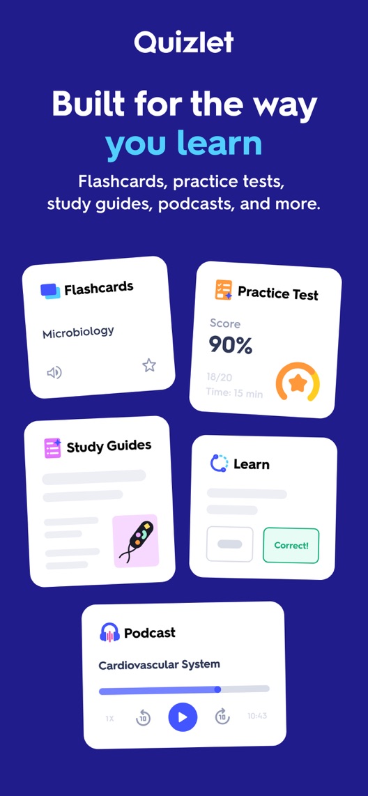
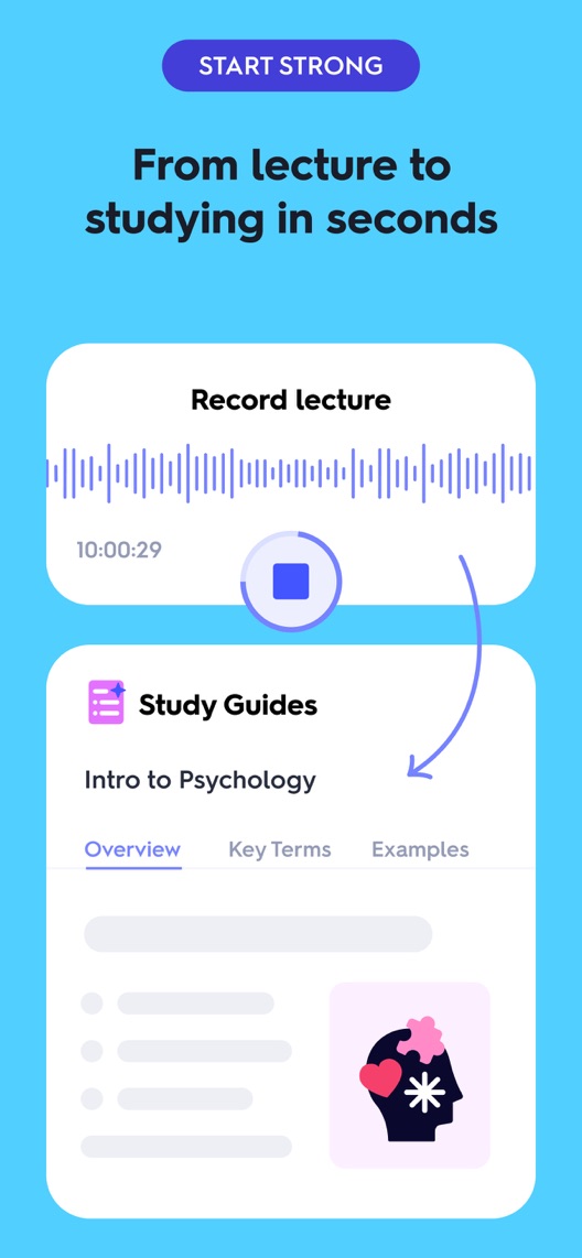
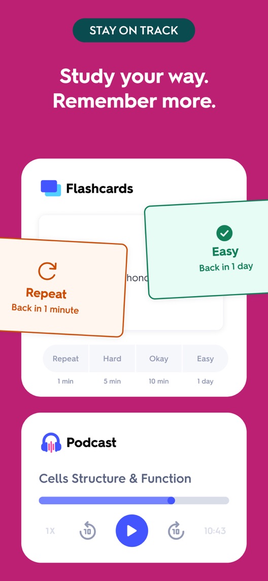
Quizlet is visibly moving beyond flashcards. The opening lists several study formats, then shows a lecture becoming a guide and cards returning at different intervals. The opportunity is to make that progression feel like one usable study session rather than three separate feature announcements.
One storefront, one language and a dated capture. This is an independent editorial audit, not a client case study.
Store & market
Apple App Store · United States
Language & device
en-US · iPhone
Captured
30 September 2026
Creative reviewed
First 3 still screenshots; video and other devices excluded
Observed app name · 29/30 characters
Quizlet: More than Flashcards
Observed subtitle · 26/30 characters
Walk into every test ready
Open the source listing ↗. Public text cannot reveal the private keyword field, search volumes, rankings or conversion rates. The recommendations below are proposals to validate.
Three things worth your attention
01
The opening is a menu of learning formats.
What I saw. The first frame includes flashcards, a practice-test example, study guides, a learning activity and audio playback.
My read. The range is clear, but a newcomer must choose where to begin. A displayed score should not be read as a typical result.
What I’d do. Research the initial study task and compare the existing workflow example against the broad opening.
02
The second frame explains an input and an output.
What I saw. A lecture-recording panel is connected by an arrow to a study guide.
My read. This gives the learner a concrete starting method. It does not prove the quality of every generated guide, processing speed or access on every plan.
What I’d do. Verify the current workflow and show the review step before implying that generated material is ready to trust.
03
The third frame combines review scheduling and listening.
What I saw. Flashcard difficulty choices and return intervals appear above an audio-study panel.
My read. Both are useful study methods, but the relationship between them is not explained in the image.
What I’d do. Create a coherent example using the same subject across capture, checking and practice.
The screenshot teardown
The original creative is preserved. Numbered notes sit beside each frame so observations and recommendations stay separate.
Frame 01
Several study formats share one overview image, including an illustrative test score.
The page communicates breadth but leaves the first action to the viewer and cannot substantiate improved grades.
Test idea: Keep the overview as control and research which format matches the visitor’s immediate task.
Figure 1. First three still screenshots from the US iPhone listing, captured 30 September 2026. Creative belongs to the app publisher and is reproduced for analysis. Publisher claims inside screenshots are not independently verified.
Brainscape names study flashcards and uses a learning-and-memory benefit in its subtitle.
The lesson: Learning outcomes are common marketing language. Quizlet should support its proposition with visible product actions rather than escalating an unmeasured outcome claim.
Figure 2. US listing names and subtitles captured 30 September 2026. These are positioning comparisons, not ranking or revenue comparisons.
The keyword questions I’d investigate
Intent candidates grounded in the listing—not fabricated search-volume or difficulty scores.
flashcards / study cards
Visitor’s job: Practise and revisit a set of terms or concepts.
Evidence: Flashcards appear in both the opening and the review-interval frame.
Decision: Keep the established study format visible while researching whether new formats improve comprehension for that audience.
lecture notes / study guide maker
Visitor’s job: Turn source material into organised study resources.
Evidence: The second frame directly connects a recording with a guide.
Decision: Verify input requirements and review controls; avoid implying perfect transcription or factual correctness.
practice test / exam preparation
Visitor’s job: Check understanding before an assessment.
Evidence: The opening includes a practice-test panel with a sample score.
Decision: Research subject and assessment intent. The pictured score is a creative example, not evidence of exam performance.
Proposed copy for discussion. These are not current listing fields or tested winners.
Observed listing
Quizlet: More than Flashcards
Walk into every test ready
Proposed alternative
Quizlet: Study & Flashcards
Turn notes into study practice
Name 27/30 · Subtitle 30/30 characters
Figure 3. A metadata alternative to review against the current listing.
Connect the established flashcard identity with an input-to-practice job. The proposal gives a concrete action without claiming a guaranteed grade, processing time or universal plan access.
The tradeoff: The current name emphasises being more than flashcards and the subtitle stresses test readiness. This alternative may underplay audio and other formats, so validate the visitor mix before narrowing the message.
A three-frame creative brief
Proposed frame 01
Start with your study material
Show: A verified current import or recording flow using authorised example material.
Establish the source and the learner’s first action.
Proposed frame 02
Check the guide against your notes
Show: A current review or editing step with a checked example.
Make verification part of the story instead of presenting generated material as automatically authoritative.
Proposed frame 03
Practise what needs another look
Show: A current card or question workflow tied to the same topic.
Connect preparation to practice without promising an academic outcome.
Figure 4. A proposed storyboard, not a fabricated screenshot or a launched treatment. Validate features and access before production.
What three reviewers can teach us
The accounts were selected for getting started, source-material input and practice. They span 2023–2025 and describe different feature generations. Historical requests and subjective learning claims are not current capability, accessibility or effectiveness evidence.
Sample: 3 selected accounts from 8 displayed reviews. Dates: 14 December 2023–29 July 2025. No sentiment percentage is calculated.
29 July 2025 · 5/5 stars
“locating all those buttons”
A July 2025 reviewer valued several study formats but described an initial learning curve.
What I’d investigate: Research the first-action problem and verify current feature access rather than treating the account as a present usability measurement.
An April 2024 reviewer requested audio input and other changes.
What I’d investigate: This request predates the captured recording creative. Use it as historical motivation, not evidence that the feature is missing now; do not adopt the reviewer’s claims about learning conditions.
A December 2023 reviewer described making cards from class material and using several study features.
What I’d investigate: Verify the current import and plan conditions. Reported confidence and usefulness are personal accounts, not measured exam outcomes.
The second frame supplies the clearest input/output example.
Deliverable: A current mobile walkthrough including source requirements, review and plan access.
Product verification
02
Compare workflow with breadth
The opening presents several starting options.
Deliverable: An order-only test swapping the complete first and second frames.
Low creative effort
03
Keep study proof distinct from outcomes
Sample scores and memory language can be read too strongly.
Deliverable: A comprehension review distinguishing app actions from promised grades or retention.
Research and editorial review
One test worth running
Does leading with the existing lecture-to-guide frame improve conversion compared with the study-format overview?
Audience
Eligible US English iPhone default-page visitors, interpreted alongside flashcard, lecture and exam-preparation intentions.
Control
Current overview first, lecture-to-guide second and practice-format third.
Treatment
Swap only the complete first and second frames; preserve wording, other positions, metadata and plan messages.
Method
Verify current access and workflow accuracy, check comprehension, then use eligible App Store product page optimization for a screenshot-order test.
Primary measure
Platform-reported download conversion for eligible randomized traffic.
Guardrails
Separately check whether visitors expect perfect generated content, guaranteed grades or access to every format without conditions.
Decision rule
Set the useful effect and sample plan from real traffic. Retain control if inconclusive; download conversion cannot establish learning effectiveness or subscription value.
What could muddy the result
Academic calendars, exam periods, subject mix, plan changes and new study-feature launches can affect which opening is most relevant.
Solid. The lecture-to-guide example and card-review intervals make the product more concrete than a generic study promise. The opening still asks visitors to process several formats at once, and the illustrated test score is not evidence of student outcomes. A workflow-first opening is a sensible hypothesis to test.
Level 1
Yeah. It really does!
The basics need a serious rethink.
Level 2
I hope no agency is getting paid for this.
Too many obvious things have been left unfinished.
Level 3
The app deserves better.
There is a useful product here. The listing needs to show it.
Level 4
Fine. If ‘fine’ is the goal.
The essentials are there, but there is little to get excited about.
Level 5
Getting there. Keep going.
Good ideas, with a few important gaps still to close.
Level 6Quizlet is here
Solid. Put the pitchfork down.
A strong foundation. Look for specific improvements, not a complete restart.
Level 7
Whoever did this knows their stuff.
Clear positioning, thoughtful choices and very few loose ends.
Level 8
Okay, now you’re showing off.
An unusually clear, convincing storefront worth learning from.
An editorial verdict on the captured storefront, not a measured ASO score or an assessment of an agency’s private work.
Your ASO assignment
Choose one source-to-practice journey for your education app.
Verify the review step and access conditions before writing a generation promise.
Distinguish illustrative scores from measured educational outcomes in the test brief.
No private analytics, search-rank dataset or internal keyword field was supplied. Review quotations are short excerpts; explanations are our summaries. App names and screenshots belong to their respective owners. We are not affiliated with Quizlet. Read our editorial methodology.