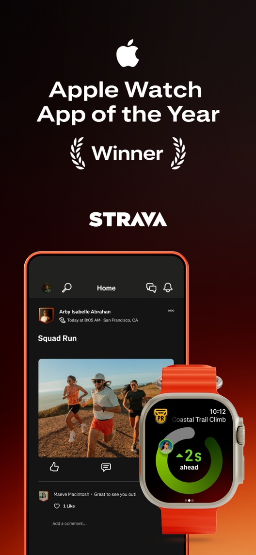
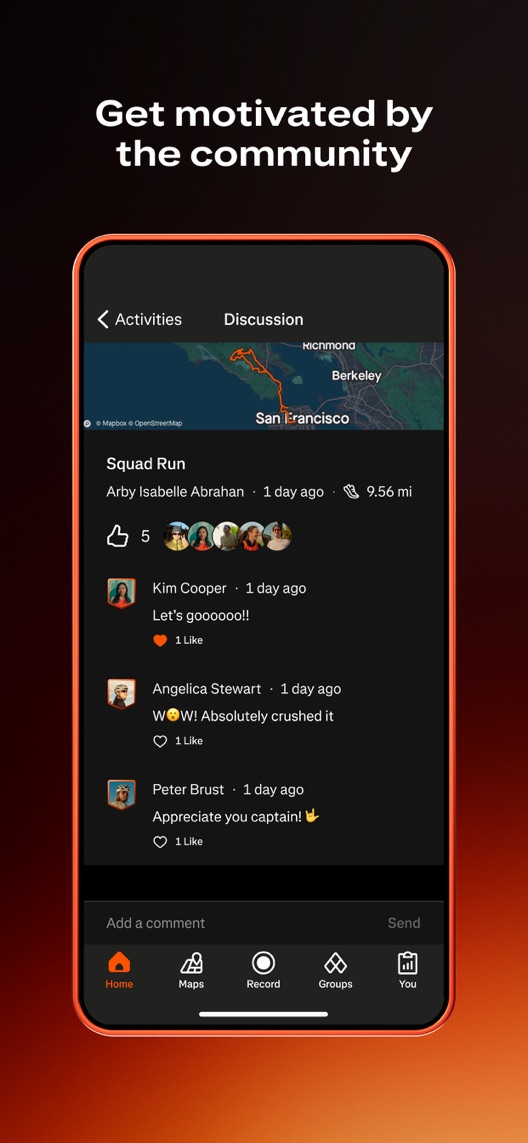
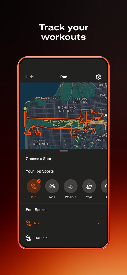
Strava puts recognition first, social reactions second and the tracking job third. A newcomer should not have to sit through the awards ceremony to understand how to record a walk. The community needs an activity to gather around.
One storefront, one language and a dated capture. This is an independent editorial audit, not a client case study.
Store & market
Apple App Store · United States
Language & device
en-US · iPhone
Captured
30 September 2026
Creative reviewed
First 3 still screenshots; video and other devices excluded
Observed app name · 23/30 characters
Strava: Run, Bike, Walk
Observed subtitle · 26/30 characters
Track & share with friends
Gab’s take · Five criteria. Two points each.
Why this gets 5/10
Routes and community response are specific, useful evidence. Keep the social personality. The recording experience should introduce the app before the award does. Show one recording, its route and the actual community response in that order. Keep recognition secondary. A watch award does not explain the first useful phone experience.
Reason to care
1/2
The activity and community context gives a relevant fitness proposition, although the award-led opener delays the first practical tracking benefit.
Product evidence
1/2
Community and routes appear without one completed recording action.
Readable at a glance
1/2
Dark small interfaces and watch imagery compete for attention.
A useful sequence
1/2
Recognition, reactions and tracking run in an unhelpful order.
A reason to choose
1/2
Activity discussion is specific but the newcomer entry is underexplained.
0: not earned · 1: useful but incomplete · 2: clearly demonstrated. Judged on the dated opening creative; public metadata provides context. These points assess creative execution, not private conversion or ranking performance. Read the scoring criteria · See all ten verdict levels
Figure 1. First three still screenshots from the US iPhone listing, captured 30 September 2026. Creative belongs to the app publisher and is reproduced for analysis. Publisher claims inside screenshots are not independently verified.
What I’d put on the table
Proposed copy for discussion. These are not current listing fields or tested winners.
Observed listing
Strava: Run, Bike, Walk
Track & share with friends
Proposed alternative
Strava: Run, Bike, Walk
Track activity. Find a crew.
Name 23/30 · Subtitle 28/30 characters
Metadata comparison. A proposed alternative to review against the current listing.
The candidate keeps activity breadth while turning the social promise into a more conversational invitation.
The tradeoff: Crew is less literal than friends and may feel less welcoming to a solo beginner. Validate the tone with intended users; it is a copy hypothesis, not a proven improvement.
Gab’s proposed direction
Give each screenshot a job.
Read the sequence from top to bottom on mobile, left to right on desktop. These are message-layout sketches, not screens from Strava or tested results.
01Make the benefit clear
Proposed headline
Record the activity you enjoy
Illustrative layout · verify the real flow
Put this in the frame: An approved current phone recording screen with clear activity selection.
Why it earns the space: Show that a first session has a simple starting point.
02Show useful evidence
Proposed headline
See what you just did
Illustrative layout · verify the real flow
Put this in the frame: A current route or activity summary with readable values.
Why it earns the space: Connect recording with a useful outcome without promising perfect GPS accuracy.
03Move the decision forward
Proposed headline
Share the effort with your people
Illustrative layout · verify the real flow
Put this in the frame: The genuine community interaction screen.
Why it earns the space: Finish with the social distinction rather than treating it as a separate product.
The test: Does showing the recording interface earlier improve default-page download conversion? The sketch gives the designer a direction; the actual product and access conditions decide what can ship.
Want this level of detail for your app?
Bring the listing. I’ll help you decide what to keep, what to fix and what to test.
AllTrails puts trail maps and outdoor discovery into its metadata.
The lesson: For a walker, discovering where to go may be a different job from recording and sharing. Do not treat all walking intent as interchangeable.
Competitor comparison. US listing names and subtitles captured 30 September 2026. These are positioning comparisons, not ranking or revenue comparisons.Keyword ideas and their evidence
The keyword questions I’d investigate
Intent candidates grounded in the listing—not fabricated search-volume or difficulty scores.
run tracker / cycling tracker
Visitor’s job: Record an activity and see its data.
Evidence: The name and third screenshot support activity recording.
Decision: Preserve functional language even when creative emphasizes community.
walking tracker
Visitor’s job: Record everyday walks or build an activity habit.
Evidence: Walking is in the name, but the sampled creative leans toward running.
Decision: Investigate as a specific audience; do not assume a missing walking-led frame proves lost installs.
fitness community / activity sharing
Visitor’s job: Stay connected and motivated through other people.
Evidence: The subtitle and second screenshot directly show this distinction.
Decision: Keep the social benefit visible; avoid replacing it with generic tracking copy.
Three displayed reviews were selected for recording, sharing and paid-value questions. All three are from 2019–2020. They are historical expectation signals and must not be presented as reports of current bugs or current pricing.
Sample: 3 selected accounts from 8 displayed reviews. Dates: 27 July 2019–27 December 2020. No sentiment percentage is calculated.
27 December 2020 · 5/5 stars
“keep in touch”
Despite its five-star rating, this review questions paid value and describes using the app for running friends.
What I’d investigate: Read the text instead of treating the star rating as sentiment. Verify current feature access before drawing a pricing conclusion.
The reviewer values activity data and sharing but reports notification and segment frustrations at that time.
What I’d investigate: Recording and social interactions are both useful message territories. The old complaints require fresh reproduction before becoming product findings.
Watch-led recognition occupies the opener above small interface detail.
Deliverable: Lead with an authentic supported run, ride or walk recording benefit.
Creative brief and current-product check
02
The reactions arrive before the activity
Comments demonstrate community without an understandable first recording.
Deliverable: Connect the discussion to the same captured activity and enlarge the useful interaction.
Creative brief and current-product check
03
The tracking job is introduced last
Route and sport selection should establish the earlier story.
Deliverable: Move the supported recording action forward and finish with its actual route summary.
Creative brief and current-product check
Open the full test plan
One test worth running
Does showing the recording interface earlier improve default-page download conversion?
Audience
Eligible US English iPhone product-page visitors; document the device and acquisition mix.
Control
Current screenshot order.
Treatment
Move the current third frame into second position and keep the community frame next.
Method
Use an eligible App Store product page optimization test. Keep the video preview, if served, and other media unchanged; this audit evaluates the first three still screenshots, not the video.
Primary measure
Platform-reported download conversion for the test audience.
Guardrails
Monitor source/device mix. Assess first activity recording separately unless a defensible link to assigned variants exists.
Decision rule
Define baseline, sample requirement, minimum practical effect and review date before launch. Do not declare a winner from a short-term numerical lead.
What could muddy the result
Seasonality, major sporting events, subscription changes and campaign creative can alter the audience.
No private analytics, search-rank dataset or internal keyword field was supplied. Review quotations are short excerpts; explanations are our summaries. App names and screenshots belong to their respective owners. We are not affiliated with Strava. Read our editorial methodology.
Your app. Your priorities.
Get an audit you can actually use.
Send your listing, market and the problem you want to solve. I’ll explain the scope and fee before work starts. Your budget should buy decisions, not a longer PDF.