ASO course · lesson 34 of 60
App icon optimization: develop testable concepts
Create icon alternatives that preserve identity and test a meaningful recognition hypothesis.
By Gabriel Machuret · Editorial methodology
Before you start: Brand constraints, audience context and current icon assets.
Module 6: Creative strategy and production
Plan about 50 minutes for reading, practice and review
You will produce: An icon concept pack with hypotheses, constraints and evaluation requirements.
Understand the decision
Treat the icon as identity
An icon must remain recognizable across the store and the installed product experience. Consider shape, contrast and distinctiveness at small size, but avoid turning it into a compressed screenshot or promotional billboard. Record brand and product constraints before exploring alternatives. A conversion-oriented change still has consequences for existing users trying to recognize the app.
Make alternatives strategically different
Changing a tiny decorative detail may be difficult to interpret and may not address the audience problem. Define the hypothesis: perhaps the current mountain symbol suggests navigation while a journal cue better communicates the product. Keep the comparison truthful and within current platform rules. Do not borrow another app’s recognizable identity merely because it performs well in your research set.
Plan implementation and evaluation together
Store icon experiments can have platform-specific requirements and product-release dependencies. Confirm what is supported before promising a quick test. Keep source files, export versions and implementation instructions. Evaluate recognition and technical acceptance separately from conversion, and record the possible effect on returning users rather than assuming all traffic is unfamiliar with the brand.
Apply the method in practice
Define the recognition task
An icon needs to identify the app at small sizes and in a competitive environment. Start with the product category, brand constraints and the recognition problem you want to investigate. A journal symbol may communicate recording; a map pin may imply navigation. Decide which association is useful before drawing variants. Avoid treating a personally preferred illustration as strategy. The concept should connect to a supported product meaning and remain recognizable when shown beside other icons.
Vary concepts deliberately
Create alternatives around a clear idea such as a simplified journal mark versus a more expressive memory symbol. Keep notes on what changes and why. Review silhouette, contrast, detail and distinction at actual size. Do not copy a competitor's mark or use badges that imply unsupported status. A family of variants that changes shape, color and symbolism together is a package comparison; you cannot later identify which component caused the result without further investigation.
Check implementation before planning a test
Store-specific icon testing and submission requirements may depend on app configuration or included assets. Verify current platform guidance and coordinate with engineering before promising a quick test. Keep the production icon, alternate files and their identifiers unambiguous. Record the audience, primary measure and guardrails if experimentation is appropriate. An icon preference survey can inform recognition and interpretation, but it does not directly measure store acquisition performance.
Platform references for this work: Apple — Product page optimization overview · Google Play — Metadata policy
Your step-by-step procedure
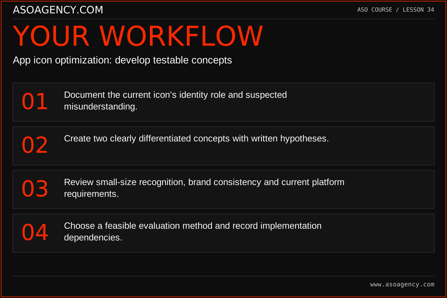
- Document the current icon’s identity role and suspected misunderstanding.
- Create two clearly differentiated concepts with written hypotheses.
- Review small-size recognition, brand consistency and current platform requirements.
- Choose a feasible evaluation method and record implementation dependencies.
Worked example and interpretation
Trail Notes and numerical research scenarios are fictional teaching examples. Platform limits, where shown, come from the linked official references.
Trail Notes compares a mountain-outline concept with a journal-page concept. Both retain the approved color family and app identity. The question is whether the journal cue better communicates the use case, not whether one color magically improves ranking. A small recognition review precedes any store experiment, and the technical owner checks the platform’s icon-test setup before scheduling work.
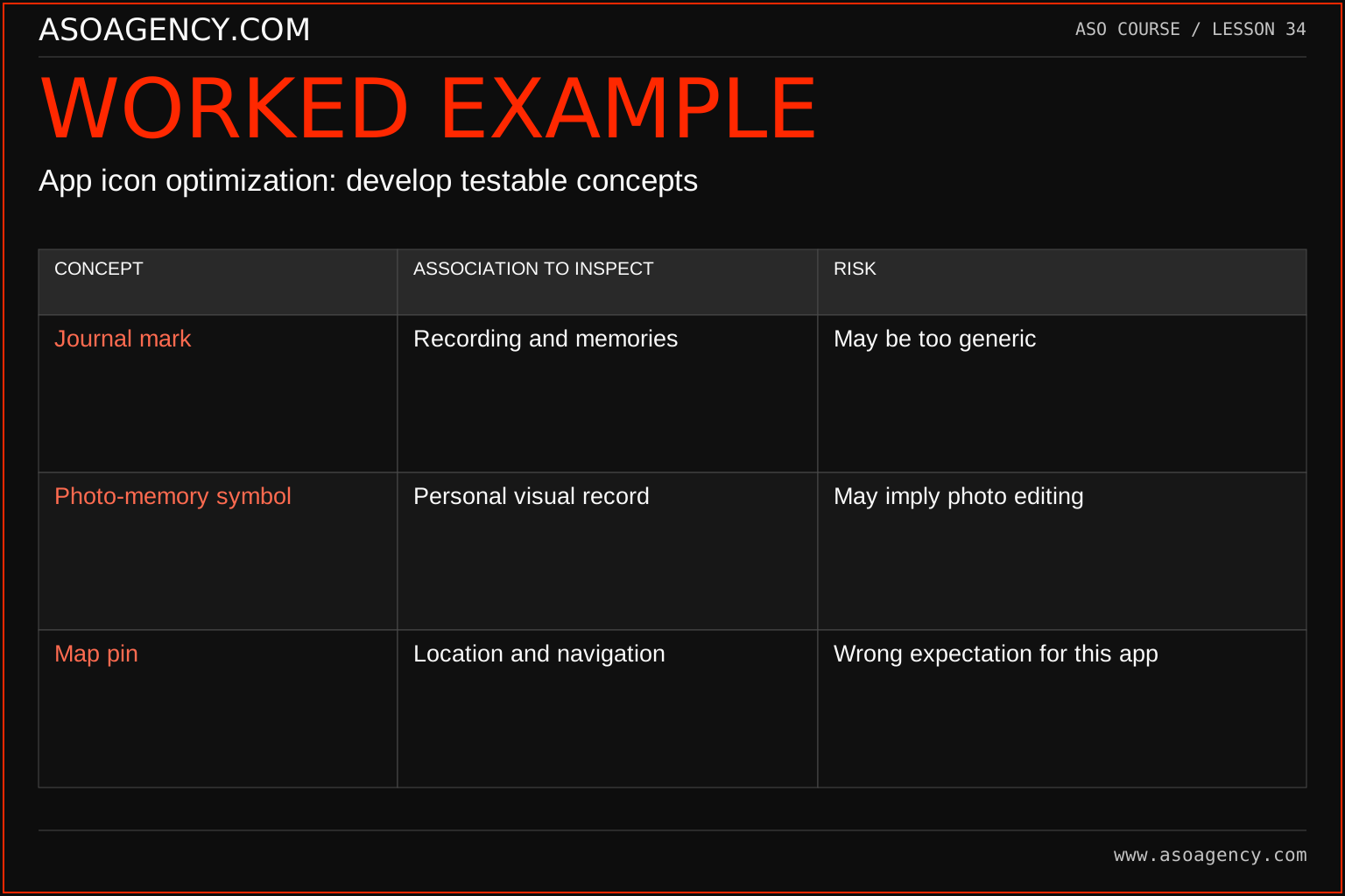
| Concept | Association to inspect | Risk |
|---|---|---|
| Journal mark | Recording and memories | May be too generic |
| Photo-memory symbol | Personal visual record | May imply photo editing |
| Map pin | Location and navigation | Wrong expectation for this app |
The concept review asks what viewers infer, not which shape the team likes most. The map-pin direction could be visually striking yet unsuitable if it reinforces the navigation misunderstanding. The other concepts also need evidence: a photo symbol might shift the app into a different perceived category. Use those interpretations to refine the shortlist before investing in a full test and release pack.
Build a handover someone can use
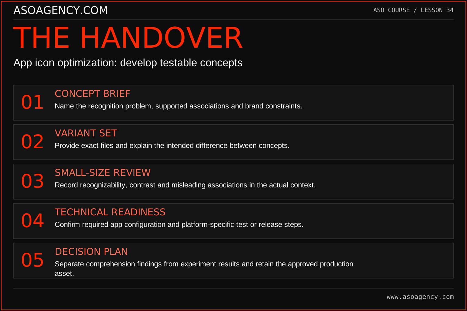
Concept brief
Name the recognition problem, supported associations and brand constraints.
Variant set
Provide exact files and explain the intended difference between concepts.
Small-size review
Record recognizability, contrast and misleading associations in the actual context.
Technical readiness
Confirm required app configuration and platform-specific test or release steps.
Decision plan
Separate comprehension findings from experiment results and retain the approved production asset.
Your ASO assignment
Use your own app and evidence, or work through the teaching case. Keep your observations separate from assumptions and explain the reasoning behind your decisions.
- Write two icon concept briefs without using competitor assets.
- List the recognition tradeoffs for existing and new users.
- Create a technical implementation checklist for the selected store.
Scenario challenge
A team prefers a map icon because it looks more outdoorsy. Explain how to evaluate whether that association helps a hiking journal or creates an unsupported navigation promise.
Assess your work
- Alternatives represent a meaningful communication difference.
- Product identity and ownership constraints are respected.
- The proposed test is technically feasible for the selected platform.
Common mistakes to catch
- Claiming a particular icon color universally converts best.
- Ignoring the release requirements of an icon experiment.
Knowledge check
A candidate gets attention because it resembles a famous competitor. Is that a sound strategy?
Read the answer and reasoning
No. Attention created through confusion is not a defensible product identity. Develop a distinctive concept grounded in your own product and have relevant rights or policy concerns reviewed. Evaluate recognition of the actual app rather than borrowed familiarity.
Sources and further reading
Platform references reviewed 29 September 2026. These sources support platform capabilities and constraints; the teaching frameworks, assignments and illustrative cases are original course material.
- Apple — Product page optimization overview — Supported experiment assets, eligibility and setup.
- Google Play — Metadata policy — Accurate, relevant metadata and prohibited presentation.
Your ASO lesson notes
Use this space for your assignment, evidence and handover. Select Save to keep a draft in this browser, or download a copy to take with you.
Notes stay on this device and are not submitted to ASO Agency.
Complete your assignment with the ASO experiment planner.
Loading your progress…
Progress is saved only in this browser. It does not sync across devices. Mark a lesson complete after doing its exercise.