ASO course · lesson 33 of 60
ASO screenshot design: readability and accessibility
Identify creative problems at realistic viewing sizes before performance testing.
By Gabriel Machuret · Editorial methodology
Before you start: A draft screenshot sequence and the intended export sizes.
Module 6: Creative strategy and production
Plan about 50 minutes for reading, practice and review
You will produce: A visual QA sheet with observations, revisions and comprehension findings.
Understand the decision
Hierarchy directs attention
Decide what should be noticed first, second and third in each frame. A headline, product screen and decorative background should not compete equally. Review the asset at small size rather than only in a large design canvas. If the primary message depends on tiny text inside the app interface, the viewer may not understand it before moving on.
Use several practical checks
Inspect text contrast, line length, cropping and the effect of color choices. Do not encode the only distinction between alternatives in color alone. Where video carries important meaning, consider how it works without sound and with appropriate captions. These reviews improve communication; an image-only check cannot certify the accessibility of the app itself or every store presentation.
Test comprehension without coaching
Show the draft briefly to someone unfamiliar with the product, then ask what it does, who it helps and what they expect next. Avoid explaining the design before asking. Record the response and confusion points. A small qualitative check diagnoses misunderstandings; it does not estimate a population conversion rate or justify declaring a statistical winner.
Apply the method in practice
Inspect the actual viewing size
Review the exported asset at a realistic store-display size, not only enlarged on a design monitor. Identify the first element noticed, the main sentence understood and the product evidence recognized. If decorative elements dominate, simplify or reduce them. Long captions can become unreadable even when the source file is sharp. Check contrast and avoid using color alone to communicate an important distinction. These are communication checks that improve clarity; they do not guarantee a particular conversion outcome.
Test understanding with tasks
Ask someone to explain what the app does after viewing the opening asset, then ask what they think they can do next. Avoid leading questions such as “Can you see how easy journaling is?” Record misunderstandings and the element that prompted them. Include people with relevant language and accessibility needs where feasible. A small qualitative review can expose problems, but report it as such. Do not turn five successful interpretations into a claim that 100% of users understand the design.
Review variants and exported states
Inspect every locale, device size and crop that will be used. A high-contrast English headline may become cramped after translation; a status conveyed by red and green may be unclear to some viewers. Check that important information appears in accompanying accessible page text where the publication environment supports it. Preserve editable source files and document changes made after review. A design QA sign-off should refer to the actual exported version, not a previous draft that looked similar.
Platform references for this work: Apple — Accessibility design guidance · Google Play — Add preview assets
Your step-by-step procedure
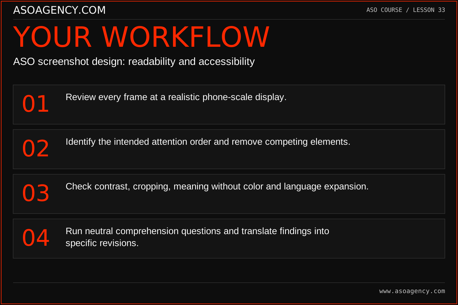
- Review every frame at a realistic phone-scale display.
- Identify the intended attention order and remove competing elements.
- Check contrast, cropping, meaning without color and language expansion.
- Run neutral comprehension questions and translate findings into specific revisions.
Worked example and interpretation
Trail Notes and numerical research scenarios are fictional teaching examples. Platform limits, where shown, come from the linked official references.
Trail Notes’ draft has a beautiful mountain background but the journal screen is tiny. Test readers describe a wallpaper app. The designer increases the product evidence, simplifies the background and clarifies the caption. A second review produces more accurate descriptions. The report calls this a comprehension improvement in the small review sample, not a measured store-conversion uplift.
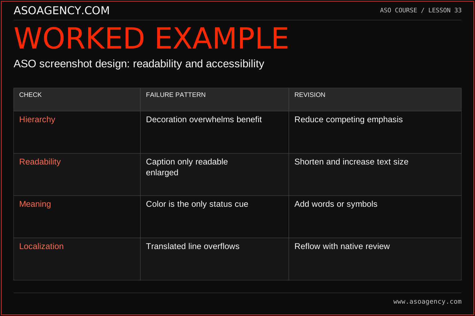
| Check | Failure pattern | Revision |
|---|---|---|
| Hierarchy | Decoration overwhelms benefit | Reduce competing emphasis |
| Readability | Caption only readable enlarged | Shorten and increase text size |
| Meaning | Color is the only status cue | Add words or symbols |
| Localization | Translated line overflows | Reflow with native review |
These checks identify specific problems instead of labeling a design simply good or bad. The appropriate revision depends on the intended message and surface. A larger headline is not helpful if it makes the product proof disappear; a shorter caption is not helpful if it removes a necessary condition. Reinspect the whole asset after each change because hierarchy is a relationship between elements.
Build a handover someone can use
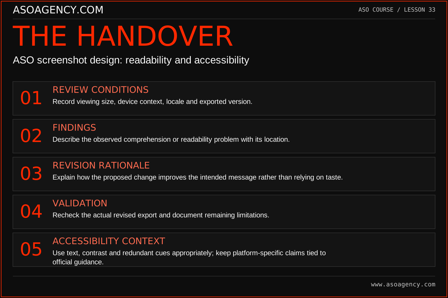
Review conditions
Record viewing size, device context, locale and exported version.
Findings
Describe the observed comprehension or readability problem with its location.
Revision rationale
Explain how the proposed change improves the intended message rather than relying on taste.
Validation
Recheck the actual revised export and document remaining limitations.
Accessibility context
Use text, contrast and redundant cues appropriately; keep platform-specific claims tied to official guidance.
Your ASO assignment
Use your own app and evidence, or work through the teaching case. Keep your observations separate from assumptions and explain the reasoning behind your decisions.
- Annotate one draft with its intended attention order.
- Record three readability or comprehension issues and concrete fixes.
- Write a neutral test script for an unfamiliar reviewer.
Scenario challenge
A graphic uses green for included keywords and red for excluded ones without labels. Propose a revision that preserves the visual distinction while making the decision understandable without color perception.
Assess your work
- The product promise survives small-size viewing.
- Important meaning does not depend solely on decorative cues.
- Qualitative observations are reported with their limited scope.
Common mistakes to catch
- Reviewing only at full design-canvas size.
- Telling a respondent what the image means before asking what they understood.
Knowledge check
Five reviewers understand the revised design. Can you claim it increases downloads?
Read the answer and reasoning
No. You have evidence about comprehension in that small review context. Use it to improve the candidate and reduce obvious confusion. A download-effect claim needs an appropriate behavioral comparison with defined populations and uncertainty.
Sources and further reading
Platform references reviewed 29 September 2026. These sources support platform capabilities and constraints; the teaching frameworks, assignments and illustrative cases are original course material.
- Apple — Accessibility design guidance — General accessibility design principles; not a store-specific conversion formula.
- Google Play — Add preview assets — Icons, feature graphics, screenshots and video requirements.
Your ASO lesson notes
Use this space for your assignment, evidence and handover. Select Save to keep a draft in this browser, or download a copy to take with you.
Notes stay on this device and are not submitted to ASO Agency.
Complete your assignment with the App store screenshot checker.
Loading your progress…
Progress is saved only in this browser. It does not sync across devices. Mark a lesson complete after doing its exercise.