ChatGPT has a recognisable name and three clear demonstrations. The question is whether an imaginary landscape is the best first answer to a newcomer looking for everyday help. That is an audience question, not a reason to stuff more capabilities into one frame.
One storefront, one language and a dated capture. This is an independent editorial audit, not a client case study.
Store & market
Apple App Store · United States
Language & device
en-US · iPhone
Captured
30 September 2026
Creative reviewed
First 3 still screenshots; video and other devices excluded
Observed app name · 7/30 characters
ChatGPT
Observed subtitle · 26/30 characters
Your everyday AI assistant
Open the source listing ↗. Public text cannot reveal the private keyword field, search volumes, rankings or conversion rates. The recommendations below are proposals to validate.
Three things worth your attention
01
The first example chooses a specific audience.
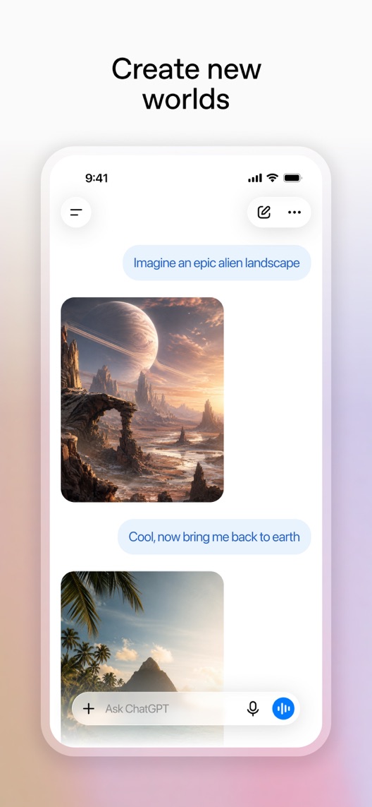
What I saw. The first still depicts generated landscapes and a follow-up instruction changing the scene.
My read. Creative exploration leads the introduction to a general assistant. That may serve image-oriented visitors well and feel less relevant to someone seeking help with writing or learning.
What I’d do. Measure the mix of visitor intentions before deciding whether to retain this image-first opening.
02
Conversation is visible, but the next useful step is not.
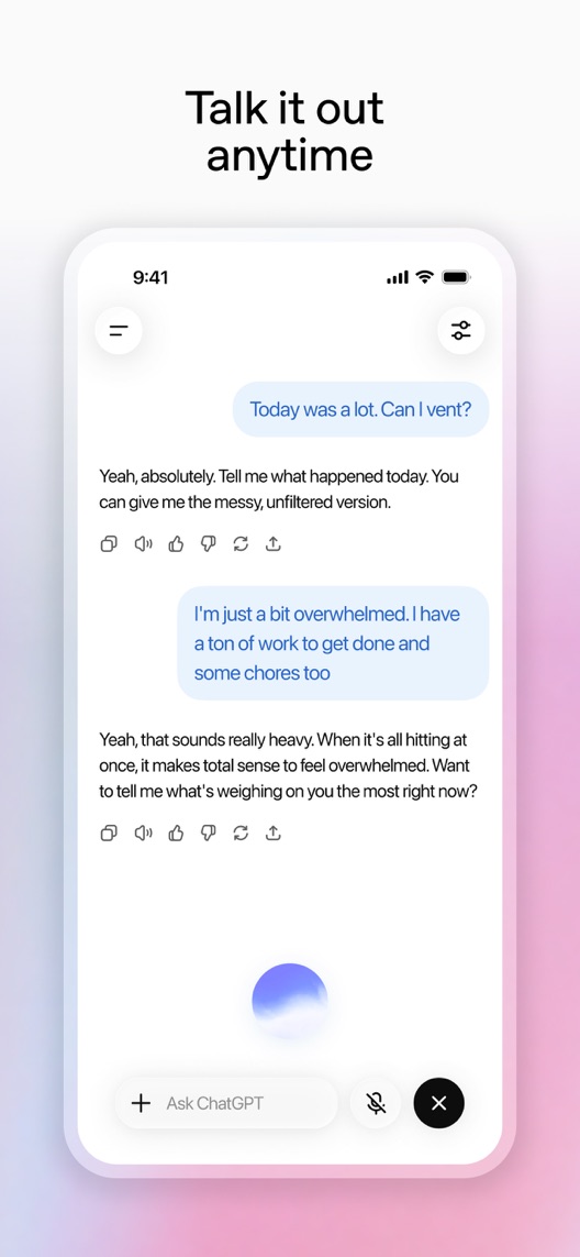
What I saw. Frame two presents a conversation about feeling overwhelmed, alongside voice controls.
My read. It demonstrates interaction and tone more than a practical outcome. Some visitors may understand it as companionship rather than assistance with a task.
What I’d do. Research what viewers think the app will help them do next; test a concrete planning example if the current message is misunderstood.
03
A quick answer is not the same as verified information.
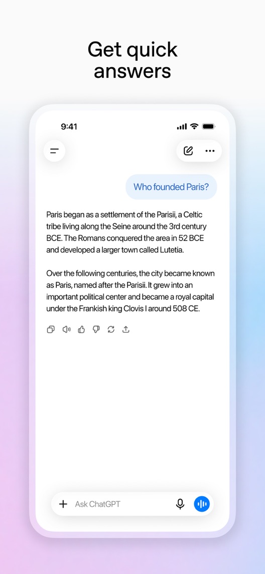
What I saw. The third still displays a response to a historical question.
My read. It makes question answering tangible, but a polished answer is not evidence of factual reliability across topics.
What I’d do. Keep proposed acquisition copy about assistance and exploration; do not turn this example into an accuracy guarantee.
The screenshot teardown
The original creative is preserved. Numbered notes sit beside each frame so observations and recommendations stay separate.
Frame 01
A landscape prompt and a follow-up request produce two visually different images.
The exchange shows iterative creation more clearly than a generic AI label would, while committing the opening to one use case.
Test idea: Keep this as the current creative control and research whether image creation matches the dominant qualified visitor intent.
Figure 1. First three still screenshots from the US iPhone listing, captured 30 September 2026. Creative belongs to the app publisher and is reproduced for analysis. Publisher claims inside screenshots are not independently verified.
Proposed copy for discussion. These are not current listing fields or tested winners.
Observed listing
ChatGPT
Your everyday AI assistant
Proposed alternative
ChatGPT
AI help for everyday tasks
Name 7/30 · Subtitle 26/30 characters
Figure 3. A metadata alternative to review against the current listing.
Keep the established name and test clearer task language in a separately reviewed metadata proposal. The concept asks visitors to think about a job they need help with, rather than another feature category.
The tradeoff: The current subtitle explicitly calls the product an assistant. Removing that word may reduce clarity or relevance for that intent, so this is a proposal to validate, not an automatic keyword improvement.
A three-frame creative brief
Proposed frame 01
Turn a busy day into a plan
Show: A verified conversation turning a short, fictional task list into an editable draft plan.
Show a recognisable everyday input and result without implying automatic access to calendars or personal data.
Proposed frame 02
Ask for a clearer explanation
Show: A checked learning example with an initial explanation and one follow-up request.
Make iteration tangible and keep all factual content independently verified.
Proposed frame 03
Explore an image idea
Show: An authentic current image-generation exchange with truthful access information.
Preserve the visual capability after establishing the broader task proposition.
Figure 4. A proposed storyboard, not a fabricated screenshot or a launched treatment. Validate features and access before production.
What three reviewers can teach us
These three displayed accounts were selected for learning, directness and expressing ideas. All have five-star ratings, despite different tones. They do not measure satisfaction, accuracy, academic outcomes or data practices; product-policy claims require separate primary-source verification.
Sample: 3 selected accounts from 8 displayed reviews. Dates: 28 March 2025–7 May 2026. No sentiment percentage is calculated.
28 March 2025 · 5/5 stars
“step by step”
A March 2025 reviewer described using explanations and practice material while returning to study.
What I’d investigate: Research the explanation job; the reviewer’s reported academic result is not evidence that the app guarantees better grades.
A May 2026 reviewer valued help expressing ideas and also made claims about information sharing.
What I’d investigate: Use this as an articulation and privacy-comprehension research lead. The reviewer’s assertions about data handling are not verified product policy.
An image-first sequence may fit only part of a broad assistant audience.
Deliverable: A visitor-intent research summary distinguishing creation, explanation and everyday planning.
Research first
02
Produce one task-led opening
The existing first frame is a clear control with a specific creative job.
Deliverable: One verified planning frame, with the rest of the sequence unchanged for the initial test.
Focused creative production
03
Check what the promise implies
Answering, planning and supportive conversation create different expectations.
Deliverable: A comprehension checklist covering factual checking, feature access and the next user action.
Product and editorial review
One test worth running
Does a concrete everyday-planning opening improve download conversion compared with the current image-generation opening?
Audience
Eligible US English iPhone default-page visitors; record the aggregate acquisition mix without assuming the platform can target this test to a specific search query.
Control
The current image-generation first frame with the full remaining sequence unchanged.
Treatment
Replace only the first frame with a verified task-list-to-draft-plan example; keep metadata, pricing messages and other frames fixed.
Method
Check concept comprehension first, then use eligible App Store product page optimization. This tests the complete opening concept, not the independent effect of its headline, UI or example.
Primary measure
Platform-reported download conversion in eligible randomized traffic.
Guardrails
Separately ask recruits what access, accuracy and task completion they expect. Reject wording that implies guaranteed correctness or actions the illustrated app cannot perform.
Decision rule
Choose a meaningful effect, sample requirement and analysis point from actual baseline traffic before launch. Keep control if inconclusive; downloads do not establish sustained usefulness or paid conversion.
What could muddy the result
Model and feature releases, access limits, publicity and shifts between image-creation and information-seeking traffic can change how the result generalises.
Solid. Large headings and real conversation examples make the capabilities understandable. The first three frames move from image generation to conversation to factual questions, but they do not follow one task through to a useful result. A task-led opening is worth testing; the public listing cannot tell us which visitor intent actually converts best.
Level 1
Yeah. It really does!
The basics need a serious rethink.
Level 2
I hope no agency is getting paid for this.
Too many obvious things have been left unfinished.
Level 3
The app deserves better.
There is a useful product here. The listing needs to show it.
Level 4
Fine. If ‘fine’ is the goal.
The essentials are there, but there is little to get excited about.
Level 5
Getting there. Keep going.
Good ideas, with a few important gaps still to close.
Level 6ChatGPT is here
Solid. Put the pitchfork down.
A strong foundation. Look for specific improvements, not a complete restart.
Level 7
Whoever did this knows their stuff.
Clear positioning, thoughtful choices and very few loose ends.
Level 8
Okay, now you’re showing off.
An unusually clear, convincing storefront worth learning from.
An editorial verdict on the captured storefront, not a measured ASO score or an assessment of an agency’s private work.
Your ASO assignment
Separate your AI app’s acquisition intentions into specific jobs rather than one broad AI category.
Write one authentic input-and-result opening and list every capability the example implies.
Compare that complete concept with the current opening while holding the rest of the page fixed.
No private analytics, search-rank dataset or internal keyword field was supplied. Review quotations are short excerpts; explanations are our summaries. App names and screenshots belong to their respective owners. We are not affiliated with ChatGPT. Read our editorial methodology.