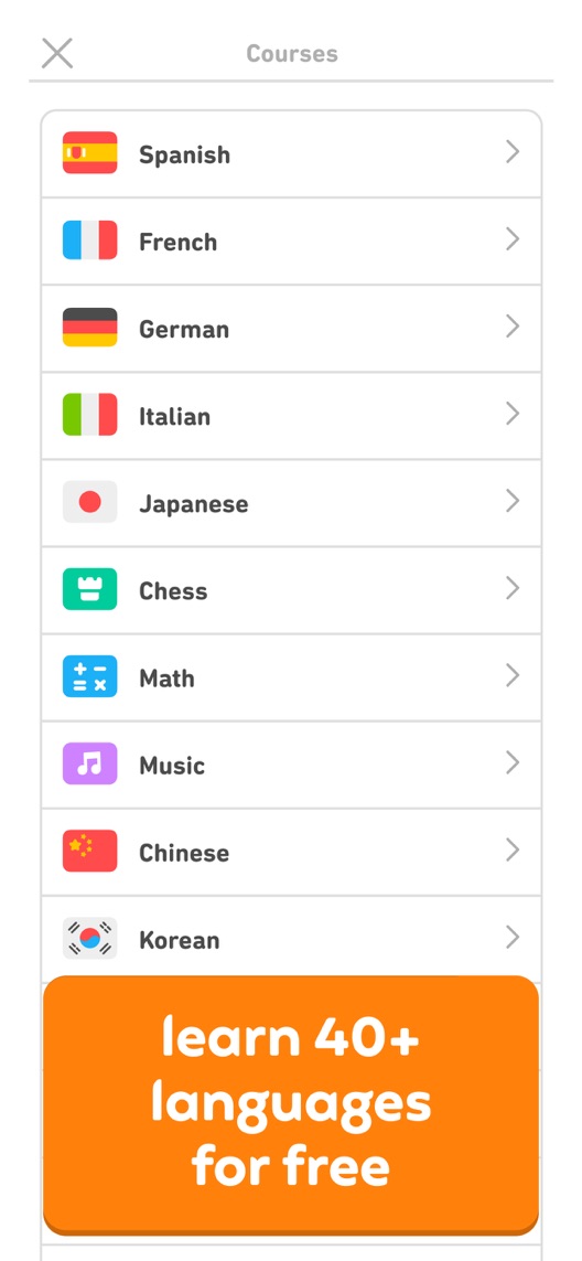
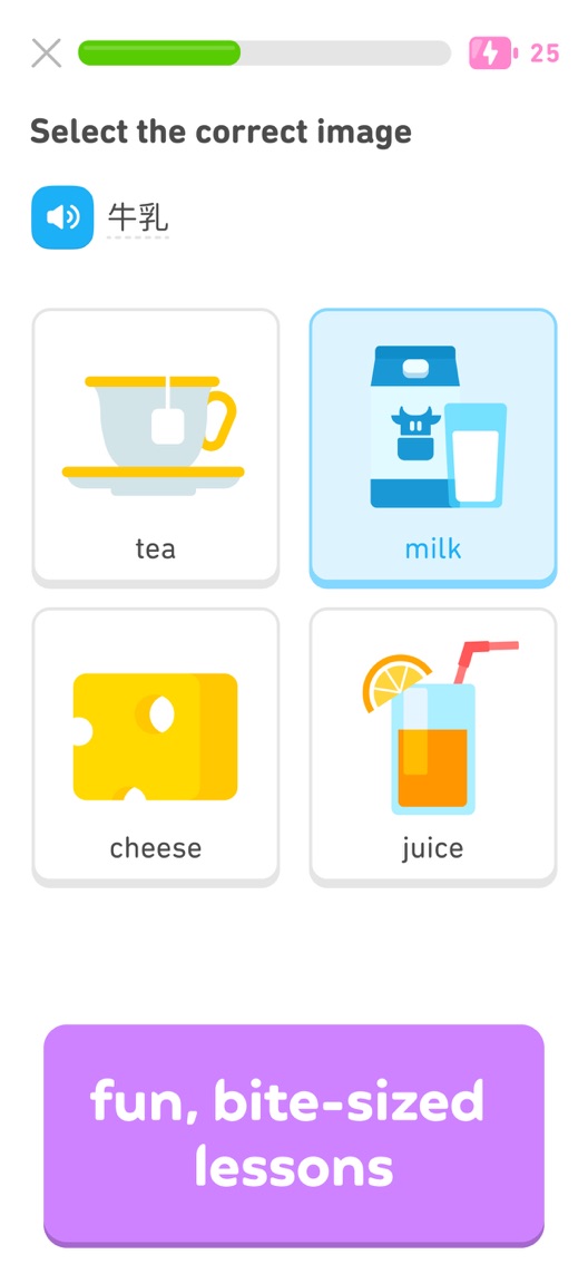
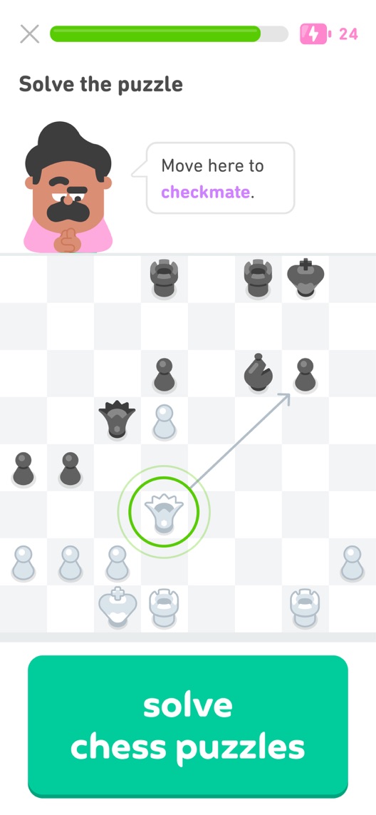
Duolingo's name says language lessons. Its third screenshot changes to chess before the language exercise has developed into a useful learning story. Breadth may be the strategy. It still spends attention that a language-seeking visitor came to use differently.
Editorial illustrationOne vocabulary question, then apparently we are playing chess.See the actual listing screenshots ↓Listing snapshot · what I checked
What I actually checked
One storefront, one language and a dated capture. This is an independent editorial audit, not a client case study.
Store & market
Apple App Store · United States
Language & device
en-US · iPhone
Captured
30 September 2026
Creative reviewed
First 3 still screenshots; video and other devices excluded
Observed app name · 26/30 characters
Duolingo: Language Lessons
Observed subtitle · 30/30 characters
Languages, Math, Music & Chess
Gab’s take · Five criteria. Two points each.
Why this gets 5/10
The vocabulary and chess exercises show genuine interaction. Keep that proof. The audience choice needs explaining so a language learner understands why the opening has changed subjects. The sequence needs a clearer audience choice and a completed lesson example. Lead with the intended learning job, enlarge the actual response and show feedback. Introduce other subjects deliberately rather than treating every new feature as an opening-frame obligation.
Reason to care
1/2
Free language choice is clear but menu-led.
Product evidence
2/2
Vocabulary and chess tasks demonstrate real interaction.
Readable at a glance
1/2
Small menu entries and captions weaken first-glance hierarchy.
A useful sequence
0/2
Chess interrupts the language story before a lesson completes.
A reason to choose
1/2
Short exercises are specific but the audience tradeoff remains unresolved.
0: not earned · 1: useful but incomplete · 2: clearly demonstrated. Judged on the dated opening creative; public metadata provides context. These points assess creative execution, not private conversion or ranking performance. Read the scoring criteria · See all ten verdict levels
Figure 1. First three still screenshots from the US iPhone listing, captured 30 September 2026. Creative belongs to the app publisher and is reproduced for analysis. Publisher claims inside screenshots are not independently verified.
What I’d put on the table
Proposed copy for discussion. These are not current listing fields or tested winners.
Observed listing
Duolingo: Language Lessons
Languages, Math, Music & Chess
Proposed alternative
Duolingo: Language Lessons
Practice a little every day
Name 26/30 · Subtitle 27/30 characters
Metadata comparison. A proposed alternative to review against the current listing.
This candidate keeps the existing category name and tests a practice-led reason to return rather than listing subjects.
The tradeoff: It gives up explicit math, music and chess cues. Review the business importance of those audiences before using it; it is not a recommendation to remove them from every locale.
Gab’s proposed direction
Give each screenshot a job.
Read the sequence from top to bottom on mobile, left to right on desktop. These are message-layout sketches, not screens from Duolingo or tested results.
01Make the benefit clear
Proposed headline
Start with the language you want
Illustrative layout · verify the real flow
Put this in the frame: A verified course selection screen with the target language visible.
Why it earns the space: Make the first choice feel relevant to the intended visitor.
02Show useful evidence
Proposed headline
Try a lesson, not a textbook
Illustrative layout · verify the real flow
Put this in the frame: An actual short exercise with readable answer choices.
Why it earns the space: Show the interaction and avoid unsupported fluency promises.
03Move the decision forward
Proposed headline
Build a practice you can return to
Illustrative layout · verify the real flow
Put this in the frame: A current progress screen with truthful labels, supplied by the product team.
Why it earns the space: Complete the language-learning story before introducing other subjects.
The test: Does a language-led sequence work better for visitors arriving from a language-specific campaign? The sketch gives the designer a direction; the actual product and access conditions decide what can ship.
Want this level of detail for your app?
Bring the listing. I’ll help you decide what to keep, what to fix and what to test.
Babbel stays within language learning and names example languages in its subtitle.
The lesson: A focused competitor can spend more early space explaining one need. Duolingo should make its broader scope a choice rather than an accidental distraction.
Memrise remains language-led in both visible metadata fields.
The lesson: Duolingo has a genuine breadth distinction. The question is when to introduce it, not whether to hide it everywhere.
Competitor comparison. US listing names and subtitles captured 30 September 2026. These are positioning comparisons, not ranking or revenue comparisons.Keyword ideas and their evidence
The keyword questions I’d investigate
Intent candidates grounded in the listing—not fabricated search-volume or difficulty scores.
Three positive examples from the eight displayed reviews were selected for their distinct use cases: family learning, travel and multi-subject exploration. They illustrate motivations; they cannot estimate satisfaction or complaint frequency.
Sample: 3 selected accounts from 8 displayed reviews. Dates: 24 May 2024–8 June 2026. No sentiment percentage is calculated.
8 June 2026 · 5/5 stars
“Spanish and math”
The reviewer describes a child exploring several subjects and their own language practice.
What I’d investigate: Breadth has a plausible audience. A narrow creative should not be treated as universally better.
Languages and other subjects share a long course picker.
Deliverable: Open with one supported language exercise and clear access wording.
Creative brief and current-product check
02
The exercise deserves its result
A vocabulary choice is shown without the follow-up feedback.
Deliverable: Demonstrate the same question's supported response and correction.
Creative brief and current-product check
03
Chess changes the sales conversation
A different subject replaces the unfinished language journey.
Deliverable: Test a focused language sequence separately from the broader multi-subject treatment.
Creative brief and current-product check
Open the full test plan
One test worth running
Does a language-led sequence work better for visitors arriving from a language-specific campaign?
Audience
One US English campaign with a documented language-learning proposition. Keep general learning traffic out of this comparison.
Control
A landing experience using the current broad sequence.
Treatment
A matching experience whose first three frames stay on language learning; keep the offer and other assets consistent.
Method
If current custom product pages and campaign tooling support the required routing, randomize traffic upstream between matched destinations. Do not assume product page optimization can target this exact audience or test every page type.
Primary measure
Download conversion from the same eligible campaign click population, using a consistent attribution window.
Guardrails
First-lesson completion only where treatment attribution is reliable; otherwise use it as a separate diagnostic.
Decision rule
Predefine sample requirements, acceptable uncertainty and a practical improvement threshold using actual campaign traffic. An underpowered result is inconclusive.
What could muddy the result
Ad copy, audience targeting, subject availability and paid-tier offers must remain comparable.
No private analytics, search-rank dataset or internal keyword field was supplied. Review quotations are short excerpts; explanations are our summaries. App names and screenshots belong to their respective owners. We are not affiliated with Duolingo. Read our editorial methodology.
Your app. Your priorities.
Get an audit you can actually use.
Send your listing, market and the problem you want to solve. I’ll explain the scope and fee before work starts. Your budget should buy decisions, not a longer PDF.