Design & creative · US iPhone listing

ASO Audit:Halide

Does their ASO suck?

My take: Getting there. Keep going.

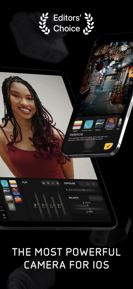
Halide has a distinct proposition: more control over how an iPhone photograph is made. Its opening gallery looks confident, but awards and superlatives do most of the explaining. I would put a verified Process Zero example closer to the front and show the capture choice behind it. That would give a prospective photographer something more useful than another claim to be the most powerful camera.

Halide opening gallery with portrait, wildlife and street photographs, award artwork and a natural-photography claim.

Actual listing creative · App Store source ↗

What I actually checked

One storefront, one language and a dated capture. This is an independent editorial audit, not a client case study.

Store & market
Apple App Store · United States
Language & device
en-US · iPhone
Captured
30 September 2026
Creative reviewed
First 3 still screenshots; video and other devices excluded
Observed app name · 28/30 characters

Halide Mark III - Pro Camera

Observed subtitle · 28/30 characters

Zero AI, Natural Photos, RAW

Open the source listing ↗. Public text cannot reveal the private keyword field, search volumes, rankings or conversion rates. The recommendations below are proposals to validate.

Three things worth your attention

01

Reputation dominates the opening.

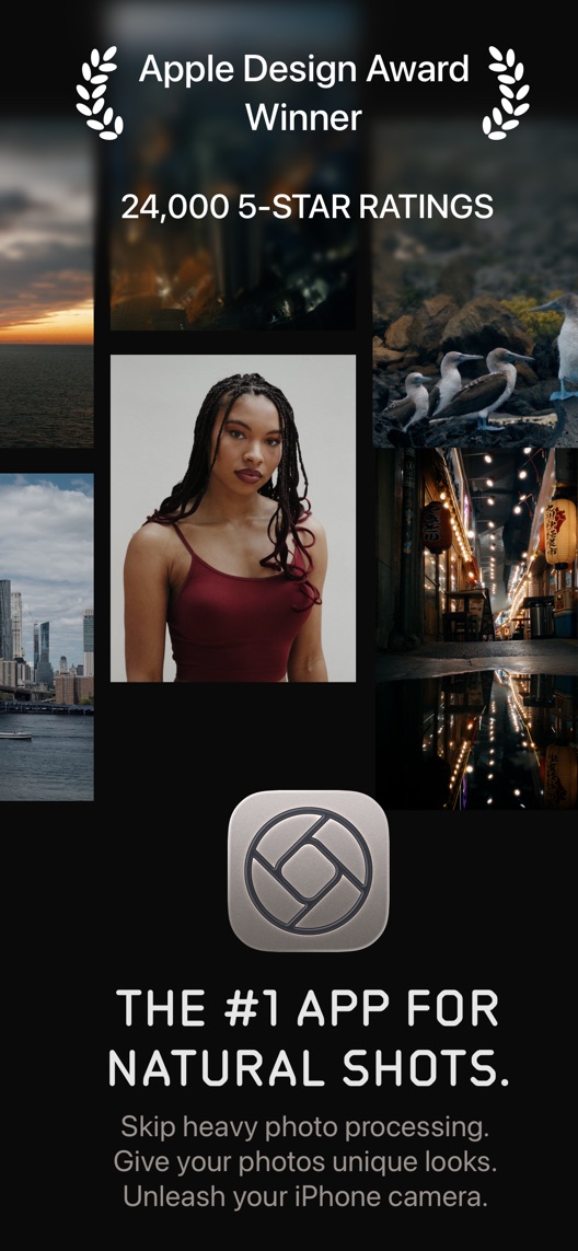
What I saw. The first still combines a photo gallery, award artwork, a five-star-rating count and a category-leadership claim.

My read. Those are publisher claims in the artwork, not independently verified current metrics. They take space that could explain natural capture.

What I’d do. Check the scope and date of claims, then lead with one authentic capture choice and resulting photograph.

02

Looks need a visible consequence.

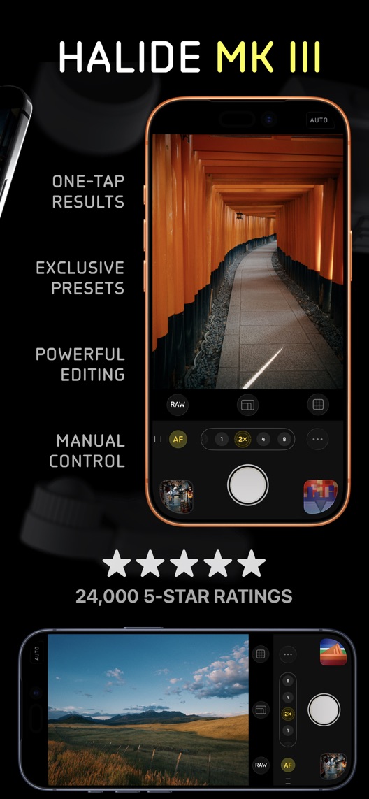
What I saw. The second still shows a selected Valencia Look and editing controls across angled devices.

My read. A visitor can see sophistication but cannot compare the effect of a processing choice from this composition alone.

What I’d do. Show a controlled same-scene example with the actual selected Look and accurately described processing.

03

The interface arrives after the accolades.

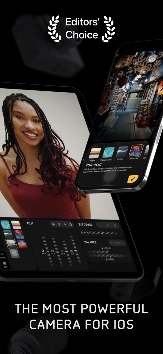
What I saw. The third still presents a large camera interface alongside one-tap, preset, editing and manual-control messages.

My read. Several buyer intentions compete here: immediate results, manual capture and later editing.

What I’d do. Choose one primary opening story and explain the other workflows further along the sequence.

The screenshot teardown

The original creative is preserved. Numbered notes sit beside each frame so observations and recommendations stay separate.

Frame 01Halide opening gallery with portrait, wildlife and street photographs, award artwork and a natural-photography claim.

The frame includes the app icon, a publisher rating-count claim and several finished images without visible capture settings.

It establishes taste but does not demonstrate which setting produced a particular result.

Test idea: Use a current, attributed sample with its actual capture mode and avoid unverified superiority language.

Original image source ↗
Frame 02Halide angled devices showing a portrait editing interface and a street photograph with Valencia selected among Looks.

Looks and editing controls appear together under an Editors’ Choice emblem.

The layout introduces choices, but neither a same-scene comparison nor a before-and-after action is visible.

Test idea: Keep the connected device composition intact if reused; test a separate first-frame demonstration rather than shuffling cropped device edges.

Original image source ↗
Frame 03Halide Mark III camera views with RAW and focus controls, an orange architectural scene and a landscape view.

The camera interface is visible beside four feature phrases and repeated rating artwork.

The displayed controls are useful evidence of the interface, but not proof that every format or lens works on every iPhone.

Test idea: Verify device and format support, then show one specific control with its actual result.

Original image source ↗
Figure 1. First three still screenshots from the US iPhone listing, captured 30 September 2026. Creative belongs to the app publisher and is reproduced for analysis. Publisher claims inside screenshots are not independently verified.

Three alternatives—and what they make clearer

Observed competitor metadata

ProCamera. Professional Camera ↗

Pro HDR, RAW+ Manual Video Cam

ProCamera names professional capture, HDR, RAW and manual video in its visible metadata.

The lesson: Halide can differentiate the processing choice instead of trying to win a longer feature list.

Observed competitor metadata

Obscura — Pro Camera ↗

Manual Controls, ProRAW, Video

Obscura names manual controls, ProRAW and video.

The lesson: Explain how Halide’s Looks and Process Zero serve a distinct still-photography decision without claiming competitors lack control.

Observed competitor metadata

ProCam - Pro Camera ↗

Manual Camera + RAW

ProCam pairs a pro-camera name with manual camera and RAW.

The lesson: Manual and RAW are shared category cues. Keep the brand recognisable and make the specific capture workflow understandable.

Figure 2. US listing names and subtitles captured 30 September 2026. These are positioning comparisons, not ranking or revenue comparisons.

The keyword questions I’d investigate

Intent candidates grounded in the listing—not fabricated search-volume or difficulty scores.

manual camera / RAW camera

Visitor’s job: Control exposure, focus and output format while shooting.

Evidence: The name says pro camera and the third still exposes capture controls.

Decision: Retain camera intent and qualify device-specific format support before proposing exact creative copy.

natural iPhone photos / Process Zero

Visitor’s job: Choose an alternative to heavier computational processing.

Evidence: The subtitle names natural photos and the description explains Process Zero.

Decision: Demonstrate a verified same-scene result without asserting that every viewer will prefer it.

film looks / camera presets

Visitor’s job: Apply a deliberate photographic rendering during capture or editing.

Evidence: The second still shows Looks and the description distinguishes them from a simple post-capture colour filter.

Decision: Explain the supported workflow and access; do not blur capture settings and imported-photo editing.

The unseen keyword field may already cover some of these terms. Build an evidence-backed keyword shortlist before making a metadata change.

What I’d put on the table

Proposed copy for discussion. These are not current listing fields or tested winners.

Observed listing

Halide Mark III - Pro Camera

Zero AI, Natural Photos, RAW

Proposed alternative

Halide: Manual RAW Camera

Natural photos, creative Looks

Name 25/30 · Subtitle 30/30 characters
Figure 3. A metadata alternative to review against the current listing.

Keep the brand and common camera intent while using the subtitle to connect the natural-photo proposition with the current Looks system.

The tradeoff: This removes the Mark III edition cue and the explicit zero-AI phrase. Evaluate brand recognition and processing comprehension separately; do not change metadata during the creative experiment.

A three-frame creative brief

  1. Proposed frame 01

    Choose how your photo is made

    Show: One verified Process Zero capture with its actual mode visible and a clearly labelled same-scene reference if used.

    Connect the proposition to evidence instead of a ranking claim.

  2. Proposed frame 02

    Find your Look

    Show: The current Looks selection with a properly attributed photograph and accurate access.

    Show a deliberate visual choice without promising a universal improvement.

  3. Proposed frame 03

    Take control when you want it

    Show: A current camera view demonstrating one supported focus or exposure adjustment.

    Make manual control understandable without obscuring automatic capture options.

Figure 4. A proposed storyboard, not a fabricated screenshot or a launched treatment. Validate features and access before production.

What three reviewers can teach us

Three 2020–2025 accounts were selected for beginner comparison, capture responsiveness and saving expectations. All predate this capture. Other accounts contain business-motive speculation or a five-star rating with strongly negative text; neither is used as evidence of current reliability or developer intent.

Sample: 3 selected accounts from 8 displayed reviews. Dates: 23 October 2020–17 September 2025. No sentiment percentage is calculated.

23 October 2020 · 5/5 stars

“see the difference side-by-side”

An October 2020 beginner valued comparing image formats during a Mark II trial and found the interface approachable.

What I’d investigate: Use comparison as a research lead, while recognising that the account predates Mark III and does not verify today’s workflow.

Listing review source · Review ID 6566553499

10 March 2023 · 3/5 stars

“bigger delay”

A March 2023 trial user praised the interface and macro mode but reported capture delays and control problems on an iPhone 14 Pro.

What I’d investigate: Retain the praise and criticism. Verify current capture performance and device support rather than presenting an old report as a current failure.

Listing review source · Review ID 9699552422

17 September 2025 · 3/5 stars

“rescued photos”

A September 2025 reviewer liked the information and processing control but reported lag and saving problems; they also said rescued photos helped.

What I’d investigate: Preserve that recovery detail. Test save reliability before making speed or dependable-capture claims, without inferring how common the issue is.

Listing review source · Review ID 13148956309

A displayed review can be old, unusually positive or internally inconsistent with its star rating. These accounts suggest questions; they do not establish current defects or typical customer experience. Use the Review Research Desk to keep evidence and interpretation separate.

What I’d do first

01

Demonstrate the processing choice

The opening asks visitors to trust the outcome without seeing the choice.

Deliverable: An authentic same-scene capture example with mode and attribution.

Product and creative capture
02

Make access explicit

The description describes a paid app despite free download availability.

Deliverable: Current trial, purchase and device-support wording beside the relevant workflow.

Offer verification
03

Audit the claims

Awards, rating totals and superiority language recur in the artwork.

Deliverable: A dated claim register with source, scope and permitted wording.

Editorial review

One test worth running

Does a verified Process Zero demonstration explain Halide better than the current reputation-led opener?

Audience
US English iPhone visitors interested in photography, separated by prior Halide familiarity and supported device family.
Control
The current first-frame gallery after unsupported or stale claims are corrected consistently across variants.
Treatment
Replace only frame one with an authentic capture-mode and result demonstration. Preserve the following device composition, metadata and paid offer.
Method
Verify output provenance, device support and save behaviour first. Run randomized comprehension research and an eligible App Store product page optimization test using the same verified offer.
Primary measure
Correct explanation of the processing choice in research and platform-reported download conversion in the storefront test.
Guardrails
No belief that the full camera is free, every format is universal or one image proves better results in every scene. Track trial activation and paid conversion separately where available.
Decision rule
Predefine a useful effect, sample size and duration from baseline data. Ship only if clarity improves without materially worsening qualified trial or purchase behaviour; keep control if inconclusive.
What could muddy the result
Mark III publicity, device launches, lighting and scene preference, legacy entitlements and promotional pricing can affect results.

Check Apple’s current product page optimization guidance and custom product page guidance before configuring a test. Write your experiment brief.

So, does their ASO suck?

Getting there. The imagery is strong and the current Mark III positioning is clear, but the first frame is mostly reputation and finished photographs. The following creative shows Looks, editing and camera controls without clearly connecting one choice to one result. The description also makes clear that Halide is paid, with an annual trial or outright purchase; a free download should not be mistaken for a free camera workflow.

  1. Level 1

    Yeah. It really does!

    The basics need a serious rethink.

  2. Level 2

    I hope no agency is getting paid for this.

    Too many obvious things have been left unfinished.

  3. Level 3

    The app deserves better.

    There is a useful product here. The listing needs to show it.

  4. Level 4

    Fine. If ‘fine’ is the goal.

    The essentials are there, but there is little to get excited about.

  5. Level 5Halide is here

    Getting there. Keep going.

    Good ideas, with a few important gaps still to close.

  6. Level 6

    Solid. Put the pitchfork down.

    A strong foundation. Look for specific improvements, not a complete restart.

  7. Level 7

    Whoever did this knows their stuff.

    Clear positioning, thoughtful choices and very few loose ends.

  8. Level 8

    Okay, now you’re showing off.

    An unusually clear, convincing storefront worth learning from.

An editorial verdict on the captured storefront, not a measured ASO score or an assessment of an agency’s private work.

Your ASO assignment

  1. Capture one supported Process Zero example and document device, mode, permissions and output provenance.
  2. Verify current trial and outright-purchase access and audit every award, rating and superiority claim.
  3. Test a new first frame while preserving the remaining connected device artwork and metadata.

What would change my mind?

Sources and scope

No private analytics, search-rank dataset or internal keyword field was supplied. Review quotations are short excerpts; explanations are our summaries. App names and screenshots belong to their respective owners. We are not affiliated with Halide. Read our editorial methodology.

Keep pulling listings apart

ASO Audit: GetYourGuideThe destination looks great. Show how an activity becomes a usable booking.ASO Audit: PhotoroomThree useful tools. Show one image making it all the way to export.ASO Audit: YukaThe score is easy to read. Make the explanation behind it just as visible.ASO Audit: MONOPOLY GO!Roll and build are clear. Show the connection between them.ASO Audit: BalanceThe question feels personal. Show what the answer changes.ASO Audit: Things 3A useful daily plan is hiding behind the navigation screen.ASO Audit: Copilot MoneyThe dashboard looks polished. Show how a transaction becomes a trustworthy budget entry.ASO Audit: Simply PianoThe songs are appealing. Show what a beginner actually does in the first lesson.ASO Audit: PoshmarkThe fashion story is strong. The seller story has barely started.ASO Audit: AllTrailsA huge trail catalogue is useful. Help someone judge the next trail before they leave.ASO Audit: InShotShow a caption being checked, not just generated.ASO Audit: MealimeConnect the meal choice to the grocery list.ASO Audit: Brawl StarsThe action is obvious. Make the first match objective just as clear.ASO Audit: Sleep CycleA detailed sleep score needs a clear explanation of what was measured.ASO Audit: StructuredThe AI prompt is visible. Show the plan it produces and what the user can change.ASO Audit: SpendeeShow how a transaction becomes a useful budget decision.ASO Audit: AnkiMobileExplain what happens after the learner answers a card.ASO Audit: Back MarketMake refurbished condition as easy to compare as price.ASO Audit: WanderlogShow what gets imported, and what the traveller still needs to check.ASO Audit: LumaFusionLet the timeline make the first impression.ASO Audit: TastyShow the cooking step behind the finished dish.ASO Audit: Stumble GuysLead with a playable objective, then show the variety.ASO Audit: FinchExplain the shared goal without making self-care feel like a performance.ASO Audit: MotionMake the mobile companion role clear before the AI feature list.ASO Audit: Lunch MoneyShow what reviewing a transaction actually changes.ASO Audit: DropsShow the vocabulary game before celebrating the streak.ASO Audit: KarmaExplain how coins become a gift card before adding more ways to earn.ASO Audit: FlightyKeep the premium opening, then make one travel decision easier to understand.ASO Audit: DarkroomShow the result of the mask, not just the selected subject.ASO Audit: Paprika Recipe ManagerConnect the saved recipe to the shopping list it creates.ASO Audit: Mini MetroExplain the line-drawing decision without covering up the map.ASO Audit: FabulousFix the routine example, then show someone actually using it.ASO Audit: SunsamaKeep the honest companion promise and complete the task-addition story.ASO Audit: ShopGoodwillMake the bid, the item and the delivery conditions part of one story.ASO Audit: PackPointAddress the published compatibility warning before testing the packing story.ASO Audit: AnyListShow the shared change, then connect a recipe to the shopping list.ASO Audit: Monument ValleyKeep the beautiful world. Show the gesture that changes it.ASO Audit: Gentler StreakLead with permission to rest, then explain the data behind the suggestion.ASO Audit: CraftTurn the beautiful document into a clear note-to-task workflow.ASO Audit: StreaksExplain what a ring means before showing a lifetime of statistics.ASO Audit: Focus To-DoShow the task before the timer, then explain what the report actually counts.ASO Audit: WaterMinderMake drink logging clear without presenting a goal percentage as a body measurement.ASO Audit: ForestExplain the session rule and the blocking rule as two different choices.ASO Audit: Goblin ToolsReplace a repeated theme preview with one clear input-to-output example.ASO Audit: Insight TimerThe first two frames ask for trust. Show how to choose a practice sooner.ASO Audit: TickTickThe voice example shows the work. Keep the review-before-save step visible.ASO Audit: GoodbudgetThe envelope view is useful. Show how a shared budget stays shared.ASO Audit: BrilliantThe visual tutoring is convincing as a demonstration. Where is the coding example?ASO Audit: DepopThe listing assistant is the practical proof. Keep the fee exceptions and seller review visible.ASO Audit: VintedThe seller promise is clear. Show the first listing before asking people to imagine the earnings.ASO Audit: HopperThe forecast screen says prices could fall. The surrounding promise needs the same care.ASO Audit: VSCOThe edit is the proof. Let visitors see it before asking them to join a creative community.ASO Audit: Too Good To GoThe mission gets attention. The surprise bag and pickup window explain the decision.ASO Audit: Royal MatchThree rescue scenes create a strong expectation. Check that the first session earns it.ASO Audit: Pokémon GOThe season gives returning trainers a reason to look. A newcomer still needs to see the first catch.ASO Audit: BetterSleepThe sound library is clear. The health and focus claims need stronger evidence than a player screen.ASO Audit: EvernoteThe notes look useful. Give the opening a clearer action than the logo alone.ASO Audit: Rocket MoneyThe recurring-charge view is useful. Make cancellation requests distinct from completed cancellations.ASO Audit: MemriseLearning for what you need is a good promise. Connect the chosen goal to a real phrase sooner.ASO Audit: BusuuThe lesson feels real. Make the jump from free lessons to AI conversations easier to understand.ASO Audit: WalmartThe delivery offer is strong. Its conditions should be as easy to understand as the promise.ASO Audit: ExpediaThe trip-planning story works. Make package totals easier to read than the savings badge.ASO Audit: PicsartThe background-removal frame explains an edit better than the opening explains the editor.ASO Audit: TinderThe campaign sells the possibility of a date. Show how a profile helps someone choose a conversation.ASO Audit: PinterestThe seasonal world is compelling. Show how someone turns that inspiration into a useful board.ASO Audit: Clash of ClansThe base-building fantasy is clear. A newcomer should see it before being asked to understand army tactics.ASO Audit: Nike Run ClubThe motivation is unmistakably Nike. Bring the guided-run experience forward so the app earns the download.ASO Audit: Google GeminiVideo creation gets the first frame. Is that the clearest introduction to a general-purpose assistant?ASO Audit: MonarchThe financial overview looks polished. Let budget-seeking visitors see the budget before the wealth chart.ASO Audit: WiseThe transfer quote is useful. Make the difference between a rate lock and arrival time unmistakable.ASO Audit: QuizletFive study formats introduce the range. One connected study session could explain the value faster.ASO Audit: EtsyThe emotional opening works. Give the shopper a clearer path from inspiration to the right item.ASO Audit: Google MapsNavigation is clear. Give the new question-and-answer feature a specific job.ASO Audit: Adobe LightroomThe photographs sell the result. Show a newcomer how much control they have.ASO Audit: CapCutThe AI transformations look impressive. Where does an ordinary edit begin?ASO Audit: DoorDashThe range is obvious. Show how to find what is available nearby.ASO Audit: RobloxThe catalogue is clear. Show what happens between choosing a game and playing.ASO Audit: Google Health (Fitbit)The brand changed. The fitness-plan promise needs a more direct demonstration.ASO Audit: Microsoft To DoThe daily list is clear. Two opening frames should teach more than one.ASO Audit: ChatGPTThe opening sells image creation. The subtitle promises a much broader assistant.ASO Audit: RevolutA premium card gets attention. The savings example needs a fresh eligibility check.ASO Audit: Khan AcademyThe mission is memorable. Show the learner what to do first.ASO Audit: eBayPayment choice leads the page. Buying and selling deserve a clearer first act.ASO Audit: AirbnbHomes still lead. Help visitors understand the wider trip without losing the stay.ASO Audit: Booking.comThe listing shows breadth and deals. Help the traveller understand how to choose a stay.ASO Audit: CanvaSix creative jobs in the first frame. Which one brings this visitor to Canva?ASO Audit: Uber EatsThe opening sells almost everything. A hungry visitor still needs one clear route to dinner.ASO Audit: Candy Crush SagaThe candy is recognisable. Show the move behind the spectacle.ASO Audit: MyFitnessPalThe opening makes food data look effortless. Show how a person checks and logs it.ASO Audit: HeadspaceThe awards are clear. The first useful meditation arrives two frames later.ASO Audit: NotionAn attractive workspace is visible. The first useful mobile action is harder to find.ASO Audit: PayPalProtection, transfers and card rewards compete for the first three frames.ASO Audit: BabbelThe speaking exercise sells the product more clearly than the broad opening promise.ASO Audit: Amazon ShoppingDiscovery leads the story. Order tracking may be the stronger reason to install.ASO Audit: CalmTwo frames of credibility. Where is the bedtime experience?ASO Audit: DuolingoLanguage learning first. Chess by frame three.ASO Audit: StravaCommunity is clear. Is the newcomer’s first activity clear enough?ASO Audit: TodoistThe creative demonstrates the product. Now make the first win unmistakable.ASO Audit: YNABThe promise is emotional. The product language asks for homework.

Want this level of detail for your app?

Bring your listing and the evidence behind it. We can turn a public critique into a prioritized plan for your actual audience.

See what an ASO audit includes →
No sales sequence. One useful conversation.