Pinterest makes you want to look. Its Halloween-led opening has a clear visual point of view, and the fashion frame gives that mood a practical direction. What the first three stills explain less clearly is the action that makes Pinterest different from simply scrolling through attractive images: finding, saving and organising an idea for later.
One storefront, one language and a dated capture. This is an independent editorial audit, not a client case study.
Store & market
Apple App Store · United States
Language & device
en-US · iPhone
Captured
30 September 2026
Creative reviewed
First 3 still screenshots; video and other devices excluded
Observed app name · 9/30 characters
Pinterest
Observed subtitle · 30/30 characters
Fashion, home design and ideas
Open the source listing ↗. Public text cannot reveal the private keyword field, search volumes, rankings or conversion rates. The recommendations below are proposals to validate.
Three things worth your attention
01
The opening is a connected seasonal composition.
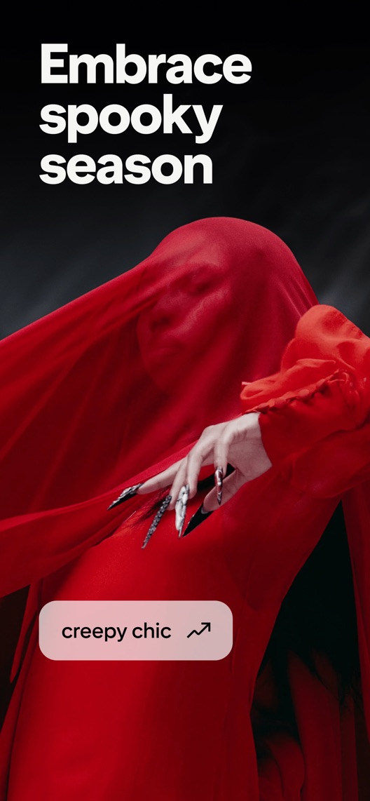
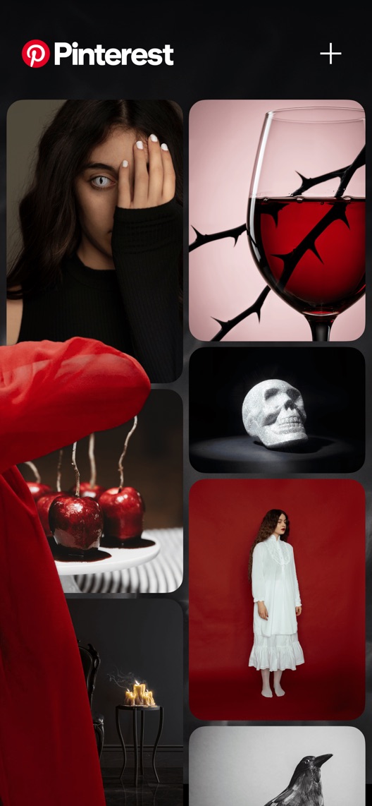
What I saw. The first frame says “Embrace spooky season”; red fabric continues into a second frame of gothic and Halloween imagery.
My read. That pair establishes a mood quickly. It also spends two early frames on the same seasonal invitation.
What I’d do. Treat the pair as one creative unit and compare it with an equally polished find-and-save pair within the same seasonal window.
02
Style has a clear visual destination.
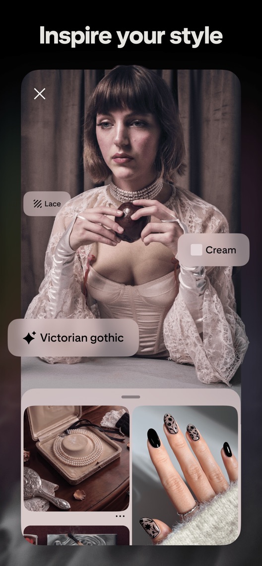
What I saw. The third frame says “Inspire your style” and overlays aesthetic labels on a fashion portrait.
My read. Specific tastes give visitors something to recognise. The image does not establish how easily a newcomer can reproduce that discovery.
What I’d do. Demonstrate a verified search leading to a relevant Pin, keeping the aesthetic specificity.
03
The metadata covers several different jobs.
What I saw. The subtitle names fashion, home design and ideas while the opening stills lean toward seasonal fashion.
My read. Home-planning visitors may have to imagine their own use case. This is an intent-coverage hypothesis, not evidence of low conversion.
What I’d do. Separate home, fashion and seasonal research before deciding which use case deserves the opening.
The screenshot teardown
The original creative is preserved. Numbered notes sit beside each frame so observations and recommendations stay separate.
Frame 01
The headline and imagery directly invite seasonal exploration.
A recognisable occasion can make the app timely, but it does not explain the saving mechanism.
Test idea: Retain the current pair as the control and date the seasonal test explicitly.
Figure 1. First three still screenshots from the US iPhone listing, captured 30 September 2026. Creative belongs to the app publisher and is reproduced for analysis. Publisher claims inside screenshots are not independently verified.
Houzz names home design, remodelling ideas and local professionals.
The lesson: Home intent can involve a real project; demonstrate idea organisation without implying Pinterest offers the same professional-service workflow.
Canva names photo/video creation and practical outputs such as collages and resumes.
The lesson: Canva is an adjacent creation alternative, not an identical discovery product. Show whether the visitor is collecting inspiration or producing a finished asset.
Figure 2. US listing names and subtitles captured 30 September 2026. These are positioning comparisons, not ranking or revenue comparisons.
The keyword questions I’d investigate
Intent candidates grounded in the listing—not fabricated search-volume or difficulty scores.
fashion inspiration / outfit ideas
Visitor’s job: Explore an aesthetic and collect references.
Evidence: The observed subtitle and third screenshot explicitly support fashion and style.
Decision: Research concrete style tasks and avoid treating pictured trend labels as measured search demand.
home design ideas / mood board
Visitor’s job: Collect a coherent direction for a room or project.
Evidence: Home design is named in the subtitle; it is not the leading opening image.
Decision: Validate the current board workflow and visitor intent before giving home planning priority.
Halloween ideas / seasonal inspiration
Visitor’s job: Find timely visual ideas for a specific occasion.
Evidence: The captured opening explicitly says spooky season.
Decision: Keep seasonal terms tied to dates and actual query evidence; do not extrapolate a September creative into year-round performance.
Proposed copy for discussion. These are not current listing fields or tested winners.
Observed listing
Pinterest
Fashion, home design and ideas
Proposed alternative
Pinterest
Find ideas. Save inspiration.
Name 9/30 · Subtitle 29/30 characters
Figure 3. A metadata alternative to review against the current listing.
Keep the recognisable name and explain the two-step job rather than listing more interests. This is a workflow-led alternative for research, not a claim that the existing category words are unnecessary.
The tradeoff: Removing fashion and home design sacrifices explicit topic vocabulary. Search relevance and comprehension must be checked separately before adopting it.
A three-frame creative brief
Proposed frame 01
Find your next idea
Show: A verified search for a specific style or home project with an authentic result.
Start with a concrete intention while retaining editorial image quality.
Proposed frame 02
Save it to your board
Show: The actual save action and destination board for that same Pin.
Complete the action across a deliberately designed pair rather than breaking the current panorama.
Proposed frame 03
See your ideas together
Show: A verified board view with a coherent collection of authorised images.
Make the value of returning visible without inventing collaboration or planning features.
Figure 4. A proposed storyboard, not a fabricated screenshot or a launched treatment. Validate features and access before production.
What three reviewers can teach us
Three dated accounts were selected for inspiration, saving and organisation. Two are from 2019 and one from 2024; none measures the current interface or the prevalence of dissatisfaction. Historical health-resource claims are not adopted as product facts.
Sample: 3 selected accounts from 8 displayed reviews. Dates: 20 September 2019–19 January 2024. No sentiment percentage is calculated.
20 September 2019 · 5/5 stars
“last three boards”
A September 2019 reviewer praised Pinterest overall but missed earlier saving behaviour and criticised interface changes.
What I’d investigate: Investigate saving comprehension today; the five-star rating does not erase the criticism or establish a current defect.
An October 2019 reviewer valued inspiration and personalised discovery.
What I’d investigate: The creative benefit is a useful language lead. Other health-related statements in the account are outside this audit’s evidence scope.
The first two frames work as a connected composition.
Deliverable: A control specification recording both frames and the seasonal dates.
Low production effort
02
Demonstrate one saved idea
The opening conveys taste more clearly than the action.
Deliverable: One verified find-and-save pair using the same seasonal subject.
Creative and workflow review
03
Separate inspiration intentions
Fashion and home visitors may want different outcomes.
Deliverable: A research sheet separating topic, task and returning-use expectations.
Research required
One test worth running
Does a find-and-save opening pair outperform the current seasonal mood pair within the same Halloween window?
Audience
Eligible US English iPhone default-page visitors; record the actual seasonal and acquisition mix rather than assuming keyword-level targeting.
Control
The intact first two seasonal screenshots, provided the creative remains current.
Treatment
Replace only the first two frames with a verified find-and-save story on the same seasonal theme; keep later frames and metadata fixed.
Method
Validate the workflow and image rights, then use eligible App Store product page optimization. This compares complete pair concepts, not the isolated effect of a save button.
Primary measure
Platform-reported download conversion for randomized eligible traffic.
Guardrails
Separate comprehension research must confirm that viewers understand saving to a board and do not mistake the app for a finished-design editor.
Decision rule
Set the useful effect, sample requirement and analysis date from baseline traffic before launch. Keep control if inconclusive; downloads do not establish repeated saving.
What could muddy the result
Halloween proximity, changing trends, campaign traffic and shifts between existing and new users can alter the outcome.
Solid. The creative feels curated rather than generic, and the subtitle names recognisable interests. The opportunity is to make the saving workflow visible without flattening the visual appeal. A seasonal opening captured before Halloween is not evidence of a year-round positioning mistake.
Level 1
Yeah. It really does!
The basics need a serious rethink.
Level 2
I hope no agency is getting paid for this.
Too many obvious things have been left unfinished.
Level 3
The app deserves better.
There is a useful product here. The listing needs to show it.
Level 4
Fine. If ‘fine’ is the goal.
The essentials are there, but there is little to get excited about.
Level 5
Getting there. Keep going.
Good ideas, with a few important gaps still to close.
Level 6Pinterest is here
Solid. Put the pitchfork down.
A strong foundation. Look for specific improvements, not a complete restart.
Level 7
Whoever did this knows their stuff.
Clear positioning, thoughtful choices and very few loose ends.
Level 8
Okay, now you’re showing off.
An unusually clear, convincing storefront worth learning from.
An editorial verdict on the captured storefront, not a measured ASO score or an assessment of an agency’s private work.
Your ASO assignment
Map one current search-to-Pin-to-board journey with dated evidence.
Brief a complete two-frame alternative on the same seasonal subject.
Write a decision rule that separates download conversion from successful saving.
No private analytics, search-rank dataset or internal keyword field was supplied. Review quotations are short excerpts; explanations are our summaries. App names and screenshots belong to their respective owners. We are not affiliated with Pinterest. Read our editorial methodology.