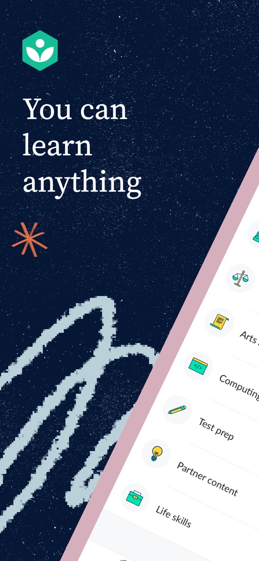
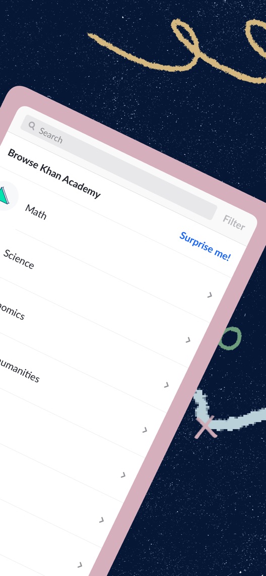
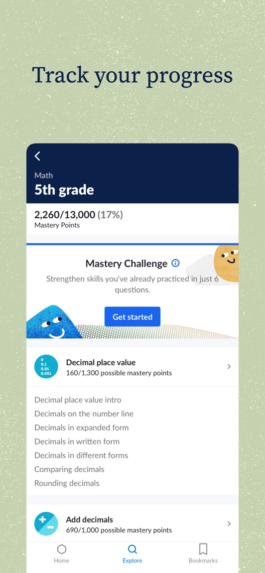
Khan Academy opens with a generous promise about learning. Its first two images form a broad subject catalogue; the third finally shows a specific maths journey. The opportunity is to make that concrete learning loop visible earlier without shrinking the mission to a single subject.
One storefront, one language and a dated capture. This is an independent editorial audit, not a client case study.
Store & market
Apple App Store · United States
Language & device
en-US · iPhone
Captured
30 September 2026
Creative reviewed
First 3 still screenshots; video and other devices excluded
Observed app name · 12/30 characters
Khan Academy
Observed subtitle · 22/30 characters
You can learn anything
Open the source listing ↗. Public text cannot reveal the private keyword field, search volumes, rankings or conversion rates. The recommendations below are proposals to validate.
Three things worth your attention
01
The opening depends on a pair.
What I saw. The first two stills use a continuous-looking diagonal device composition, split across a subject catalogue.
My read. The pair communicates breadth, but the second frame does not work as an independent first impression. Reordering it alone would break the intended composition.
What I’d do. Preserve the full pair as control and design any alternative as a complete two-frame concept.
02
Progress makes the learning proposition tangible.
What I saw. Frame three shows fifth-grade maths, mastery points, a challenge and individual topics.
My read. This gives a learner a starting level and a way to see progress. It is more concrete than the general mission, without proving academic outcomes.
What I’d do. Build a proposed practice-to-progress story using verified current mobile screens.
03
The app and website are not interchangeable.
What I saw. The listing description explicitly says some website functionality is unavailable in the app.
My read. Broad subject imagery can create expectations beyond the actual mobile experience. A review praising the platform cannot settle mobile feature availability.
What I’d do. Audit the current app journey for each proposed subject and feature before adding it to metadata or screenshots.
The screenshot teardown
The original creative is preserved. Numbered notes sit beside each frame so observations and recommendations stay separate.
Frame 01
The opening contains the mission, brand mark and a cropped subject menu.
It establishes a broad educational identity, while the actual first learning action remains outside the frame.
Test idea: Keep the opening pair intact and propose a self-contained starting task for comparison.
Figure 1. First three still screenshots from the US iPhone listing, captured 30 September 2026. Creative belongs to the app publisher and is reproduced for analysis. Publisher claims inside screenshots are not independently verified.
Coursera names career growth, courses, certificates and degrees.
The lesson: This is a different educational purchase intent. Khan Academy should not borrow credential language when its mobile proposition is practice and understanding.
Brilliant names maths and coding and positions itself as a personal tutor.
The lesson: That narrower subject proposition is easier to identify quickly. Khan Academy can offer a concrete entry point while retaining wider subject coverage later.
Figure 2. US listing names and subtitles captured 30 September 2026. These are positioning comparisons, not ranking or revenue comparisons.
The keyword questions I’d investigate
Intent candidates grounded in the listing—not fabricated search-volume or difficulty scores.
math practice / algebra practice
Visitor’s job: Work through a topic and understand mistakes.
Evidence: The third screenshot shows a maths course with topic progress and a challenge.
Decision: Research learner level and topic language; verify the exact mobile exercises before proposing narrower claims.
free learning app / learning videos
Visitor’s job: Access educational explanations without a subscription barrier.
Evidence: The official description presents a free learning library, while the screenshot catalogue shows multiple subjects.
Decision: Confirm the proposed content is available in the mobile app; do not treat the entire website as an app feature list.
study progress / mastery practice
Visitor’s job: See what has been practised and what to work on next.
Evidence: The third frame shows mastery points and subject-level progress.
Decision: Use this as a benefit hypothesis, not evidence of keyword demand or guaranteed educational improvement.
Proposed copy for discussion. These are not current listing fields or tested winners.
Observed listing
Khan Academy
You can learn anything
Proposed alternative
Khan Academy
Free lessons and math practice
Name 12/30 · Subtitle 30/30 characters
Figure 3. A metadata alternative to review against the current listing.
Retain the brand and give the subtitle a concrete entry job grounded in the listing’s free learning proposition and visible maths example. The wording is a testable focus, not a claim that maths is the only valuable subject.
The tradeoff: The current mission is broader and emotionally recognisable. A maths-led subtitle could discourage science or humanities visitors, so validate the intent mix before narrowing the default message.
A three-frame creative brief
Proposed frame 01
Start with a topic you need
Show: A verified mobile maths topic screen showing an appropriate starting level.
Give the learner a specific decision rather than requiring them to infer it from a broad catalogue.
Proposed frame 02
Practise, check, try again
Show: A current exercise and the actual feedback or hint step, using a checked example.
Explain the learning loop without promising effortless mastery or invented outcomes.
Proposed frame 03
See what to work on next
Show: A verified progress view connected to the same topic.
Finish one coherent story while broader subjects remain available later in the sequence.
Figure 4. A proposed storyboard, not a fabricated screenshot or a launched treatment. Validate features and access before production.
What three reviewers can teach us
These selected accounts concern practice, correction and progress. Two are from 2020, and one discusses the wider platform. They are neither evidence of current exercise defects nor a representative evaluation of learning effectiveness.
Sample: 3 selected accounts from 8 displayed reviews. Dates: 26 August 2020–30 October 2025. No sentiment percentage is calculated.
30 October 2025 · 5/5 stars
“practice problems”
An October 2025 reviewer valued explanations, practice and the broader learning platform.
What I’d investigate: Separate platform praise from verified mobile capability before using it to support a specific app claim.
The listing itself distinguishes app features from website features.
Deliverable: A subject-and-feature checklist based on a current mobile walkthrough.
Product verification
02
Show one complete learning loop
The current opening spends two frames on breadth.
Deliverable: A complete two-frame topic-and-practice alternative, keeping the current pair as control.
Focused creative production
03
Explain progress without overpromising
Points and challenges are visible but academic results are not.
Deliverable: A checked progress example and learner interviews about what the numbers mean.
Research and editorial review
One test worth running
Does a concrete topic-and-practice opening pair convert better than the current mission-and-catalogue pair?
Audience
Eligible US English iPhone default-page visitors; analyse the result alongside the observed subject and learner-level mix.
Control
The complete current first-two-frame composition, followed by the existing progress frame and remaining creative.
Treatment
Replace the opening pair with verified topic selection and exercise-feedback screens; hold all later frames, metadata and access messages fixed.
Method
Verify mobile capabilities and concept comprehension, then use eligible App Store product page optimization. Treat the result as a comparison of two complete stories, not one isolated design variable.
Primary measure
Platform-reported download conversion within eligible randomized traffic.
Guardrails
In separate comprehension research check that viewers do not infer guaranteed grades, credentials or access to every website feature.
Decision rule
Plan sample size and a useful effect from real baseline traffic. Retain control if inconclusive; a download-conversion test cannot demonstrate mastery or educational attainment.
What could muddy the result
School calendars, exam periods, subject mix, device use and changes to mobile content availability can affect who responds.
Getting there. The listing has distinctive creative and a useful progress demonstration. However, the two-frame catalogue spends considerable space on subject breadth before showing practice. The description also distinguishes mobile features from the wider website, so a more specific app promise needs careful scope checking.
Level 1
Yeah. It really does!
The basics need a serious rethink.
Level 2
I hope no agency is getting paid for this.
Too many obvious things have been left unfinished.
Level 3
The app deserves better.
There is a useful product here. The listing needs to show it.
Level 4
Fine. If ‘fine’ is the goal.
The essentials are there, but there is little to get excited about.
Level 5Khan Academy is here
Getting there. Keep going.
Good ideas, with a few important gaps still to close.
Level 6
Solid. Put the pitchfork down.
A strong foundation. Look for specific improvements, not a complete restart.
Level 7
Whoever did this knows their stuff.
Clear positioning, thoughtful choices and very few loose ends.
Level 8
Okay, now you’re showing off.
An unusually clear, convincing storefront worth learning from.
An editorial verdict on the captured storefront, not a measured ASO score or an assessment of an agency’s private work.
Your ASO assignment
Check which website capabilities your education app actually supports on mobile.
Storyboard one topic-to-practice-to-progress journey with verified screens.
Define an acquisition test without equating downloads with learning outcomes.
No private analytics, search-rank dataset or internal keyword field was supplied. Review quotations are short excerpts; explanations are our summaries. App names and screenshots belong to their respective owners. We are not affiliated with Khan Academy. Read our editorial methodology.