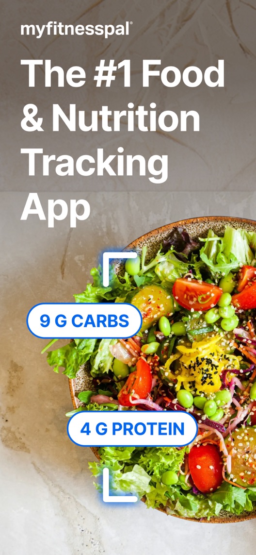
MyFitnessPal’s opening is clean and visually confident. But food labels floating over a meal do not explain the work of selecting an entry, checking a portion and saving it. That is the product story I would investigate.
One storefront, one language and a dated capture. This is an independent editorial audit, not a client case study.
Store & market
Apple App Store · United States
Language & device
en-US · iPhone
Captured
30 September 2026
Creative reviewed
First 3 still screenshots; video and other devices excluded
Observed app name · 29/30 characters
MyFitnessPal: Calorie Counter
Observed subtitle · 29/30 characters
AI Nutrition & Macros Tracker
Open the source listing ↗. Public text cannot reveal the private keyword field, search volumes, rankings or conversion rates. The recommendations below are proposals to validate.
Three things worth your attention
01
The opening pair is one continuous food composition.
What I saw. The salad, background and bracket motif continue across the first two images, with nutrient labels and food-entry cards.
My read. These are not independent cards that can be shuffled casually. Moving one alone would break the visual story.
What I’d do. Treat the pair as the comparison unit and preserve it intact as control.
02
The entry-checking step is missing from the captured opening.
What I saw. The first two stills show nutrient amounts and ingredient records, but not a visible capture, portion edit or save interaction.
My read. A newcomer may infer less work or more certainty than the real workflow supports. The image itself cannot validate data accuracy.
What I’d do. Demonstrate a verified current input-and-review path and identify the plan required to use it.
03
The third frame explains the output.
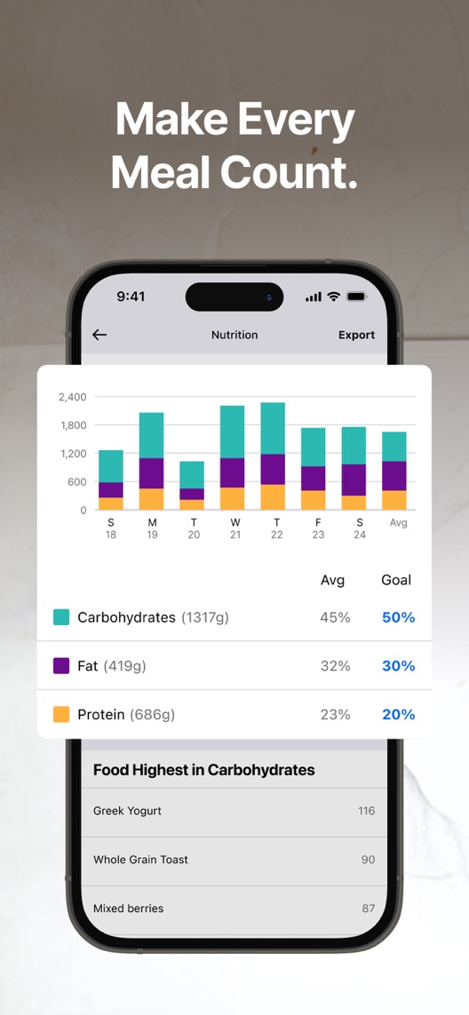
What I saw. A nutrition summary shows a multi-day chart, macro proportions and a food list.
My read. This gives the logging activity a visible result. It does not make the illustrated goals suitable for every person.
What I’d do. Connect a real logged entry to the summary without turning illustrative numbers into health recommendations.
The screenshot teardown
The original creative is preserved. Numbered notes sit beside each frame so observations and recommendations stay separate.
Frame 01
A food photograph carries nutrient labels beneath a category-leadership claim.
It communicates tracking at a glance but does not show where the values come from or how they are checked.
Test idea: Verify the claimed feature and its access requirements before using similar capture imagery in a new concept.
Figure 1. First three still screenshots from the US iPhone listing, captured 30 September 2026. Creative belongs to the app publisher and is reproduced for analysis. Publisher claims inside screenshots are not independently verified.
Lifesum includes AI calorie counting, a food diary and macro tracking in its metadata.
The lesson: An AI label does not explain accuracy, access or the user’s checking role; show those workflow details where relevant.
Figure 2. US listing names and subtitles captured 30 September 2026. These are positioning comparisons, not ranking or revenue comparisons.
The keyword questions I’d investigate
Intent candidates grounded in the listing—not fabricated search-volume or difficulty scores.
food diary / calorie counter
Visitor’s job: Record food and inspect a running summary.
Evidence: The observed name and the third screenshot establish counting and nutrition reporting.
Decision: Research the user’s logging job and vocabulary without assuming a weight-loss goal for every visitor.
macro tracker / nutrition log
Visitor’s job: Review the composition of recorded meals.
Evidence: The third frame explicitly displays macro proportions and a food list.
Decision: Validate this intent against the actual product and avoid presenting sample targets as universally appropriate.
meal scan / AI food logging
Visitor’s job: Reduce manual work when recording a meal.
Evidence: The name/subtitle and food-recognition-like creative invite investigation of assisted logging.
Decision: Confirm the exact current feature, plan and review steps before making speed or accuracy claims; the stills alone do not verify the mechanism.
Proposed copy for discussion. These are not current listing fields or tested winners.
Observed listing
MyFitnessPal: Calorie Counter
AI Nutrition & Macros Tracker
Proposed alternative
MyFitnessPal: Calorie Counter
Log food. Review your macros.
Name 29/30 · Subtitle 29/30 characters
Figure 3. A metadata alternative to review against the current listing.
Retain the familiar descriptive name and make the subtitle describe two observable tasks. This focuses on workflow rather than implying that automation removes the need to check an entry.
The tradeoff: The alternative removes explicit AI positioning and may underrepresent assisted logging for users seeking it. Validate that acquisition intent and current entitlements before deciding whether task clarity deserves the limited subtitle space.
A three-frame creative brief
Proposed frame 01
Add the food you want to log
Show: A verified current entry workflow, with the actual input method and access context shown.
Explain the starting action rather than implying that a photo alone guarantees exact information.
Proposed frame 02
Check the entry and portion
Show: The real review/edit controls before saving, using clearly illustrative data.
Make the user’s checking step visible and avoid promising nutritional precision from the creative.
Proposed frame 03
Review your recorded pattern
Show: The current summary corresponding to the example entries, without a promised health outcome.
Connect the inputs to a useful record while keeping illustrative goals distinct from advice.
Figure 4. A proposed storyboard, not a fabricated screenshot or a launched treatment. Validate features and access before production.
What three reviewers can teach us
Three 2024–2025 accounts were selected for repeat entry, setup effort and portion flexibility. They are positive overall but contain specific research questions. They do not establish current feature availability, nutritional accuracy, current price or health outcomes.
Sample: 3 selected accounts from 8 displayed reviews. Dates: 17 July 2024–11 August 2025. No sentiment percentage is calculated.
16 April 2025 · 5/5 stars
“food favorites”
An April 2025 reviewer valued reusing food entries and described meal-planning features.
What I’d investigate: Investigate repeat logging and plan access. Their reported value does not verify current pricing or health effectiveness.
A July 2024 reviewer described initial setup effort becoming easier with continued use.
What I’d investigate: Test whether the listing honestly explains the input/reuse workflow; do not reuse their personal weight account as an outcome promise.
The opening can be read as a strong automation promise.
Deliverable: A current product walkthrough covering input, correction, portion and save steps, with plan access.
Product verification
02
Build a complete two-frame alternative
The current first pair is connected and should remain intact as control.
Deliverable: A self-contained input/review pair using authentic UI and truthful illustrative values.
Focused creative production
03
Keep reporting distinct from advice
The chart is useful as a product example, not a universal target.
Deliverable: A creative review that removes implied accuracy guarantees and health-outcome claims.
Editorial review
One test worth running
Does an explicit input-and-review opening pair convert better than the current food-and-nutrient composition?
Audience
Eligible US English iPhone default-page visitors, without assuming a diagnosis, diet or weight goal for any individual.
Control
Current connected first-two screenshot composition, with the remaining sequence unchanged.
Treatment
Replace the pair with verified input and entry-review screens; keep the summary frame, metadata, offers and remaining creative fixed.
Method
Use eligible App Store product page optimization after product verification and comprehension research. This is a two-frame concept comparison, not an isolated test of one label or a nutritional-accuracy study.
Primary measure
Platform-reported download conversion for eligible randomized traffic.
Guardrails
Check in separate interviews whether visitors understand required review, feature access and that illustrated data are examples. Do not measure or infer health outcomes from this store test.
Decision rule
Predefine the useful effect and sample plan using actual traffic. Reject a misleading concept even if attention improves; retain control when the conversion evidence is inconclusive.
What could muddy the result
Plan changes, new assisted-entry features, seasonal fitness campaigns and shifts in logging versus meal-planning intent may affect interpretation.
Getting there. Food, nutrition and macro tracking are clear, and the third frame shows an actual summary. The connected opening pair makes data extraction look simple without showing the input or verification step. A more explicit logging workflow could set clearer expectations; this audit does not assess nutritional accuracy or health outcomes.
Level 1
Yeah. It really does!
The basics need a serious rethink.
Level 2
I hope no agency is getting paid for this.
Too many obvious things have been left unfinished.
Level 3
The app deserves better.
There is a useful product here. The listing needs to show it.
Level 4
Fine. If ‘fine’ is the goal.
The essentials are there, but there is little to get excited about.
Level 5MyFitnessPal is here
Getting there. Keep going.
Good ideas, with a few important gaps still to close.
Level 6
Solid. Put the pitchfork down.
A strong foundation. Look for specific improvements, not a complete restart.
Level 7
Whoever did this knows their stuff.
Clear positioning, thoughtful choices and very few loose ends.
Level 8
Okay, now you’re showing off.
An unusually clear, convincing storefront worth learning from.
An editorial verdict on the captured storefront, not a measured ASO score or an assessment of an agency’s private work.
Your ASO assignment
Document the real input, correction, portion and save steps for your tracking app.
Mark every creative element that could imply automatic accuracy or universal feature access.
Compare complete opening concepts while keeping any connected original artwork intact as control.
No private analytics, search-rank dataset or internal keyword field was supplied. Review quotations are short excerpts; explanations are our summaries. App names and screenshots belong to their respective owners. We are not affiliated with MyFitnessPal. Read our editorial methodology.