Uber Eats wants the listing to reflect more than restaurant delivery. That makes sense. But the first two images spend a lot of space on assortment before the third shows a straightforward way to browse nearby food.
One storefront, one language and a dated capture. This is an independent editorial audit, not a client case study.
Store & market
Apple App Store · United States
Language & device
en-US · iPhone
Captured
30 September 2026
Creative reviewed
First 3 still screenshots; video and other devices excluded
Observed app name · 27/30 characters
Uber Eats: Food & Groceries
Observed subtitle · 29/30 characters
Fresh grocery delivery & more
Open the source listing ↗. Public text cannot reveal the private keyword field, search volumes, rankings or conversion rates. The recommendations below are proposals to validate.
Three things worth your attention
01
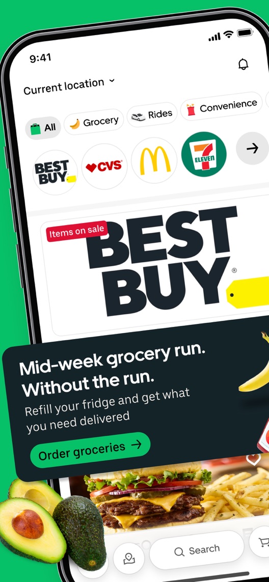
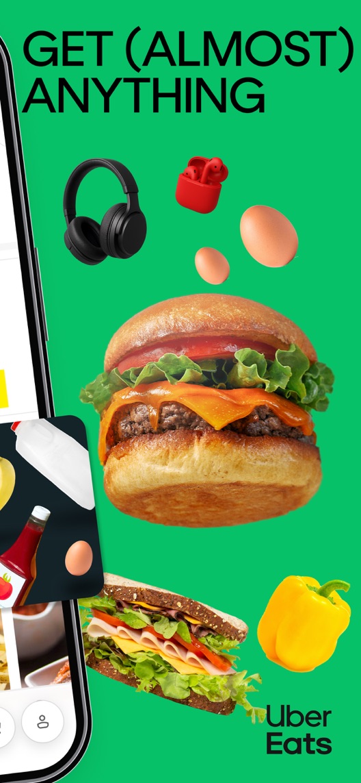
The first two frames form a connected composition.
What I saw. The angled phone and product imagery continue across the opening pair, alongside retail, grocery and restaurant cues.
My read. These frames work together visually. Simply swapping one with a later screenshot would break the composition and change more than the intended message order.
What I’d do. Treat the opening pair as one creative unit when planning a comparison.
02
Breadth competes with the immediate meal job.
What I saw. The opening shows retail brands and groceries as well as prepared food; frame two reinforces very broad selection.
My read. An existing food-delivery user may learn something new. A newcomer trying to order dinner has several competing signals to parse.
What I’d do. Test a paired concept that starts with nearby restaurant browsing and then introduces grocery/retail breadth.
03
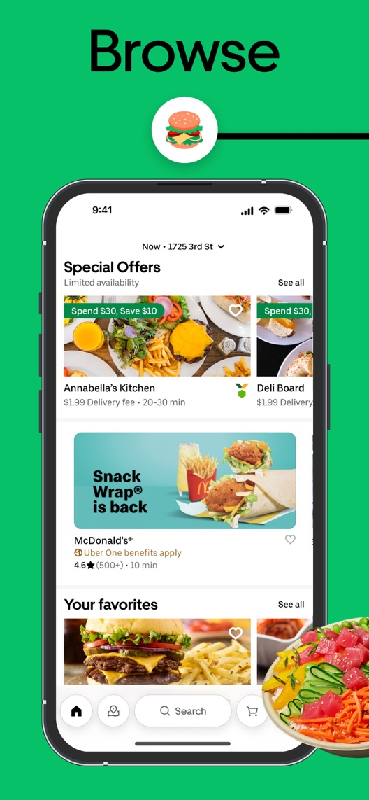
The third screenshot explains local choice.
What I saw. Frame three shows restaurant cards, location context, estimated times, delivery-price examples and offer labels.
My read. This supplies practical selection information, but values and availability are local and time-dependent.
What I’d do. Use verified current UI and clearly illustrative values when developing a simpler opening.
The screenshot teardown
The original creative is preserved. Numbered notes sit beside each frame so observations and recommendations stay separate.
Frame 01
A dense home view combines several delivery categories and a grocery-focused message.
The range is visible, but it is harder to identify one first action than in the later restaurant list.
Test idea: Develop a self-contained first frame with one local browsing task rather than moving this connected panel in isolation.
Figure 1. First three still screenshots from the US iPhone listing, captured 30 September 2026. Creative belongs to the app publisher and is reproduced for analysis. Publisher claims inside screenshots are not independently verified.
Proposed copy for discussion. These are not current listing fields or tested winners.
Observed listing
Uber Eats: Food & Groceries
Fresh grocery delivery & more
Proposed alternative
Uber Eats: Food & Groceries
Order meals and everyday needs
Name 27/30 · Subtitle 30/30 characters
Figure 3. A metadata alternative to review against the current listing.
Keep the observed descriptive name and propose a task-led subtitle that spans meals and everyday items without claiming universal selection, speed or price.
The tradeoff: The alternative removes the explicit fresh-grocery emphasis. That may be important to acquisition strategy, so compare the actual restaurant/grocery/retail intent mix before making the change.
A three-frame creative brief
Proposed frame 01
See what is available nearby
Show: A current location-aware restaurant list with accurate illustrative decision information.
Start with a recognisable meal-selection job.
Proposed frame 02
Groceries and more, when available
Show: A verified grocery/retail view for the same example area, with availability context.
Explain breadth as an additional use case rather than a universal promise.
Proposed frame 03
Review the order before you place it
Show: A verified checkout review with delivery address, applicable charges and key conditions.
Show an informed first transaction; do not invent cancellation rights or a fee guarantee.
Figure 4. A proposed storyboard, not a fabricated screenshot or a launched treatment. Validate features and access before production.
What three reviewers can teach us
These three 2024–2025 complaints were chosen for address, rating/text mismatch and retail-versus-restaurant expectations. They deliberately overrepresent problems and do not establish prevalence, current policies or the truth of disputed charges.
Sample: 3 selected accounts from 8 displayed reviews. Dates: 23 March 2024–24 February 2025. No sentiment percentage is calculated.
24 February 2025 · 5/5 stars
“Work address”
A February 2025 reviewer described ordering to the wrong address and disputing a cancellation charge.
What I’d investigate: Research address confirmation and current pre-order comprehension; this account does not establish the platform’s present policy or resolve the dispute.
An April 2024 reviewer explicitly said the five-star rating was intended to increase visibility of a complaint.
What I’d investigate: Code the text separately from the star value. Do not classify this as a satisfied customer or calculate sentiment from stars alone.
A March 2024 reviewer expected a retail order to work differently from a prepared-food order.
What I’d investigate: Examine whether breadth-led acquisition explains the correct transaction context, without claiming that all retail and restaurant policies differ in a particular way.
Deliverable: An approved control pair and one self-contained two-frame alternative.
Focused creative production
02
Verify locality and transaction information
Times, fees, availability and order conditions depend on context.
Deliverable: A dated source/feature check for the area and flow shown in proposed creative.
Product review
03
Code reviews by the job and the text
Five-star complaints and retail orders can distort a simple sentiment count.
Deliverable: A review worksheet separating restaurant, grocery, retail, address and support issues.
Focused evidence review
One test worth running
Does a simpler restaurant-first opening pair work better than the current connected assortment montage?
Audience
Eligible US English iPhone default-page visitors. Record acquisition mix where available without pretending the default test targets only hungry restaurant customers.
Control
The current connected first and second screenshots, with the remaining sequence unchanged.
Treatment
Replace the first pair with two approved self-contained frames: local restaurant browsing, then grocery/retail breadth. Preserve metadata, offers and later assets.
Method
Run an eligible App Store product page optimization creative-concept test. This compares a two-frame treatment as a whole; it cannot identify which individual headline, crop or image caused a difference.
Primary measure
Platform-reported download conversion for eligible randomized visitors.
Guardrails
Use separate comprehension research to check expected local availability, delivery charges and the need to confirm the address before ordering.
Decision rule
Predefine a useful lift, sample requirement and review point from actual traffic. Keep control if the result is inconclusive or the treatment creates unsupported availability expectations.
What could muddy the result
Merchant promotions, grocery expansion, local availability, membership campaigns and seasonal meal demand can change acquisition intent.
Getting there. The green visual identity is distinctive and the listing makes its wider delivery range visible. The connected opening pair is busy, and the clearest restaurant-browsing example comes third. I would test a simpler entry story while preserving honest location and availability expectations.
Level 1
Yeah. It really does!
The basics need a serious rethink.
Level 2
I hope no agency is getting paid for this.
Too many obvious things have been left unfinished.
Level 3
The app deserves better.
There is a useful product here. The listing needs to show it.
Level 4
Fine. If ‘fine’ is the goal.
The essentials are there, but there is little to get excited about.
Level 5Uber Eats is here
Getting there. Keep going.
Good ideas, with a few important gaps still to close.
Level 6
Solid. Put the pitchfork down.
A strong foundation. Look for specific improvements, not a complete restart.
Level 7
Whoever did this knows their stuff.
Clear positioning, thoughtful choices and very few loose ends.
Level 8
Okay, now you’re showing off.
An unusually clear, convincing storefront worth learning from.
An editorial verdict on the captured storefront, not a measured ASO score or an assessment of an agency’s private work.
Your ASO assignment
Check whether your first screenshots are independent frames or a connected composition.
Write a treatment that respects that structure and identify the complete creative unit being tested.
Separate star ratings from review text and code the underlying transaction type.
No private analytics, search-rank dataset or internal keyword field was supplied. Review quotations are short excerpts; explanations are our summaries. App names and screenshots belong to their respective owners. We are not affiliated with Uber Eats. Read our editorial methodology.