Booking.com makes its travel range obvious. The interesting opportunity is in the decision between searching and booking: why is this particular stay right for this particular trip?
One storefront, one language and a dated capture. This is an independent editorial audit, not a client case study.
Store & market
Apple App Store · United States
Language & device
en-US · iPhone
Captured
30 September 2026
Creative reviewed
First 3 still screenshots; video and other devices excluded
Observed app name · 28/30 characters
Booking.com: Hotels & Travel
Observed subtitle · 29/30 characters
Hotels, flights & car rentals
Open the source listing ↗. Public text cannot reveal the private keyword field, search volumes, rankings or conversion rates. The recommendations below are proposals to validate.
Three things worth your attention
01
The opening has a clear starting action.
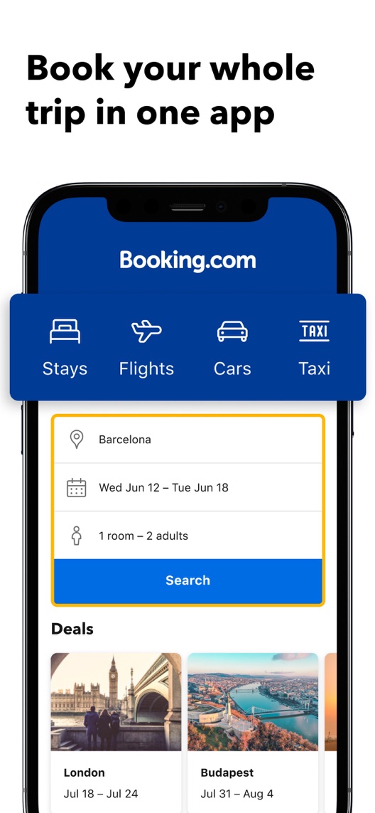
What I saw. The first still shows a destination, dates, room occupancy and a search button, alongside several travel categories.
My read. This is stronger than a generic travel photograph: the visitor can identify the inputs. The category strip also positions the app beyond accommodation.
What I’d do. Preserve the search demonstration and check that the current app still matches the illustrated flow.
02
The results demonstrate comparison better than the headline explains it.
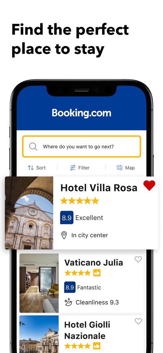
What I saw. The second frame includes sort, filter and map controls, with ratings and location details on property cards.
My read. The interface contains specific decision aids, while the headline makes a broad promise about finding a suitable stay.
What I’d do. Test a more concrete headline about comparing ratings and location, leaving the rest of the frame unchanged.
03
The discount example is a reason to install, with conditions.
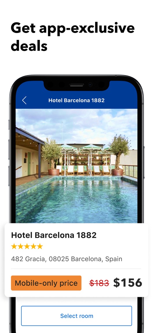
What I saw. Frame three displays a property, a crossed-out price and a mobile-only price.
My read. This gives a website user a potential app benefit. One creative example does not establish that every property, date or traveller gets a lower price.
What I’d do. Verify the current offer scope and preserve its conditions; do not generalise the pictured saving into a universal claim.
The screenshot teardown
The original creative is preserved. Numbered notes sit beside each frame so observations and recommendations stay separate.
Frame 01
A recognisable accommodation search sits beneath a strip of travel services.
The user can understand how to begin, even though the broad travel promise spans several different journeys.
Test idea: Keep this as the baseline opening and verify the current search flow before producing new assets.
Figure 1. First three still screenshots from the US iPhone listing, captured 30 September 2026. Creative belongs to the app publisher and is reproduced for analysis. Publisher claims inside screenshots are not independently verified.
Proposed copy for discussion. These are not current listing fields or tested winners.
Observed listing
Booking.com: Hotels & Travel
Hotels, flights & car rentals
Proposed alternative
Booking.com: Hotels & Travel
Find stays. Plan your trip.
Name 28/30 · Subtitle 27/30 characters
Figure 3. A metadata alternative to review against the current listing.
Keep the descriptive name and try a task-led subtitle connecting accommodation search to trip planning. The concept is clarity of journey, not adding an unverified discount promise.
The tradeoff: This removes explicit flights and car rentals from the subtitle. Those terms may matter to qualified visitors, so the proposal needs acquisition and query evidence before replacing the existing service list.
A three-frame creative brief
Proposed frame 01
Start with the trip you have in mind
Show: A current destination/date/occupancy search with verified navigation.
Make the first inputs and the app’s travel context easy to recognise.
Proposed frame 02
Compare ratings and location
Show: The current hotel results and decision controls, with no invented ratings or property claims.
Explain the comparison job rather than promising a universally perfect stay.
Proposed frame 03
Check the details before you book
Show: A verified property/room view with accurate price and relevant booking conditions.
Connect selection to an informed booking without implying that one offer applies to every stay.
Figure 4. A proposed storyboard, not a fabricated screenshot or a launched treatment. Validate features and access before production.
What three reviewers can teach us
One historical property review and two 2026 service accounts were deliberately selected to separate accommodation satisfaction from booking-service expectations. The sample is neither random nor representative; disputed events are reported as reviewer accounts, not verified company conduct.
Sample: 3 selected accounts from 8 displayed reviews. Dates: 13 January 2021–14 August 2026. No sentiment percentage is calculated.
13 January 2021 · 5/5 stars
“centrally-located”
A 2021 reviewer mainly praised an individual hotel and its location.
What I’d investigate: Code this as property feedback. It can suggest selection criteria, but it is not evidence that the booking app itself performs well.
An August 2026 reviewer questioned value, rewards and property information.
What I’d investigate: Research price and eligibility comprehension; do not treat one account as proof that prices or descriptions are generally incorrect.
A May 2026 reviewer described a disputed reservation cancellation and support experience.
What I’d investigate: Check how the current journey explains confirmation and property conditions, without deciding the facts of this individual dispute.
The second frame already contains useful ratings and location information.
Deliverable: One headline-only treatment, with the complete current creative retained as control.
Low creative effort
02
Review the mobile-price example
A depicted saving can be read too broadly.
Deliverable: A dated offer-scope check covering property, dates, availability and eligibility.
Product and editorial review
03
Separate property and platform feedback
Hotel compliments and reservation disputes describe different experiences.
Deliverable: A review-coding sheet with property, search, booking, payment and support categories.
Focused evidence review
One test worth running
Does an explicit ratings-and-location headline on frame two improve conversion compared with the current broad selection headline?
Audience
Eligible US English iPhone default-page visitors. Interpret the test against the observed accommodation-versus-other-travel traffic mix.
Control
The current screenshot sequence and original second-frame headline.
Treatment
Replace only the second-frame headline with the approved comparison wording; hold interface, crop, sequence, metadata and price example fixed.
Method
Use eligible App Store product page optimization for the screenshot text change. First check in a small comprehension study that the proposed wording accurately describes the shown controls.
Primary measure
Platform-reported download conversion within eligible randomized traffic.
Guardrails
Ask recruited visitors whether they infer guaranteed lowest prices or identical booking conditions across properties; revise wording that creates either expectation.
Decision rule
Choose a useful effect and sample plan from actual baseline traffic before launch. Keep control if the planned analysis is inconclusive; do not infer booking revenue from downloads.
What could muddy the result
Holiday demand, destination mix, mobile-only promotions and changes in room availability can affect the traffic attracted to the listing.
Solid. Search, hotel results and a mobile-price example form a recognisable journey. The second frame could explain the comparison tools more specifically, while the deal frame needs careful qualification. None of this establishes that a different headline will outperform the current one.
Level 1
Yeah. It really does!
The basics need a serious rethink.
Level 2
I hope no agency is getting paid for this.
Too many obvious things have been left unfinished.
Level 3
The app deserves better.
There is a useful product here. The listing needs to show it.
Level 4
Fine. If ‘fine’ is the goal.
The essentials are there, but there is little to get excited about.
Level 5
Getting there. Keep going.
Good ideas, with a few important gaps still to close.
Level 6Booking.com is here
Solid. Put the pitchfork down.
A strong foundation. Look for specific improvements, not a complete restart.
Level 7
Whoever did this knows their stuff.
Clear positioning, thoughtful choices and very few loose ends.
Level 8
Okay, now you’re showing off.
An unusually clear, convincing storefront worth learning from.
An editorial verdict on the captured storefront, not a measured ASO score or an assessment of an agency’s private work.
Your ASO assignment
Separate your travel app’s search, comparison and booking jobs.
Write a headline naming one visible comparison aid and change only that headline in the test brief.
Code property feedback separately from app and reservation-service feedback.
No private analytics, search-rank dataset or internal keyword field was supplied. Review quotations are short excerpts; explanations are our summaries. App names and screenshots belong to their respective owners. We are not affiliated with Booking.com. Read our editorial methodology.