Google Maps begins with turn-by-turn driving, introduces a conversational trip question and returns to traffic. The examples make route planning tangible. The second headline is broader than the airport-planning question underneath it, giving the team a precise wording test without changing the whole listing.
One storefront, one language and a dated capture. This is an independent editorial audit, not a client case study.
Store & market
Apple App Store · United States
Language & device
en-US · iPhone
Captured
30 September 2026
Creative reviewed
First 3 still screenshots; video and other devices excluded
Observed app name · 11/30 characters
Google Maps
Observed subtitle · 28/30 characters
Places, navigation & traffic
Open the source listing ↗. Public text cannot reveal the private keyword field, search volumes, rankings or conversion rates. The recommendations below are proposals to validate.
Three things worth your attention
01
Driving is the immediate opening job.
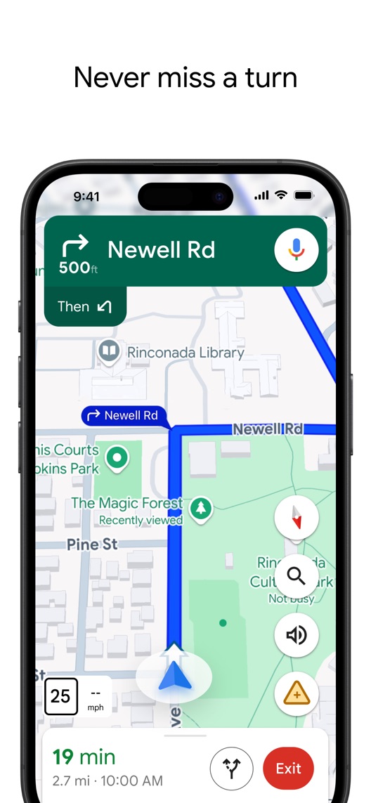
What I saw. The first frame shows a next-turn instruction, route line and journey summary.
My read. A driver can recognise the utility quickly. Visitors seeking transit or local places may need later context.
What I’d do. Retain the clear navigation example while researching the actual driving, transit and discovery mix.
02
The conversational headline is broader than its proof.
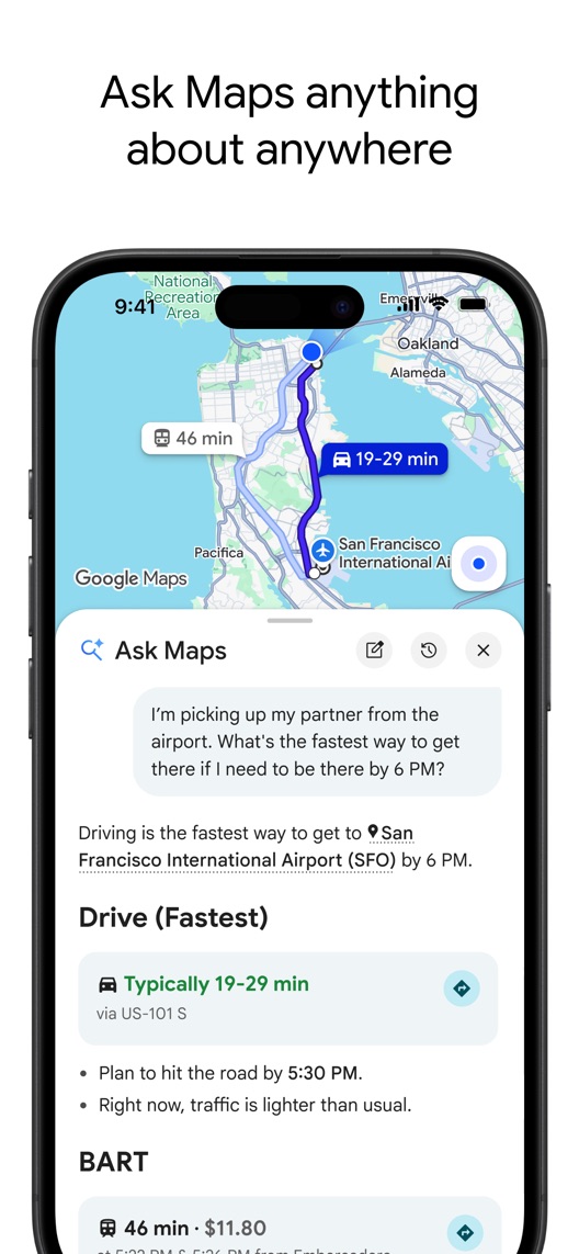
What I saw. Frame two asks a specific question about reaching an airport by a set time and compares transport options.
My read. The example demonstrates trip planning more clearly than the broad claim that precedes it. It does not establish that every place or question is supported.
What I’d do. Test a headline naming the trip-planning job while holding the interface and example constant.
03
Traffic information is shown as an estimate.
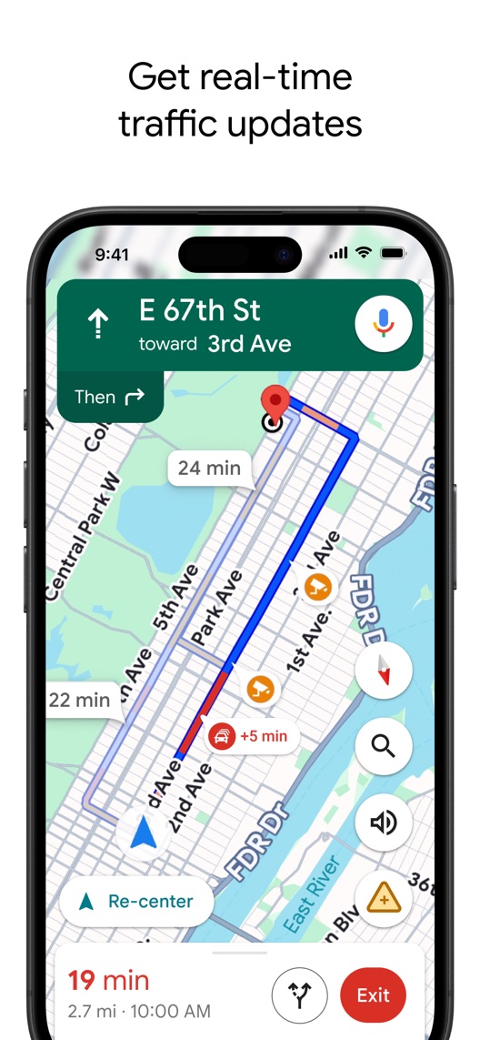
What I saw. The third frame shows route alternatives, incident icons and a delay marker.
My read. This demonstrates decision support, not a guarantee of the quickest route or an on-time arrival.
What I’d do. Keep route and timing language conditional, and verify current feature availability before making stronger claims.
The screenshot teardown
The original creative is preserved. Numbered notes sit beside each frame so observations and recommendations stay separate.
Frame 01
The active navigation interface supplies an immediate next step.
The use case is recognisable but one pictured route does not validate map accuracy everywhere.
Test idea: Preserve the concrete driving example and avoid turning its headline into an absolute reliability promise.
Figure 1. First three still screenshots from the US iPhone listing, captured 30 September 2026. Creative belongs to the app publisher and is reproduced for analysis. Publisher claims inside screenshots are not independently verified.
Apple Maps positions navigation and exploring the world.
The lesson: It also spans directions and discovery. Google Maps can explain a particular planning interaction rather than relying only on category breadth.
Proposed copy for discussion. These are not current listing fields or tested winners.
Observed listing
Google Maps
Places, navigation & traffic
Proposed alternative
Google Maps
Plan trips. Find your route.
Name 11/30 · Subtitle 28/30 characters
Figure 3. A metadata alternative to review against the current listing.
Retain the brand and connect planning with navigation using two concrete jobs shown in the sequence. The proposal avoids guaranteed timing and does not imply that a conversational answer is always correct.
The tradeoff: The current subtitle explicitly includes places, navigation and traffic. This alternative loses the place-discovery term and traffic wording, which may be valuable intentions; test that tradeoff before narrowing the default page.
A three-frame creative brief
Proposed frame 01
Choose where you need to go
Show: A verified destination and route-planning view with realistic example inputs.
Start with the destination decision and maintain accurate mode and region context.
Proposed frame 02
Ask about the trip you are planning
Show: The checked airport scenario with a specific headline and truthful feature access.
Explain the new interaction through one useful question rather than an unlimited promise.
Proposed frame 03
Review changing traffic conditions
Show: A current navigation example with clearly illustrative timing and route information.
Show decision support without presenting estimates as guaranteed outcomes.
Figure 4. A proposed storyboard, not a fabricated screenshot or a launched treatment. Validate features and access before production.
What three reviewers can teach us
Only the three app-related accounts in the eight displayed reviews were selected. Five others primarily described experiences with local businesses or services and were excluded from app analysis. Two selected accounts date to 2019; none establishes current route accuracy or cross-platform feature parity.
Sample: 3 selected accounts from 8 displayed reviews. Dates: 28 May 2019–10 February 2026. No sentiment percentage is calculated.
10 February 2026 · 5/5 stars
“Apple CarPlay”
A February 2026 reviewer requested changes to speed display and location sharing in a vehicle context.
What I’d investigate: Verify current availability and safe interaction design independently; do not recommend the reviewer’s workaround or treat requested features as established gaps.
A May 2019 reviewer described saving places, planning stops and contributing information.
What I’d investigate: Use these as historical motivations, not a current capability inventory or evidence for the reviewer’s absolute reliability claim.
A November 2019 reviewer compared navigation interfaces and raised readability concerns.
What I’d investigate: Check present map readability with current devices. The old platform comparisons and accuracy opinions are not current product facts.
The airport example is more specific than its headline.
Deliverable: One headline-only trip-planning alternative for frame two.
Low creative effort
02
Separate travel modes in research
The default opening mainly serves drivers.
Deliverable: An intent map covering driving, transit and place discovery.
Focused research
03
Filter place feedback out of app evidence
Most displayed accounts in this capture concern other services.
Deliverable: A review-coding rule separating app interaction from businesses found through maps.
Editorial evidence review
One test worth running
Does a trip-planning headline on the second frame improve conversion compared with the current broad conversational headline?
Audience
Eligible US English iPhone default-page visitors; interpret results alongside driving, transit and local-discovery acquisition mix.
Control
The current second-frame headline and airport-planning interface.
Treatment
Change only the headline to approved trip-planning wording; keep the question, map, other screenshots and metadata fixed.
Method
Verify current feature access and scenario accuracy, run stationary comprehension research, then use eligible App Store product page optimization for the text change.
Primary measure
Platform-reported download conversion within eligible randomized traffic.
Guardrails
Check separately that people do not expect infallible answers, guaranteed arrival times or universal geographic coverage; conduct no research interaction while participants drive.
Decision rule
Set the useful effect and sample plan from actual traffic. Retain control if inconclusive; conversion does not establish navigation accuracy, trip safety or completed journeys.
What could muddy the result
Travel demand, geography, feature rollout, traffic conditions and transport-mode campaigns can shift the audience and applicability of the result.
Solid. Actual map interfaces, route information and a concrete airport scenario carry the proposition well. The conversational frame would be easier to interpret with a task-specific headline, and none of the route examples proves universally correct directions or arrival times. That is a clarity opportunity, not a claim about navigation quality.
Level 1
Yeah. It really does!
The basics need a serious rethink.
Level 2
I hope no agency is getting paid for this.
Too many obvious things have been left unfinished.
Level 3
The app deserves better.
There is a useful product here. The listing needs to show it.
Level 4
Fine. If ‘fine’ is the goal.
The essentials are there, but there is little to get excited about.
Level 5
Getting there. Keep going.
Good ideas, with a few important gaps still to close.
Level 6Google Maps is here
Solid. Put the pitchfork down.
A strong foundation. Look for specific improvements, not a complete restart.
Level 7
Whoever did this knows their stuff.
Clear positioning, thoughtful choices and very few loose ends.
Level 8
Okay, now you’re showing off.
An unusually clear, convincing storefront worth learning from.
An editorial verdict on the captured storefront, not a measured ASO score or an assessment of an agency’s private work.
Your ASO assignment
Separate app feedback from reviews of places or services discovered through your app.
Match a broad feature headline to one specific demonstrated travel task.
Write a test that keeps estimates and geographic coverage distinct from guarantees.
No private analytics, search-rank dataset or internal keyword field was supplied. Review quotations are short excerpts; explanations are our summaries. App names and screenshots belong to their respective owners. We are not affiliated with Google Maps. Read our editorial methodology.