PayPal can do several jobs. The opening listing tries to sell three at once. I would first decide whether this visitor came to pay a person, shop with PayPal or use the card.
One storefront, one language and a dated capture. This is an independent editorial audit, not a client case study.
Store & market
Apple App Store · United States
Language & device
en-US · iPhone
Captured
30 September 2026
Creative reviewed
First 3 still screenshots; video and other devices excluded
Observed app name · 24/30 characters
PayPal - Pay, Send, Save
Observed subtitle · 30/30 characters
Debit card, rewards, pay later
Open the source listing ↗. Public text cannot reveal the private keyword field, search volumes, rankings or conversion rates. The recommendations below are proposals to validate.
Three things worth your attention
01
The first headline and interface answer different questions.
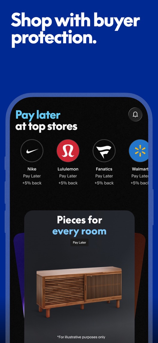
What I saw. Frame one leads with buyer protection while the visible interface emphasises pay-later offers at shops.
My read. Protection and financing may be related in a purchase journey, but they are not the same benefit. The visual does not itself explain the scope of protection.
What I’d do. Pair the protection message with a verified relevant purchase flow, or test a headline that directly describes the visible shopping task.
02
The second frame shows the clearest action.
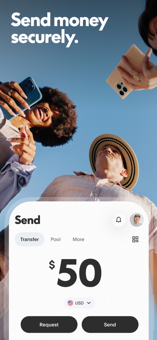
What I saw. A send interface includes a money amount, currency and request/send controls.
My read. Someone who wants to pay another person can recognise the job without decoding a promotion. The screenshot alone does not establish transfer fees, speed or eligibility.
What I’d do. Use this existing frame as the lead in an order-only experiment and preserve every qualification.
03
Rewards make the third frame time-sensitive.
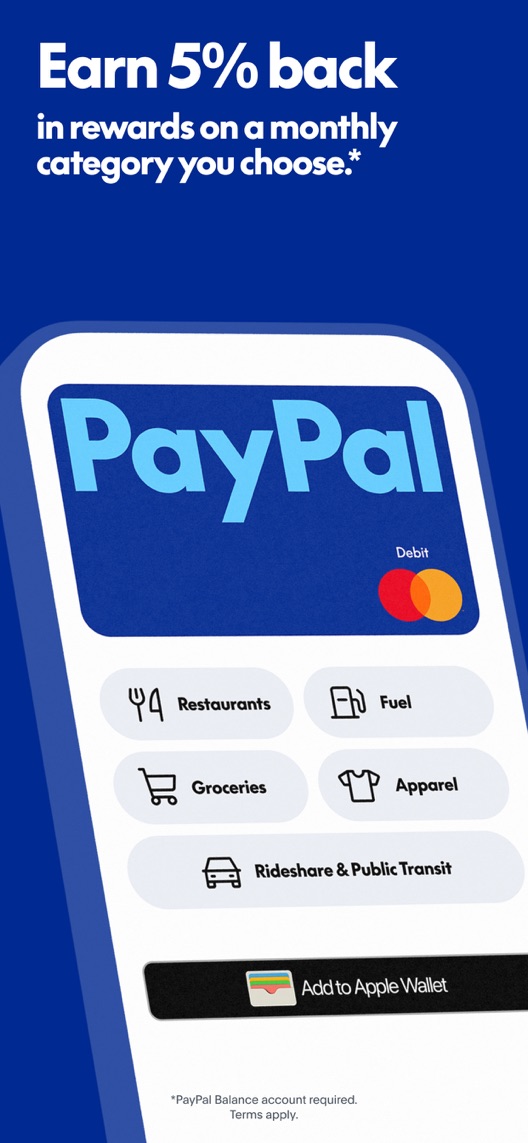
What I saw. The third screenshot advertises a percentage reward, category selection and a debit card, with account and terms notes.
My read. This is concrete but conditional. A captured creative is not proof that every visitor qualifies or that the offer will stay unchanged.
What I’d do. Record the offer date and link it to current product review before changing or repeating any reward claim.
The screenshot teardown
The original creative is preserved. Numbered notes sit beside each frame so observations and recommendations stay separate.
Frame 01
The headline discusses protection, while the phone content highlights pay-later shopping.
The relationship between the benefit and the interface requires explanation from the visitor.
Test idea: Develop a matched message-and-interface concept after verifying the product flow and applicable conditions.
Figure 1. First three still screenshots from the US iPhone listing, captured 30 September 2026. Creative belongs to the app publisher and is reproduced for analysis. Publisher claims inside screenshots are not independently verified.
Wise explicitly centres international transfers and payments.
The lesson: Transfer intent may be domestic or international. Do not borrow cross-border vocabulary without checking the relevant PayPal product and territory.
Figure 2. US listing names and subtitles captured 30 September 2026. These are positioning comparisons, not ranking or revenue comparisons.
The keyword questions I’d investigate
Intent candidates grounded in the listing—not fabricated search-volume or difficulty scores.
send money / request money
Visitor’s job: Pay another person or request a payment.
Evidence: The second screenshot shows the send interface and the name includes sending.
Decision: Research the precise transaction intent; validate fees and eligibility before writing supporting copy.
online payments / shopping wallet
Visitor’s job: Use an account during online shopping.
Evidence: The first screenshot shows shop offers and a purchase-protection message.
Decision: Investigate checkout intent separately from credit and rewards intent so the first frame can match one clear job.
debit card / spending rewards
Visitor’s job: Understand a card and its conditional benefits.
Evidence: The subtitle and third frame advertise the card and rewards.
Decision: Retain as an evidence-backed research cluster, not a promise of universal availability or a reason to overstate returns.
Proposed copy for discussion. These are not current listing fields or tested winners.
Observed listing
PayPal - Pay, Send, Save
Debit card, rewards, pay later
Proposed alternative
PayPal: Send Money & Pay
Payments, shopping, debit card
Name 24/30 · Subtitle 30/30 characters
Figure 3. A metadata alternative to review against the current listing.
This alternative prioritises transaction language and a plain list of product areas. It deliberately avoids repeating a percentage reward, a credit promise or a claim about fee-free transfers.
The tradeoff: Removing saving and pay-later wording would reduce emphasis on two existing acquisition propositions. The proposal needs query and campaign evidence; it is not a recommendation to eliminate those products from the wider listing.
A three-frame creative brief
Proposed frame 01
Send or request a payment
Show: The current verified send/request interface with conditions appropriate to the selected territory.
Lead with a job that can be understood without a promotional offer.
Proposed frame 02
Use PayPal when you shop
Show: A current relevant shopping or checkout flow, with any protection wording reviewed against applicable terms.
Make the headline and interface describe the same transaction.
Proposed frame 03
Explore card options
Show: A verified card destination with accurate eligibility and offer information.
Show the wider product without suggesting every installer receives the same benefits.
Figure 4. A proposed storyboard, not a fabricated screenshot or a launched treatment. Validate features and access before production.
What three reviewers can teach us
The chosen 2018–2021 accounts illustrate protection, eligibility and business-versus-consumer intent. They are deliberately historical and cannot verify current offers, support quality, fees or functionality. The business account is included to expose a sampling mismatch, not endorse a feature claim.
Sample: 3 selected accounts from 8 displayed reviews. Dates: 24 February 2018–24 January 2021. No sentiment percentage is calculated.
15 October 2020 · 5/5 stars
“transaction dispute”
A 2020 reviewer described confidence in third-party purchases and an experience with dispute support.
What I’d investigate: Research how current prospective users understand protection. One historical account does not establish universal coverage or support outcomes.
A 2021 reviewer described confusion between a promotional message and access to a card.
What I’d investigate: Check whether current acquisition copy creates incorrect eligibility expectations; do not infer that the same promotion or issue exists today.
A 2018 reviewer described using several PayPal business products.
What I’d investigate: Separate consumer-app intent from business-platform intent. This account is too old and broad to verify present features in the consumer app.
Protection and pay-later shopping should not be treated as interchangeable.
Deliverable: A reviewed mapping from every headline to the actual shown product and conditions.
Product and copy review
02
Test a transfer-led opening
Frame two already demonstrates a clear task.
Deliverable: Order 2–1–3 versus the existing sequence, with promotions and metadata unchanged.
Low creative effort
03
Give offer copy an owner and expiry review
Reward and eligibility language can become stale.
Deliverable: A source-and-review-date record for every conditional claim.
Ongoing editorial ownership
One test worth running
Does the existing send/request screenshot work better as the opening than the shopping/protection screenshot?
Audience
Eligible US English iPhone default-page traffic; interpret the result alongside campaign mix rather than assuming every visitor seeks transfers.
Control
Current shopping/protection, send/request and card-reward sequence.
Treatment
Swap the first and second stills only, keeping all wording, offer notes and later creative unchanged.
Method
Run an eligible App Store product page optimization order test. Review claim accuracy first. Test a newly matched shopping creative separately so it does not confound the ordering result.
Primary measure
Platform-reported download conversion for eligible randomized visitors.
Guardrails
In separate comprehension research, check that visitors do not infer universal protection, guaranteed card access or unconditional rewards.
Decision rule
Set a practical lift and sample plan from actual baseline traffic; read the full interval at the planned review point. An unclear result keeps the existing order pending better intent evidence.
What could muddy the result
Changes to reward offers, card availability, merchant campaigns and the relative share of transfer versus shopping traffic can alter interpretation.
Getting there. Each captured frame has a legible headline and a recognisable use case. The weak point is the connection between them: a protection headline sits above pay-later shopping, then the sequence jumps to transfers and rewards. Better message matching is worth testing; no private performance data is available.
Level 1
Yeah. It really does!
The basics need a serious rethink.
Level 2
I hope no agency is getting paid for this.
Too many obvious things have been left unfinished.
Level 3
The app deserves better.
There is a useful product here. The listing needs to show it.
Level 4
Fine. If ‘fine’ is the goal.
The essentials are there, but there is little to get excited about.
Level 5PayPal is here
Getting there. Keep going.
Good ideas, with a few important gaps still to close.
Level 6
Solid. Put the pitchfork down.
A strong foundation. Look for specific improvements, not a complete restart.
Level 7
Whoever did this knows their stuff.
Clear positioning, thoughtful choices and very few loose ends.
Level 8
Okay, now you’re showing off.
An unusually clear, convincing storefront worth learning from.
An editorial verdict on the captured storefront, not a measured ASO score or an assessment of an agency’s private work.
Your ASO assignment
Map every financial-product headline to the exact interface and conditions shown.
Mark promises that vary by eligibility, transaction type, territory or date.
Create one order-only test and list which offer changes would invalidate the comparison.
No private analytics, search-rank dataset or internal keyword field was supplied. Review quotations are short excerpts; explanations are our summaries. App names and screenshots belong to their respective owners. We are not affiliated with PayPal. Read our editorial methodology.