Rocket Money opens with a concrete question people care about: what charges are coming up? It then introduces a text-based assistant and a cancellation entry point. The strongest improvement is precision. Seeing a recurring charge, receiving a suggestion and submitting a cancellation request are three different actions, and none should be mistaken for a guaranteed saving.
One storefront, one language and a dated capture. This is an independent editorial audit, not a client case study.
Store & market
Apple App Store · United States
Language & device
en-US · iPhone
Captured
30 September 2026
Creative reviewed
First 3 still screenshots; video and other devices excluded
Observed app name · 30/30 characters
Rocket Money - Bills & Budgets
Observed subtitle · 30/30 characters
Subscription & Expense Manager
Open the source listing ↗. Public text cannot reveal the private keyword field, search volumes, rankings or conversion rates. The recommendations below are proposals to validate.
Three things worth your attention
01
Upcoming charges are concrete.
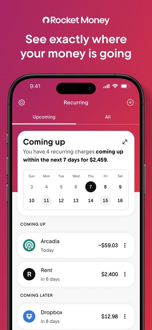
What I saw. The first frame shows a recurring-charge calendar, a seven-day summary and named example bills.
My read. The interface explains monitoring, but the word exactly should not be read as proof that every account or charge is always detected accurately.
What I’d do. Verify account coverage, update timing and edit controls before expanding the promise.
02
The assistant example is illustrative.
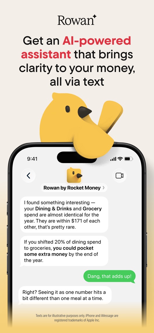
What I saw. The second frame introduces Rowan through a text exchange comparing spending categories and suggesting a shift in spending.
My read. It demonstrates a conversational format, not the quality, suitability or savings effect of actual advice. The creative explicitly labels the texts illustrative.
What I’d do. Retain that context and verify the assistant’s access and supported tasks before briefing new examples.
03
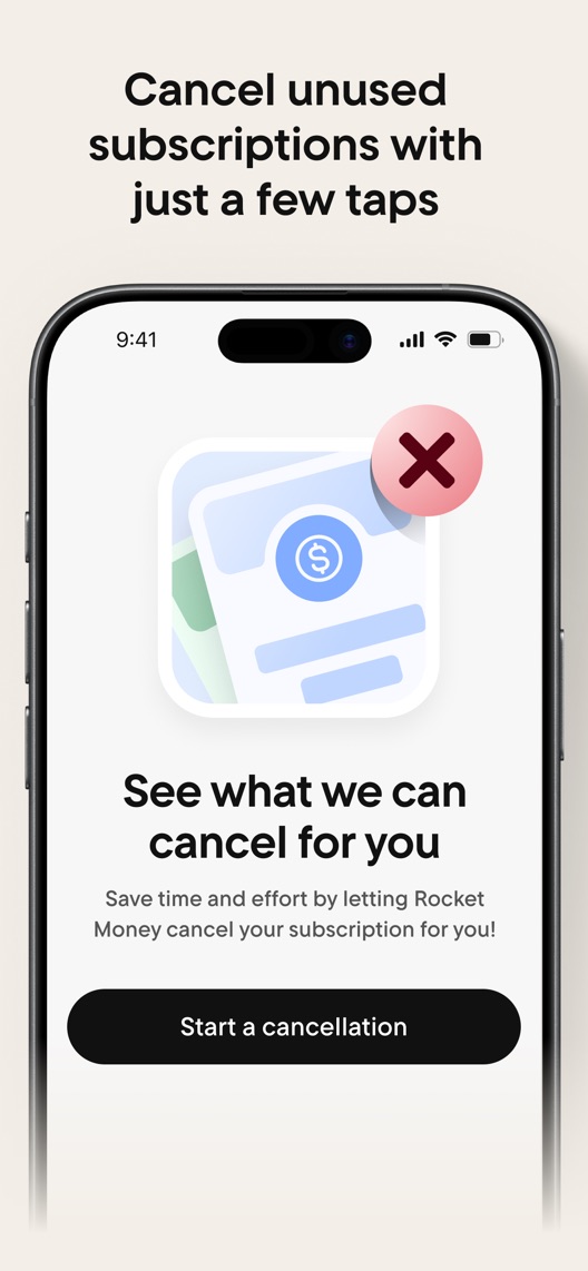
The cancellation screenshot shows a beginning.
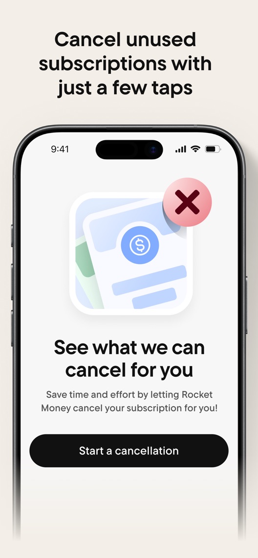
What I saw. The third frame says cancel unused subscriptions with a few taps but displays Start a cancellation and See what we can cancel for you.
My read. Submitting a request and achieving cancellation are different stages; eligibility and completion are not established by this image.
What I’d do. Use verified process language and show a real status step before implying the job is finished.
The screenshot teardown
The original creative is preserved. Numbered notes sit beside each frame so observations and recommendations stay separate.
Frame 01
The screen lists due dates and amounts in a clear upcoming-payments view.
It demonstrates organisation, not universal detection accuracy or a current financial statement.
Test idea: Use clearly illustrative data and verify how users correct or confirm recurring charges.
Figure 1. First three still screenshots from the US iPhone listing, captured 30 September 2026. Creative belongs to the app publisher and is reproduced for analysis. Publisher claims inside screenshots are not independently verified.
Copilot names tracking and budgeting with spending, investing and net worth.
The lesson: The monitoring job is shared category territory. Demonstrate what happens after a recurring charge is identified without assuming equivalent service features.
Figure 2. US listing names and subtitles captured 30 September 2026. These are positioning comparisons, not ranking or revenue comparisons.
The keyword questions I’d investigate
Intent candidates grounded in the listing—not fabricated search-volume or difficulty scores.
subscription tracker / recurring bills
Visitor’s job: See what will be charged and when.
Evidence: The subtitle names subscription management and the opening shows recurring charges.
Decision: Prioritise the specific monitoring job and verify detection, refresh and edit behaviour.
cancel subscriptions / cancellation help
Visitor’s job: Stop an eligible unwanted recurring service.
Evidence: The third frame explicitly offers a cancellation start step.
Decision: Separate request, eligibility, confirmation and completion; do not imply all subscriptions can be cancelled instantly.
expense manager / spending overview
Visitor’s job: Understand spending categories and patterns.
Evidence: Expense management appears in the subtitle and the assistant example compares categories.
Decision: Research comprehension without treating an illustrative suggestion as personalised financial advice or a guaranteed saving.
Proposed copy for discussion. These are not current listing fields or tested winners.
Observed listing
Rocket Money - Bills & Budgets
Subscription & Expense Manager
Proposed alternative
Rocket Money - Bills & Budgets
Track bills and subscriptions
Name 30/30 · Subtitle 29/30 characters
Figure 3. A metadata alternative to review against the current listing.
Keep the current focused name and state the clearest demonstrated monitoring task. The alternative avoids suggesting that the app has already cancelled or reduced every bill it finds.
The tradeoff: It removes expense manager from the subtitle and repeats bills from the name. The narrower proposition may lose useful budgeting or general-expense relevance.
A three-frame creative brief
Proposed frame 01
See your upcoming charges
Show: A current recurring-charge view with clearly illustrative amounts and accurate timing labels.
Retain the clearest existing explanation of the monitoring job.
Proposed frame 02
Review a subscription
Show: A verified subscription detail with the actual available actions and access conditions.
Connect identification to a decision without assuming that every item is unwanted or eligible.
Proposed frame 03
Follow a cancellation request
Show: A current supported request and status flow with clear completion language.
Explain what the service does after the first tap rather than collapsing the whole process into an outcome claim.
Figure 4. A proposed storyboard, not a fabricated screenshot or a launched treatment. Validate features and access before production.
What three reviewers can teach us
Three accounts from 2023 and 2026 were selected for monitoring, correction and cancellation expectations. They describe different levels of desired assistance. Individual savings, security statements, historical pricing and reported scheduling defects are not treated as current verified facts.
Sample: 3 selected accounts from 8 displayed reviews. Dates: 28 May 2023–23 January 2026. No sentiment percentage is calculated.
23 January 2026 · 5/5 stars
“premium cancellation assistance”
A January 2026 reviewer valued recurring-charge visibility and described using cancellation help.
What I’d investigate: Verify current plan and service scope independently; the reviewer’s claims of complete detection and security are not audit findings.
The shown button starts a process while the headline can imply completion.
Deliverable: An approved request-stage headline and verified status-flow brief.
Product and editorial review
02
Verify recurring-data expectations
The interface contains exact-looking amounts and dates.
Deliverable: A dated account-coverage, refresh and correction source sheet.
Required product check
03
Keep assistant examples grounded
The Rowan exchange is illustrative and contains a savings suggestion.
Deliverable: A verified task-and-access specification for future creative.
Product research
One test worth running
Does explicit cancellation-request wording improve process understanding while preserving qualified conversion?
Audience
Eligible US English iPhone default-page visitors, with separate research among subscription-monitoring and cancellation-help prospects.
Control
The current third-frame wording only after review confirms it is accurate; correct any confirmed misleading claim consistently before testing.
Treatment
Change only the third-frame headline to verified request-stage wording while retaining the same start screen, sequence and metadata.
Method
Verify eligibility, plan scope and statuses, then run comprehension research and eligible App Store product page optimization. This tests wording, not the service’s cancellation success rate.
Primary measure
Platform-reported download conversion for eligible randomized traffic.
Guardrails
Participants must distinguish submitting a request from confirmed completion and understand that eligibility matters. Savings and service completion require separate evidence.
Decision rule
Set useful effect, sample requirement and analysis timing from baseline before launch. Keep control if inconclusive or if a conversion lift depends on stronger mistaken expectations.
What could muddy the result
Service coverage, plan changes, subscription renewal periods and assistant launches can affect the result.
Solid. The opening recurring-charge interface gives the visitor something practical to understand immediately. The cancellation frame is less precise: the headline describes cancelling while the shown screen starts the process. Clarifying that distinction is more useful than adding another broad money-management promise.
Level 1
Yeah. It really does!
The basics need a serious rethink.
Level 2
I hope no agency is getting paid for this.
Too many obvious things have been left unfinished.
Level 3
The app deserves better.
There is a useful product here. The listing needs to show it.
Level 4
Fine. If ‘fine’ is the goal.
The essentials are there, but there is little to get excited about.
Level 5
Getting there. Keep going.
Good ideas, with a few important gaps still to close.
Level 6Rocket Money is here
Solid. Put the pitchfork down.
A strong foundation. Look for specific improvements, not a complete restart.
Level 7
Whoever did this knows their stuff.
Clear positioning, thoughtful choices and very few loose ends.
Level 8
Okay, now you’re showing off.
An unusually clear, convincing storefront worth learning from.
An editorial verdict on the captured storefront, not a measured ASO score or an assessment of an agency’s private work.
Your ASO assignment
Record the current path from identifying a recurring charge to a supported cancellation status.
Separate monitoring, request submission and confirmed completion in the creative brief.
Verify assistant access and illustrative financial examples before reuse.
No private analytics, search-rank dataset or internal keyword field was supplied. Review quotations are short excerpts; explanations are our summaries. App names and screenshots belong to their respective owners. We are not affiliated with Rocket Money. Read our editorial methodology.