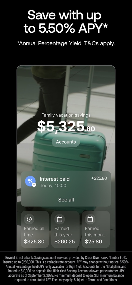
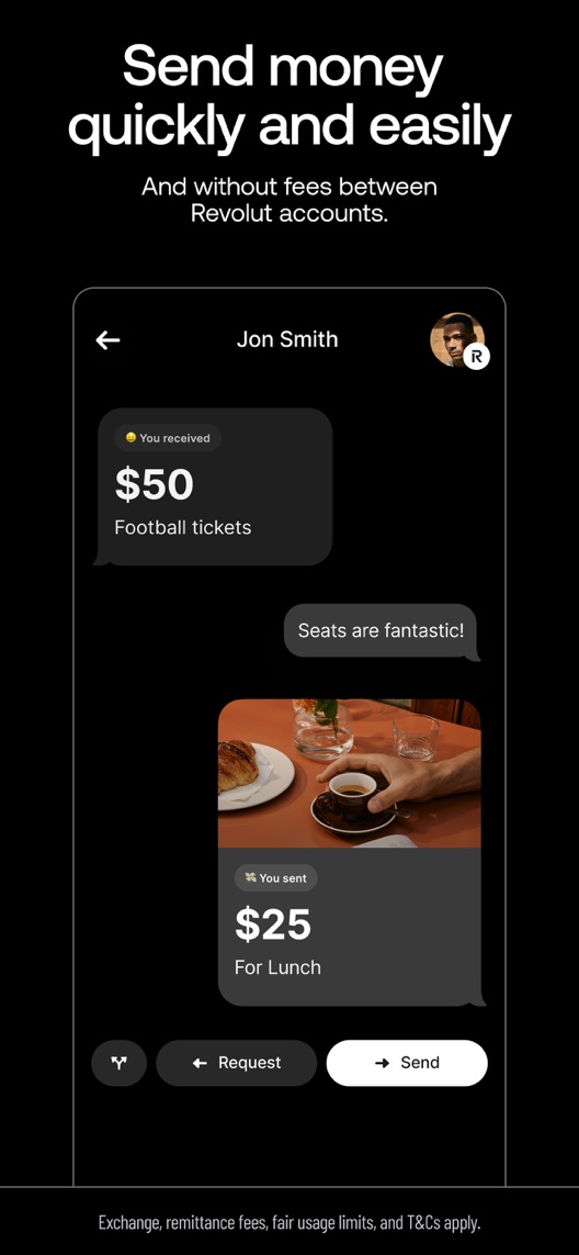
Revolut looks polished. The harder question is what a US newcomer understands they can actually do, at what cost and under which conditions. The first three frames move from brand to savings to transfers, with important qualifications in small print.
One storefront, one language and a dated capture. This is an independent editorial audit, not a client case study.
Store & market
Apple App Store · United States
Language & device
en-US · iPhone
Captured
30 September 2026
Creative reviewed
First 3 still screenshots; video and other devices excluded
Observed app name · 30/30 characters
Revolut: send, spend, and save
Observed subtitle · 24/30 characters
Change the way you money
Open the source listing ↗. Public text cannot reveal the private keyword field, search volumes, rankings or conversion rates. The recommendations below are proposals to validate.
Three things worth your attention
01
The hero sells the brand before the workflow.
What I saw. The first frame centres a colourful payment card, a worldwide customer claim and award marks.
My read. This supplies social proof and a premium impression, but does not show what the person will do after installing. The worldwide claim is not a count of US active users.
What I’d do. Keep brand proof subordinate to a verified US product action in a proposed alternative.
02
The savings headline has conditions that change its meaning.
What I saw. Frame two advertises an upper-end yield while its footnote limits eligibility by plan and balance and states a September 2025 rate date.
My read. A large maximum-rate promise can be read as a broadly available rate. The captured date is newer than the date printed in the creative, requiring a product-owner check.
What I’d do. Verify the current US offer, plan, deposit cap, fees and rate date before producing any new savings-led creative.
03
The transfer example is narrower than all money transfers.
What I saw. The third frame shows a conversational payment interface and describes transfers between Revolut accounts.
My read. This is a specific peer-payment example. It should not become an unrestricted claim about free international transfers or immediate settlement.
What I’d do. Retain the account-to-account scope and check how recruits understand speed and fees.
The screenshot teardown
The original creative is preserved. Numbered notes sit beside each frame so observations and recommendations stay separate.
Frame 01
A physical-card image dominates the brand introduction; provider information appears along the bottom.
The visual is memorable, but the card alone does not explain account setup or the everyday task.
Test idea: Test a current in-app action as the opening while preserving accurate provider and eligibility information.
Figure 1. First three still screenshots from the US iPhone listing, captured 30 September 2026. Creative belongs to the app publisher and is reproduced for analysis. Publisher claims inside screenshots are not independently verified.
Proposed copy for discussion. These are not current listing fields or tested winners.
Observed listing
Revolut: send, spend, and save
Change the way you money
Proposed alternative
Revolut: Send, Spend & Save
Money transfers and payments
Name 27/30 · Subtitle 28/30 characters
Figure 3. A metadata alternative to review against the current listing.
Keep the three visible product jobs while replacing the abstract slogan with transfer and payment language. The alternative avoids numeric rates and claims about universal fee-free access.
The tradeoff: This gives less space to savings and premium brand positioning. It may attract transfer expectations that the US product does not meet for every route, so product-scope verification and intent research are prerequisites.
A three-frame creative brief
Proposed frame 01
Send money between accounts
Show: An authentic current Revolut-to-Revolut payment flow with readable scope and applicable conditions.
Introduce a specific action without promising unrestricted free or instant transfers.
Proposed frame 02
See your spending clearly
Show: A product-verified transaction view using fictional, clearly illustrative account information.
Make the card useful through a visible everyday workflow rather than a card photograph alone.
Proposed frame 03
Check the savings terms
Show: A current eligible savings view with an approved, dated offer and prominent material qualifications.
Only publish this concept after confirming the US offer; do not reuse the old rate merely because it is still pictured.
Figure 4. A proposed storyboard, not a fabricated screenshot or a launched treatment. Validate features and access before production.
What three reviewers can teach us
The selection covers requested features, a resolved restriction and an old support complaint. Dates and resolutions matter. These accounts cannot establish current fees, rates, regulatory status, investment returns or the prevalence of service problems.
Sample: 3 selected accounts from 8 displayed reviews. Dates: 15 January 2020–14 January 2026. No sentiment percentage is calculated.
14 January 2026 · 5/5 stars
“more currencies”
A January 2026 reviewer praised several features while requesting broader currency and card capabilities.
What I’d investigate: Separate requested capabilities from existing ones. The reviewer’s financial returns and rate comparisons are not verified evidence.
An October 2025 reviewer updated an account-restriction complaint to say access had been restored.
What I’d investigate: Preserve the resolution when interpreting the account; investigate terminology and support comprehension without judging the individual compliance decision.
The visible offer date precedes this capture by more than a year.
Deliverable: A current US product-owner sign-off documenting eligibility, rate date, caps and fees.
Required evidence check
02
Clarify the transfer scope
Account-to-account payments and international transfers are not interchangeable promises.
Deliverable: An approved transfer vocabulary and one authentic payment-flow opening.
Product and creative review
03
Make the conditions legible
Small print carries information that materially limits the large promise.
Deliverable: A phone-size comprehension review of benefit, provider, cost and eligibility wording.
Focused layout review
One test worth running
Does an action-led account-to-account transfer opening outperform the current card-and-brand opening?
Audience
Eligible US English iPhone default-page visitors, with US product availability verified before recruitment or launch.
Control
The current card-led opening after correcting any independently confirmed inaccurate offer information consistently across all variants.
Treatment
Change only the opening to a verified Revolut-to-Revolut transfer example; keep the remaining compliant sequence, metadata and offers identical.
Method
Complete product-scope and offer verification first. Then run eligible App Store product page optimization for the opening concept, preceded by comprehension interviews.
Primary measure
Platform-reported download conversion for eligible randomized traffic, without calling downloads funded or approved accounts.
Guardrails
In separate research check whether viewers incorrectly expect all transfers to be free, instant or unrestricted. A treatment that creates those expectations must be revised.
Decision rule
Pre-register a useful effect and sample plan from real traffic. Do not continue inaccurate offer copy for experimental purity, and do not infer account activation or financial benefit from conversion.
What could muddy the result
Rate and plan changes, eligibility rules, acquisition campaigns and the balance of domestic versus cross-border intentions affect interpretation.
Getting there. The creative has strong visual hierarchy and a clear transfer example, but the opening slogan does less work than a concrete product action. The savings frame carries a rate dated September 2025 within a September 2026 capture. That does not prove the offer is wrong today; it makes current offer verification the first job before reuse.
Level 1
Yeah. It really does!
The basics need a serious rethink.
Level 2
I hope no agency is getting paid for this.
Too many obvious things have been left unfinished.
Level 3
The app deserves better.
There is a useful product here. The listing needs to show it.
Level 4
Fine. If ‘fine’ is the goal.
The essentials are there, but there is little to get excited about.
Level 5Revolut is here
Getting there. Keep going.
Good ideas, with a few important gaps still to close.
Level 6
Solid. Put the pitchfork down.
A strong foundation. Look for specific improvements, not a complete restart.
Level 7
Whoever did this knows their stuff.
Clear positioning, thoughtful choices and very few loose ends.
Level 8
Okay, now you’re showing off.
An unusually clear, convincing storefront worth learning from.
An editorial verdict on the captured storefront, not a measured ASO score or an assessment of an agency’s private work.
Your ASO assignment
List every qualification that materially changes your financial app’s largest creative promise.
Verify each claim against a dated current product source before drafting alternatives.
Write an experiment distinguishing downloads from approved, funded or active accounts.
No private analytics, search-rank dataset or internal keyword field was supplied. Review quotations are short excerpts; explanations are our summaries. App names and screenshots belong to their respective owners. We are not affiliated with Revolut. Read our editorial methodology.