Wise opens with the actual numbers a sender wants to compare: what leaves their account, what the recipient gets and the fee. That is a strong starting point. The harder part is keeping speed, rate protection and financial security from becoming one vague promise in the reader’s mind.
One storefront, one language and a dated capture. This is an independent editorial audit, not a client case study.
Store & market
Apple App Store · United States
Language & device
en-US · iPhone
Captured
30 September 2026
Creative reviewed
First 3 still screenshots; video and other devices excluded
Observed app name · 27/30 characters
Wise: Global Money Transfer
Observed subtitle · 29/30 characters
Send payments internationally
Open the source listing ↗. Public text cannot reveal the private keyword field, search volumes, rankings or conversion rates. The recommendations below are proposals to validate.
Three things worth your attention
01
The quote makes the transaction legible.
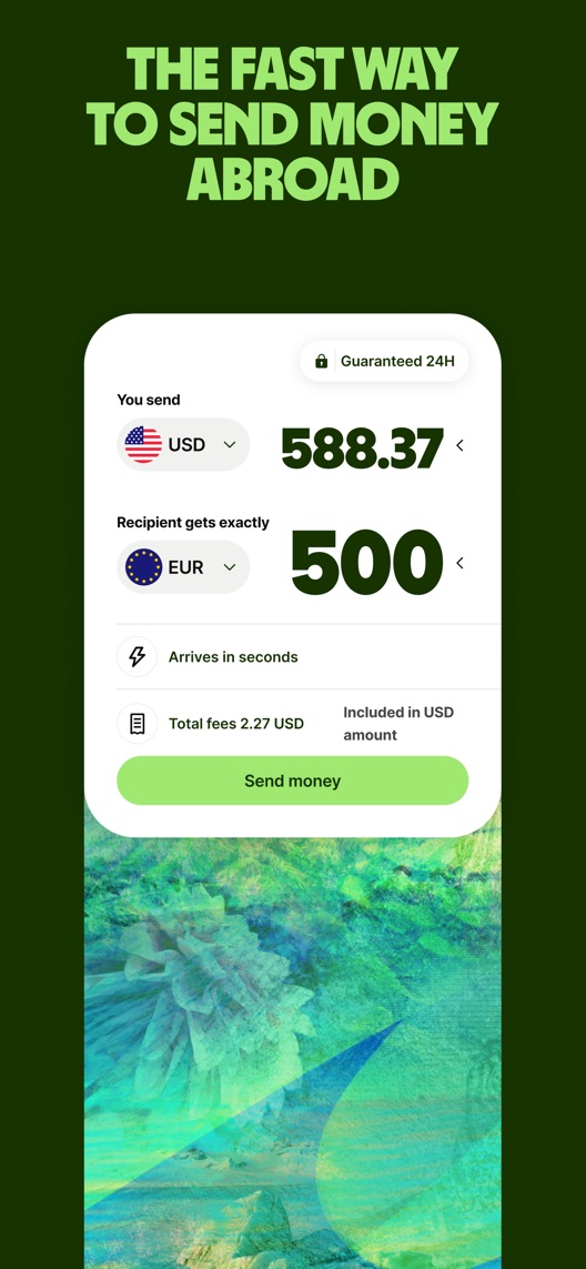
What I saw. The opening shows a USD-to-EUR example with sender amount, recipient amount, fee and arrival message.
My read. A prospective sender can understand the comparison without imagining the interface. The pictured amounts are illustrative, not a current exchange-rate quote.
What I’d do. Keep the concrete quote structure and verify the current corridor and funding-method conditions before producing new examples.
02
Social proof is not a security mechanism.
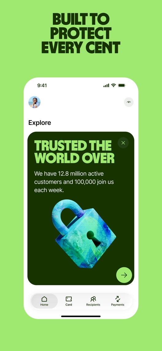
What I saw. The second frame pairs a protection headline with a lock graphic and publisher customer-count claims.
My read. Scale can reassure, but the screen does not explain what protects a transfer or what happens if a problem occurs.
What I’d do. Research whether viewers can separate popularity from actual account controls and support processes.
03
Rate protection and speed sit close together.
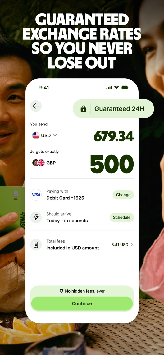
What I saw. The third frame shows a timed guarantee badge, transfer amounts, a payment method and an arrival estimate.
My read. A visitor may confuse the duration of a rate lock with an arrival guarantee. The image alone does not establish the applicable conditions.
What I’d do. Check comprehension and use approved wording that distinguishes the rate, its validity period and estimated delivery.
The screenshot teardown
The original creative is preserved. Numbered notes sit beside each frame so observations and recommendations stay separate.
Frame 01
The quote exposes the main monetary inputs and the amount the recipient would receive in the example.
This is a useful product demonstration, but the pictured rate and fee cannot be treated as a live offer.
Test idea: Preserve the quote layout and use a currently verified, clearly illustrative example in any replacement.
Figure 1. First three still screenshots from the US iPhone listing, captured 30 September 2026. Creative belongs to the app publisher and is reproduced for analysis. Publisher claims inside screenshots are not independently verified.
Western Union foregrounds international cash transfers.
The lesson: Delivery method matters. Do not treat cash collection and bank-account transfers as identical intentions or compare their conditions without current evidence.
Proposed copy for discussion. These are not current listing fields or tested winners.
Observed listing
Wise: Global Money Transfer
Send payments internationally
Proposed alternative
Wise: Global Money Transfer
See fees. Send money abroad.
Name 27/30 · Subtitle 28/30 characters
Figure 3. A metadata alternative to review against the current listing.
Keep the focused name and connect fee visibility to the transfer action. The alternative avoids a numeric fee, exchange-rate advantage or unconditional speed guarantee.
The tradeoff: The current subtitle explicitly names international payments. The proposal repeats part of the name and shifts attention toward cost comprehension, so it may lose useful vocabulary without improving qualified relevance.
A three-frame creative brief
Proposed frame 01
See what you send and receive
Show: A verified current quote with sender amount, recipient amount and all relevant charges.
Preserve the strongest existing proof: the actual decision before a transfer.
Proposed frame 02
Understand the rate and timing
Show: A current review step with separately explained rate validity and estimated arrival.
Prevent two different conditions from being read as a single guarantee.
Proposed frame 03
Follow your transfer
Show: A verified transfer-status view and the actual available help path.
Complete the sender journey without implying that every transfer is instant or risk-free.
Figure 4. A proposed storyboard, not a fabricated screenshot or a launched treatment. Validate features and access before production.
What three reviewers can teach us
These selected accounts address fee visibility and timing. One contains a later improvement within the same review; another carries five stars despite strongly critical text. They do not establish current rates, typical speed, legal status or the merits of individual disputes.
Sample: 3 selected accounts from 8 displayed reviews. Dates: 4 May 2023–28 April 2025. No sentiment percentage is calculated.
4 May 2023 · 5/5 stars
“transparent fee structure”
A May 2023 reviewer valued seeing rates and fees before a transfer.
What I’d investigate: Use fee comprehension as a research lead. The account’s descriptions of banking status and security are not substitutes for current official facts.
An April 2025 account includes an update describing improved delivery and transfer identification after earlier complaints.
What I’d investigate: Preserve the improvement and the date; investigate how estimated timing is understood rather than repeating only the initial criticism.
A January 2025 reviewer disputed transfer timing and cancellation delays.
What I’d investigate: Treat these as unverified service allegations and an expectation-research prompt, not proof of deliberate misconduct or current delivery performance.
Rate validity and arrival estimates appear close together.
Deliverable: A dated terminology check and comprehension questions for each concept.
Product and editorial review
02
Make the rate-lock headline precise
Broad protection wording can be interpreted beyond the shown mechanism.
Deliverable: One approved headline-only alternative for the third frame.
Low creative effort
03
Verify every quote example
Fees and availability depend on the transaction.
Deliverable: A source sheet covering corridor, funding method, amounts, rate validity and estimated arrival.
Required evidence check
One test worth running
Does a more precise rate-lock headline on frame three improve conversion while reducing confusion with arrival guarantees?
Audience
Eligible US English iPhone default-page visitors; interpret results alongside the actual corridor and transfer-intent mix.
Control
Current third-frame wording, provided product review confirms it remains accurate; correct any independently confirmed error consistently before testing.
Treatment
Change only the third-frame headline to approved rate-lock wording, leaving the quote, order, metadata and other frames fixed.
Method
Verify current terms and run comprehension research before eligible App Store product page optimization. The randomized store test measures conversion; interviews separately assess the reason people understood the message.
Primary measure
Platform-reported download conversion within eligible randomized traffic.
Guardrails
Reject wording that makes recruits infer guaranteed arrival, a universal best rate or protection from every financial loss.
Decision rule
Define the useful effect and sample plan using actual baseline traffic. Retain control if inconclusive; download conversion does not establish successful transfers, lower costs or funded accounts.
What could muddy the result
Exchange-rate volatility, corridor mix, payment-method changes and acquisition campaigns may alter the audience and relevance of the example.
Solid. The first and third screenshots show a concrete transfer quote rather than a generic money illustration. The opportunity is precision: the pictured rate-lock badge, arrival message and protection wording answer different questions. Their conditions need to remain distinct before any stronger promise is proposed.
Level 1
Yeah. It really does!
The basics need a serious rethink.
Level 2
I hope no agency is getting paid for this.
Too many obvious things have been left unfinished.
Level 3
The app deserves better.
There is a useful product here. The listing needs to show it.
Level 4
Fine. If ‘fine’ is the goal.
The essentials are there, but there is little to get excited about.
Level 5
Getting there. Keep going.
Good ideas, with a few important gaps still to close.
Level 6Wise is here
Solid. Put the pitchfork down.
A strong foundation. Look for specific improvements, not a complete restart.
Level 7
Whoever did this knows their stuff.
Clear positioning, thoughtful choices and very few loose ends.
Level 8
Okay, now you’re showing off.
An unusually clear, convincing storefront worth learning from.
An editorial verdict on the captured storefront, not a measured ASO score or an assessment of an agency’s private work.
Your ASO assignment
Separate cost, rate validity and arrival timing in your financial app’s creative.
Verify the complete conditions behind one illustrative quote.
Write a headline-only test with independent comprehension checks.
No private analytics, search-rank dataset or internal keyword field was supplied. Review quotations are short excerpts; explanations are our summaries. App names and screenshots belong to their respective owners. We are not affiliated with Wise. Read our editorial methodology.