YNAB sells a different relationship with money, not just a chart of spending. Its listing needs to make that method understandable to someone who has never heard the acronym.
One storefront, one language and a dated capture. This is an independent editorial audit, not a client case study.
Store & market
Apple App Store · United States
Language & device
en-US · iPhone
Captured
30 September 2026
Creative reviewed
First 3 still screenshots; video and other devices excluded
Observed app name · 4/30 characters
YNAB
Observed subtitle · 29/30 characters
Never worry about money again
Open the source listing ↗. Public text cannot reveal the private keyword field, search volumes, rankings or conversion rates. The recommendations below are proposals to validate.
Three things worth your attention
01
The name depends on brand recognition.
What I saw. The public name is YNAB. The subtitle makes an emotional promise rather than naming budgeting.
My read. That may be familiar to referred visitors, but it offers less explicit category context to a newcomer. We cannot infer actual keyword visibility from these two fields.
What I’d do. Review a category-bearing name candidate and test whether new users understand it more quickly.
02
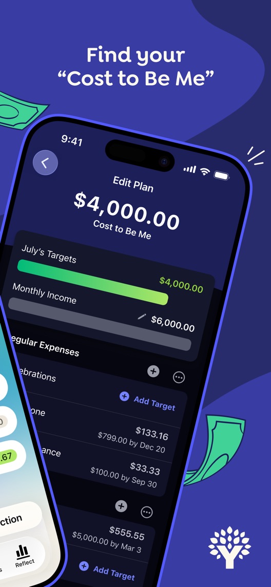
The second frame introduces house terminology.
What I saw. Screenshot two highlights a named cost concept above a planning interface.
My read. The phrase may be meaningful after onboarding. In a store listing, it adds a concept the visitor must decode before seeing the benefit.
What I’d do. Explain the underlying everyday question in proposed copy, then show the product term after the idea makes sense.
03
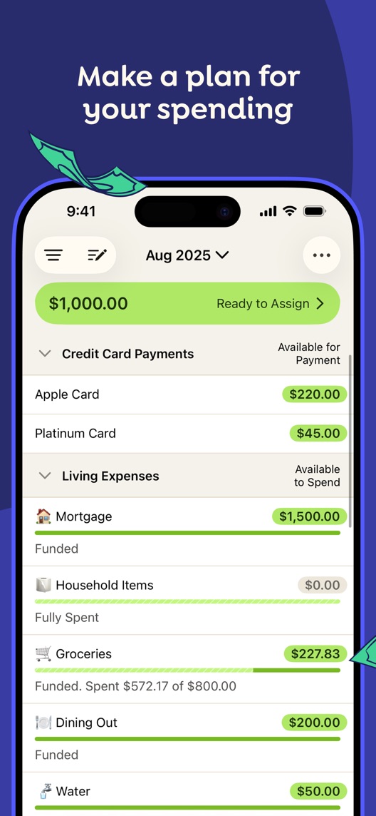
The third frame shows the mechanism more directly.
What I saw. Screenshot three displays spending categories with money assigned and available.
My read. It gives a concrete picture of making decisions before spending. That is more specific than a promise that money worries will disappear.
What I’d do. Bring the planning mechanism earlier in a test and retain a realistic, non-guaranteed outcome.
The screenshot teardown
The original creative is preserved. Numbered notes sit beside each frame so observations and recommendations stay separate.
Frame 01
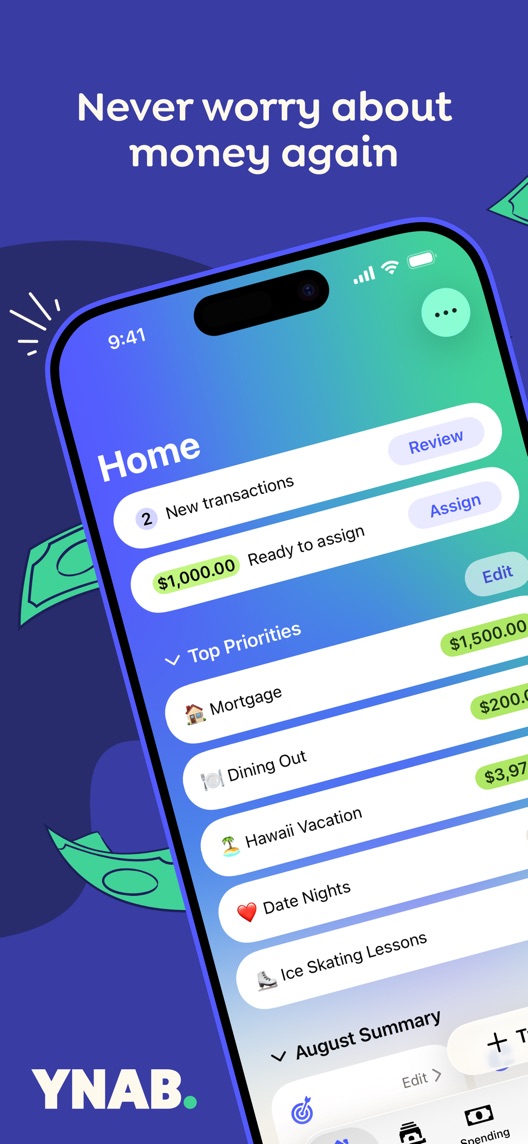
The first frame leads with an expansive emotional promise and a tilted app screen.
The benefit is memorable, but the mechanism is not yet explained to someone unfamiliar with the product.
Test idea: Test a planning-led alternative that names what the user can do, without guaranteeing a financial outcome.
Figure 1. First three still screenshots from the US iPhone listing, captured 30 September 2026. Creative belongs to the app publisher and is reproduced for analysis. Publisher claims inside screenshots are not independently verified.
Rocket Money foregrounds bills, budgets, subscriptions and expense management.
The lesson: A concrete money-management job is easy to recognize. YNAB should clarify its different planning method instead of implying identical functionality.
Proposed copy for discussion. These are not current listing fields or tested winners.
Observed listing
YNAB
Never worry about money again
Proposed alternative
YNAB: Budget & Spending Plan
Give your money a clear plan
Name 28/30 · Subtitle 28/30 characters
Figure 3. A metadata alternative to review against the current listing.
The name candidate explains the product category. The subtitle expresses a controllable action rather than a guarantee that worry will disappear.
The tradeoff: It gives up the simplicity of the brand-only name and some emotional intensity. The repeated planning concept may need refinement after reviewing actual keyword evidence and comprehension results.
A three-frame creative brief
Proposed frame 01
Plan your spending before it happens
Show: A verified current allocation screen with a small number of readable categories.
Explain the mechanism before the house terminology.
Proposed frame 02
Know what you have set aside
Show: A current goal or category view with clear labels.
Make the benefit observable without promising savings amounts.
Proposed frame 03
Adjust the plan when life changes
Show: A product-verified example of reallocating funds between categories.
Present budgeting as an active habit while avoiding a set-and-forget implication.
Figure 4. A proposed storyboard, not a fabricated screenshot or a launched treatment. Validate features and access before production.
What three reviewers can teach us
Three examples from the eight displayed reviews were selected for learning effort, interface change and goal-setting motivation. The dates span 2021–2025; they are individual reports, not evidence of current financial results.
Sample: 3 selected accounts from 8 displayed reviews. Dates: 29 October 2021–22 November 2025. No sentiment percentage is calculated.
29 October 2021 · 5/5 stars
“tutorials first”
The reviewer describes initial setup effort and learning the handling of credit-card purchases.
What I’d investigate: A method-led creative should make the first step approachable without implying the product requires no learning.
The current visible metadata assumes the visitor understands the brand.
Deliverable: A category-bearing name candidate and a short comprehension check.
Metadata research
02
Translate the second-frame concept
Product terminology arrives before its practical meaning is established.
Deliverable: A plain-language headline paired with a verified current screen.
Moderate creative effort
03
Bring allocation forward
The third frame best illustrates the planning mechanism.
Deliverable: An order-only variant and a separate later copy concept.
Low creative effort
One test worth running
Does showing the spending-allocation mechanism before the product-specific concept improve understanding?
Audience
New US English iPhone visitors; distinguish referred brand-aware traffic where reliable data permits.
Control
Current order of the first three screenshots.
Treatment
Swap frames two and three, leaving the metadata and remaining creative unchanged.
Method
Use an eligible App Store product page optimization experiment for the reorder. Evaluate the proposed name separately through research and release planning; do not describe a metadata release comparison as a randomized screenshot test.
Primary measure
Platform-reported download conversion for eligible visitors.
Guardrails
Check whether recruited new users understand that the app involves active planning. No financial-outcome claim is part of the experiment.
Decision rule
Use the actual baseline to predefine the minimum useful improvement, sample requirement and decision date. Keep the current order if the evidence cannot distinguish the variants.
What could muddy the result
Price changes, trial changes, financial seasonality and acquisition campaigns may alter visitor expectations.
Getting there. The creative makes the emotional appeal clear and shows the interface. But a brand-only name and a distinctive product phrase leave a new budgeting shopper to connect some dots. I would test a clearer explanation of the method before reaching for a louder promise.
Level 1
Yeah. It really does!
The basics need a serious rethink.
Level 2
I hope no agency is getting paid for this.
Too many obvious things have been left unfinished.
Level 3
The app deserves better.
There is a useful product here. The listing needs to show it.
Level 4
Fine. If ‘fine’ is the goal.
The essentials are there, but there is little to get excited about.
Level 5YNAB is here
Getting there. Keep going.
Good ideas, with a few important gaps still to close.
Level 6
Solid. Put the pitchfork down.
A strong foundation. Look for specific improvements, not a complete restart.
Level 7
Whoever did this knows their stuff.
Clear positioning, thoughtful choices and very few loose ends.
Level 8
Okay, now you’re showing off.
An unusually clear, convincing storefront worth learning from.
An editorial verdict on the captured storefront, not a measured ASO score or an assessment of an agency’s private work.
Your ASO assignment
Circle every product-specific phrase in your first three screenshots.
Rewrite one phrase as a task a first-time user recognizes.
Check whether the proposed wording promises an action or guarantees an outcome you cannot establish.
No private analytics, search-rank dataset or internal keyword field was supplied. Review quotations are short excerpts; explanations are our summaries. App names and screenshots belong to their respective owners. We are not affiliated with YNAB. Read our editorial methodology.