Candy Crush looks unmistakably like Candy Crush. The question is whether someone who has never played can understand a useful move, an objective and the appeal from the first glance.
One storefront, one language and a dated capture. This is an independent editorial audit, not a client case study.
Store & market
Apple App Store · United States
Language & device
en-US · iPhone
Captured
30 September 2026
Creative reviewed
First 3 still screenshots; video and other devices excluded
Observed app name · 16/30 characters
Candy Crush Saga
Observed subtitle · 28/30 characters
Your Relaxing Puzzle Escape!
Open the source listing ↗. Public text cannot reveal the private keyword field, search volumes, rankings or conversion rates. The recommendations below are proposals to validate.
Three things worth your attention
01
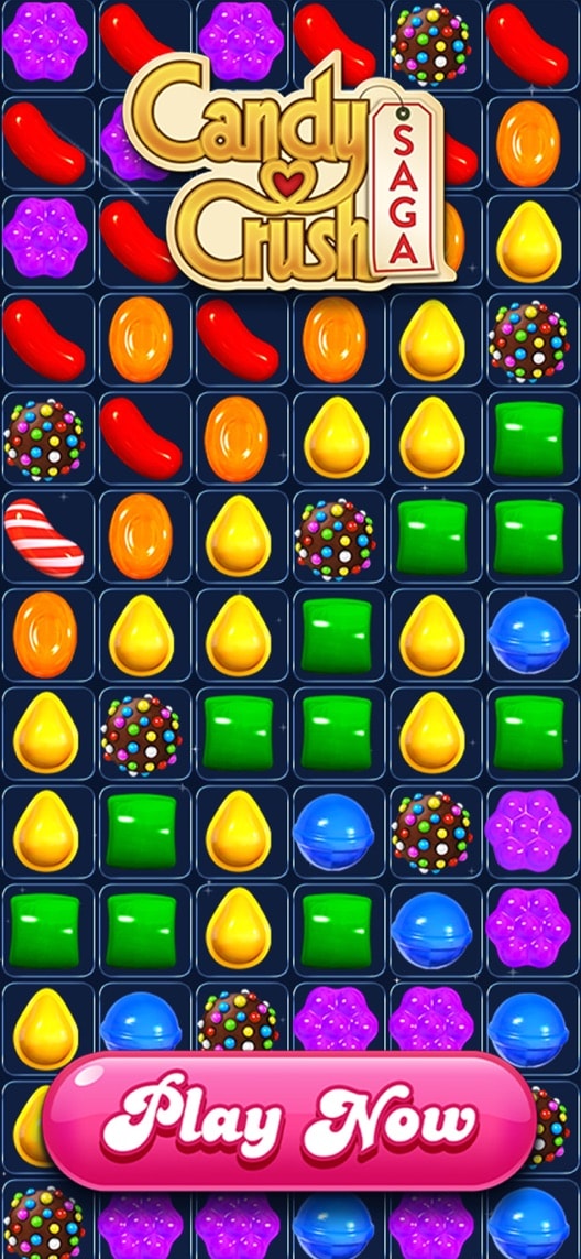
The first still is a brand invitation.
What I saw. A large logo and static play prompt sit over a field of candy pieces.
My read. Returning players can recognise the game instantly. A newcomer gets less help understanding the move they will make or the level objective.
What I’d do. Test an authentic gameplay-led opening while retaining clear brand recognition.
02
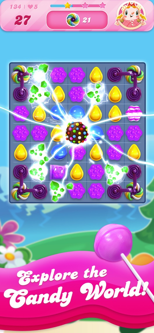
Effects dominate the first visible board.
What I saw. The second frame shows a board, objective indicators and a bright special-candy effect.
My read. The image communicates spectacle. The relationship between the player’s input and that result is harder to infer from the still alone.
What I’d do. Select a verified gameplay capture that preserves the move, objective and result without fabricating an impossible board.
03
The subtitle sets an emotional expectation.
What I saw. The subtitle positions the game as a relaxing puzzle escape, while selected historical reviewers discuss difficulty and frustration.
My read. Those accounts are not representative and do not prove the positioning is wrong. They do justify asking what new players expect from the phrase.
What I’d do. Research the expectation explicitly; a gameplay-led subtitle can be explored without promising how every user will feel.
The screenshot teardown
The original creative is preserved. Numbered notes sit beside each frame so observations and recommendations stay separate.
Frame 01
The first still emphasises brand recognition and an invitation to play rather than a complete level interface.
It is easy to recognise, but gives a new player few clues about objectives or available moves.
Test idea: Compare it with a truthful gameplay opening; keep any static call-to-action visually distinct from the store’s actual install control.
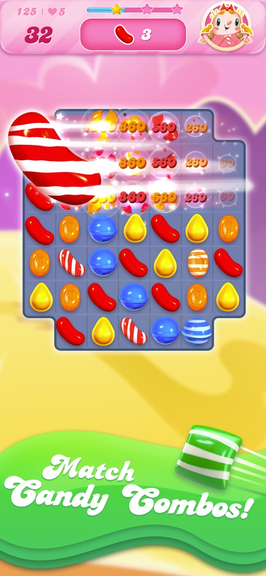
Figure 1. First three still screenshots from the US iPhone listing, captured 30 September 2026. Creative belongs to the app publisher and is reproduced for analysis. Publisher claims inside screenshots are not independently verified.
Proposed copy for discussion. These are not current listing fields or tested winners.
Observed listing
Candy Crush Saga
Your Relaxing Puzzle Escape!
Proposed alternative
Candy Crush Saga
Match candies. Solve puzzles.
Name 16/30 · Subtitle 29/30 characters
Figure 3. A metadata alternative to review against the current listing.
Keep the established brand and use the subtitle to explain the activity. The proposal trades an emotional promise for mechanic clarity; it is not a claim that the existing mood positioning is ineffective.
The tradeoff: A mechanic-led subtitle gives up the explicit relaxation framing and may feel less distinctive to existing fans. Evaluate new-player understanding and qualified genre intent before changing a familiar proposition.
A three-frame creative brief
Proposed frame 01
Make your next match
Show: A real level capture showing a valid move and the relevant objective, approved against current gameplay.
Make the player’s action understandable before amplifying the effect.
Proposed frame 02
Build a candy combination
Show: An authentic combination sequence or truthful still from that mechanic.
Connect the action to the reward without inventing easier play or impossible outcomes.
Proposed frame 03
See what comes next
Show: A verified progression view with accurate representation of level access and purchase context.
Explain the ongoing experience without promising effortless progress.
Figure 4. A proposed storyboard, not a fabricated screenshot or a launched treatment. Validate features and access before production.
What three reviewers can teach us
Three historical complaints from 2022–2024 were selected to examine difficulty, spending expectations and progression. They are not a representative player sample, do not establish current bugs and cannot verify allegations about the game’s commercial design.
Sample: 3 selected accounts from 8 displayed reviews. Dates: 3 June 2022–25 January 2024. No sentiment percentage is calculated.
7 May 2023 · 5/5 stars
“fun and relaxing”
A 2023 reviewer contrasted an expectation of relaxing play with frustration at difficult levels.
What I’d investigate: Research mood and difficulty expectations with new players. Do not treat this single complaint as representative of the game.
A 2024 long-time player described dissatisfaction with spending and late-game progress.
What I’d investigate: Separate a veteran’s late-game account from first-install comprehension; do not repeat their speculation about how difficulty is determined.
A 2022 reviewer described a disputed connectivity and resource-access problem.
What I’d investigate: Check how current acquisition messaging represents progression and optional resources; the old account does not verify a current technical defect.
The proposed opening must reflect a possible current game state.
Deliverable: A recorded source moment and approved still showing a valid move and objective.
Gameplay and creative review
02
Compare the first-frame concept
Brand invitation and mechanic explanation serve different jobs.
Deliverable: One gameplay-led opening against the current brand-led image, with later assets unchanged.
Focused creative production
03
Check mood and purchase expectations
A relaxation message may mean different things to new and veteran players.
Deliverable: A beginner interview guide separating expected challenge, session length and optional purchases.
Small research study
One test worth running
Does an authentic gameplay-led first image convert better than the existing logo-and-play opening?
Audience
Eligible US English iPhone default-page visitors, supplemented by a separate new-player comprehension sample rather than assuming all visitors are beginners.
Control
Current first screenshot and unchanged remaining store assets.
Treatment
Replace only the first screenshot with an approved genuine gameplay example including a valid move, objective and restrained branding.
Method
Use eligible App Store product page optimization for the first-frame concept. Since the image changes as a whole, do not attribute an effect to any one component without a later isolated test.
Primary measure
Platform-reported download conversion for eligible randomized traffic.
Guardrails
Ask recruited newcomers to explain the mechanic and expected challenge/purchases. Do not claim retention or player wellbeing from an install-conversion result.
Decision rule
Predefine the minimum practical improvement and sample plan from the actual baseline. Keep control if uncertainty remains or the treatment depicts gameplay inaccurately.
What could muddy the result
Live events, returning-player campaigns, level updates and shifts in brand familiarity can change the audience during the experiment.
Solid. The visual identity is immediate, and frames two and three show boards, objectives and effects. The opening mostly presents the brand and a large play prompt. A clearer first gameplay moment is worth comparing, while the relaxing positioning needs honest expectation research rather than an assumption that every player experiences it that way.
Level 1
Yeah. It really does!
The basics need a serious rethink.
Level 2
I hope no agency is getting paid for this.
Too many obvious things have been left unfinished.
Level 3
The app deserves better.
There is a useful product here. The listing needs to show it.
Level 4
Fine. If ‘fine’ is the goal.
The essentials are there, but there is little to get excited about.
Level 5
Getting there. Keep going.
Good ideas, with a few important gaps still to close.
Level 6Candy Crush Saga is here
Solid. Put the pitchfork down.
A strong foundation. Look for specific improvements, not a complete restart.
Level 7
Whoever did this knows their stuff.
Clear positioning, thoughtful choices and very few loose ends.
Level 8
Okay, now you’re showing off.
An unusually clear, convincing storefront worth learning from.
An editorial verdict on the captured storefront, not a measured ASO score or an assessment of an agency’s private work.
Your ASO assignment
Record an actual playable moment and identify the input, objective and visible result.
Check the creative against that recording before approving a gameplay claim.
Write separate questions for beginner expectations and veteran progression feedback.
No private analytics, search-rank dataset or internal keyword field was supplied. Review quotations are short excerpts; explanations are our summaries. App names and screenshots belong to their respective owners. We are not affiliated with Candy Crush Saga. Read our editorial methodology.