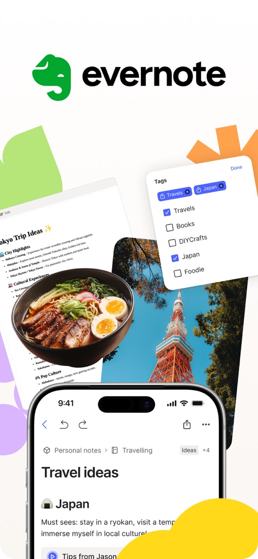
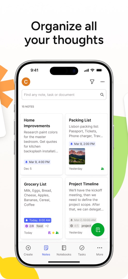
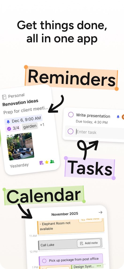
Evernote’s first three stills tell a familiar organisation story: collect travel ideas, browse notes, then connect reminders, tasks and calendar information. There is useful product detail here. The opening, however, asks the visitor to infer the job from a busy collage beneath a large logo. A short, concrete explanation could help without discarding the established design.
One storefront, one language and a dated capture. This is an independent editorial audit, not a client case study.
Store & market
Apple App Store · United States
Language & device
en-US · iPhone
Captured
30 September 2026
Creative reviewed
First 3 still screenshots; video and other devices excluded
Observed app name · 29/30 characters
Evernote: AI Notes & Notebook
Observed subtitle · 29/30 characters
Tasks, memo & lists organizer
Open the source listing ↗. Public text cannot reveal the private keyword field, search volumes, rankings or conversion rates. The recommendations below are proposals to validate.
Three things worth your attention
01
The first frame relies on visual inference.
What I saw. The opening shows the logo, travel notes, photos, tags and a phone view without a benefit headline.
My read. The collage implies collecting a trip’s material, but the viewer has to assemble that meaning from several objects.
What I’d do. Test a concise travel-organisation headline while preserving the actual interface evidence.
02
Organisation is shown across different contexts.
What I saw. The second frame includes home improvements, a packing list, groceries and a project timeline under Organize all your thoughts.
My read. The variety demonstrates breadth, while the search field suggests retrieval without showing a search result.
What I’d do. Verify one capture-to-find journey and use it to make the organisation promise concrete.
03
Several planning features share the third frame.
What I saw. Reminders, tasks and calendar examples appear together, including a dated calendar view.
My read. The collage signals breadth but does not establish sync behaviour, account access or how the features connect.
What I’d do. Verify the current relationship between notes and planning features before calling it one seamless workflow.
The screenshot teardown
The original creative is preserved. Numbered notes sit beside each frame so observations and recommendations stay separate.
Frame 01
Several pieces of trip information are presented together beneath the brand.
The use case is plausible, but its action is less explicit than the later headlines.
Test idea: Add a verified, concise use-case explanation without removing the note evidence or breaking the connected decorative composition.
Figure 1. First three still screenshots from the US iPhone listing, captured 30 September 2026. Creative belongs to the app publisher and is reproduced for analysis. Publisher claims inside screenshots are not independently verified.
The lesson: Capture language is immediately understandable. Demonstrate the actual material Evernote can collect and retrieve without adopting reviewer claims of superiority.
Bear emphasises Markdown notes and focused text editing.
The lesson: Focused writing is a different priority from a mixed-media planning workspace. Make the benefit of Evernote’s breadth visible rather than assuming more features always win.
Figure 2. US listing names and subtitles captured 30 September 2026. These are positioning comparisons, not ranking or revenue comparisons.
The keyword questions I’d investigate
Intent candidates grounded in the listing—not fabricated search-volume or difficulty scores.
note taking app / notebook
Visitor’s job: Capture information and find it later.
Evidence: The name names notes and notebook, while the opening shows a mixed-media travel note.
Decision: Prioritise a verified capture-to-retrieval task and investigate real query relevance before changing metadata.
tasks and reminders / planning notes
Visitor’s job: Connect information with something to do.
Evidence: The subtitle names tasks and the third frame labels reminders and calendar.
Decision: Verify access and integration scope; do not imply all planning features are identical across platforms or plans.
AI notes / AI notebook
Visitor’s job: Use assistance to work with saved information.
Evidence: AI is explicit in the observed name, but the first three stills do not demonstrate an AI interaction.
Decision: Research this expectation separately and require a current input-to-output example before making AI the creative lead.
Proposed copy for discussion. These are not current listing fields or tested winners.
Observed listing
Evernote: AI Notes & Notebook
Tasks, memo & lists organizer
Proposed alternative
Evernote: Notes & Notebook
Capture ideas. Organize tasks.
Name 26/30 · Subtitle 30/30 characters
Figure 3. A metadata alternative to review against the current listing.
Describe the demonstrated core activities and retain the notebook category. The alternative intentionally centres the visible organisation story rather than an AI capability not shown in this sample.
The tradeoff: Removing AI from the title may lose a strategically important audience, while notebook and notes overlap. The change needs actual query and product-positioning evidence, not just a preference for simpler copy.
A three-frame creative brief
Proposed frame 01
Keep your trip ideas together
Show: A verified note combining authorised text, images and tags in the current mobile app.
Make the existing travel example understandable without inventing a new feature.
Proposed frame 02
Find the detail you saved
Show: A current search and result for one item from that same note.
Complete the capture-to-retrieval promise with actual product proof.
Proposed frame 03
Turn a detail into a next step
Show: A verified task or reminder linked to the note, with accurate access conditions.
Connect organisation to action without claiming that every calendar or integration works identically.
Figure 4. A proposed storyboard, not a fabricated screenshot or a launched treatment. Validate features and access before production.
What three reviewers can teach us
Three accounts from 2021, 2022 and 2025 were selected for continuity, capture and planning. Two explicitly describe improvements or recovery after earlier problems. They do not establish current sync reliability, ownership effects, plan access or comparative product quality.
Sample: 3 selected accounts from 8 displayed reviews. Dates: 28 July 2021–16 May 2025. No sentiment percentage is calculated.
16 May 2025 · 4/5 stars
“favorite note-taking app”
A May 2025 account contains several updates: criticism of interruptions followed by improved usability and continued preference for Evernote.
What I’d investigate: Preserve the improvement rather than extracting only the earlier complaint; investigate interruption-free capture today.
The logo and collage leave the use-case sentence implicit.
Deliverable: One first-frame headline treatment preserving the connected artwork.
Low creative effort
02
Complete the capture-to-find story
The grid shows stored notes but not successful retrieval.
Deliverable: A verified travel-note capture and search walkthrough.
Product research
03
Resolve the AI expectation
The title and first three stills emphasise different aspects.
Deliverable: A positioning decision backed by current AI workflow and query evidence.
Research and product review
One test worth running
Does a concrete travel-organisation headline help visitors understand the opening collage and improve conversion?
Audience
Eligible US English iPhone default-page visitors, with separate research among note-taking and planning prospects.
Control
The current first frame with its logo and travel collage, with the connected decorative sequence retained.
Treatment
Add one approved Keep your trip ideas together headline in a redesigned first-frame text area; preserve the depicted interfaces, boundary artwork, later frames and metadata.
Method
Verify the depicted workflow and readability, then use eligible App Store product page optimization. This tests a headline-and-layout treatment rather than text alone.
Primary measure
Platform-reported download conversion for eligible randomized traffic.
Guardrails
Visitors should understand collecting and organising notes without inferring an unshown AI capability or guaranteed synchronisation. Capture success needs separate valid measurement.
Decision rule
Set useful effect and required sample using baseline traffic before launch. Keep control if inconclusive and do not generalise a travel-led result to all productivity intentions.
What could muddy the result
AI launches, pricing changes, school and work seasons, and shifts between existing and new users may alter results.
Solid. Real note and organisation interfaces carry the story, and the examples span personal and project use. The opportunity is a clearer opening action and a more explicit connection between capture and retrieval. The current AI-led title does not mean every pictured feature is AI-powered, and these stills do not establish an AI workflow.
Level 1
Yeah. It really does!
The basics need a serious rethink.
Level 2
I hope no agency is getting paid for this.
Too many obvious things have been left unfinished.
Level 3
The app deserves better.
There is a useful product here. The listing needs to show it.
Level 4
Fine. If ‘fine’ is the goal.
The essentials are there, but there is little to get excited about.
Level 5
Getting there. Keep going.
Good ideas, with a few important gaps still to close.
Level 6Evernote is here
Solid. Put the pitchfork down.
A strong foundation. Look for specific improvements, not a complete restart.
Level 7
Whoever did this knows their stuff.
Clear positioning, thoughtful choices and very few loose ends.
Level 8
Okay, now you’re showing off.
An unusually clear, convincing storefront worth learning from.
An editorial verdict on the captured storefront, not a measured ASO score or an assessment of an agency’s private work.
Your ASO assignment
Record a current capture, search and task-linking journey using one note.
Brief a first-frame explanation that preserves connected artwork.
Separate what the title promises about AI from what the three screenshots actually demonstrate.
No private analytics, search-rank dataset or internal keyword field was supplied. Review quotations are short excerpts; explanations are our summaries. App names and screenshots belong to their respective owners. We are not affiliated with Evernote. Read our editorial methodology.