Notion makes organization look appealing. But a newcomer looking at these first three frames sees a finished workspace, not how to turn a thought into something useful on a phone.
One storefront, one language and a dated capture. This is an independent editorial audit, not a client case study.
Store & market
Apple App Store · United States
Language & device
en-US · iPhone
Captured
30 September 2026
Creative reviewed
First 3 still screenshots; video and other devices excluded
Observed app name · 24/30 characters
Notion: Notes, Tasks, AI
Observed subtitle · 30/30 characters
Plan, organize, track projects
Open the source listing ↗. Public text cannot reveal the private keyword field, search volumes, rankings or conversion rates. The recommendations below are proposals to validate.
Three things worth your attention
01
The opening is a mood, not a demonstration.
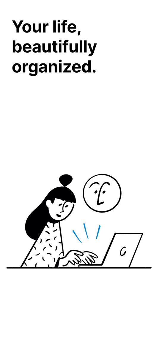
What I saw. Frame one pairs an organization promise with a monochrome illustration of a person at a laptop.
My read. It is clear branding, but the laptop illustration does not establish the value of installing the iPhone app.
What I’d do. Replace only the first-frame concept in a later test with a mobile capture task using authentic current UI.
02
Two workspace views repeat the same message.
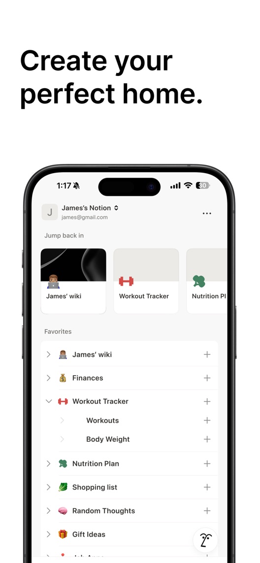
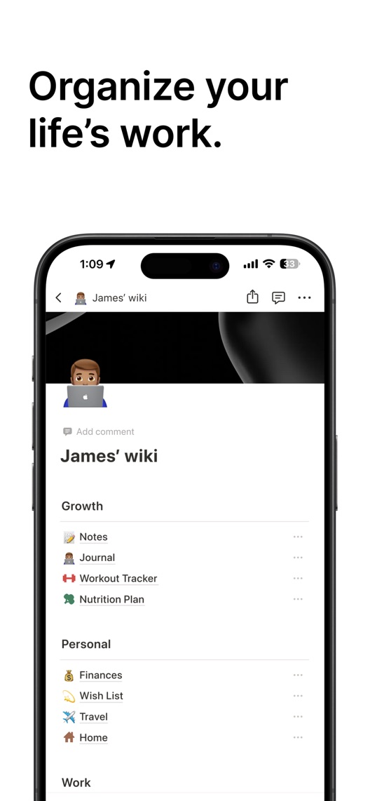
What I saw. Frames two and three show a personal home and a wiki with nested areas for work, life and interests.
My read. The range may reassure established users. A beginner still has to imagine the steps between an empty account and this developed system.
What I’d do. Show a small input and its organised result rather than two versions of the destination.
03
AI appears in the name but not in these first three stills.
What I saw. The observed name includes notes, tasks and AI. The captured first three screenshots show personal organisation rather than an explicit AI interaction.
My read. The listing makes a broader promise than the opening sequence demonstrates. That does not prove the feature is absent elsewhere.
What I’d do. Decide which visitor intent this opening serves, then demonstrate that intent without implying every AI feature is included in every plan.
The screenshot teardown
The original creative is preserved. Numbered notes sit beside each frame so observations and recommendations stay separate.
Frame 01
The image introduces an organisation promise without showing the phone interface.
The visual is recognisably Notion, but it leaves the mobile job undefined.
Test idea: Keep the monochrome style and test one real mobile task in this position.
Figure 1. First three still screenshots from the US iPhone listing, captured 30 September 2026. Creative belongs to the app publisher and is reproduced for analysis. Publisher claims inside screenshots are not independently verified.
Proposed copy for discussion. These are not current listing fields or tested winners.
Observed listing
Notion: Notes, Tasks, AI
Plan, organize, track projects
Proposed alternative
Notion: Notes, Tasks, AI
Capture ideas. Organize work.
Name 24/30 · Subtitle 29/30 characters
Figure 3. A metadata alternative to review against the current listing.
Retain the existing name and try a subtitle built around a starting action and its purpose. The hypothesis is better first-use comprehension, not guaranteed additional indexing or demand.
The tradeoff: The alternative removes explicit project tracking from the subtitle and still does not explain AI entitlement. Compare it with project-oriented visitor language and confirm every demonstrated mobile action before release.
A three-frame creative brief
Proposed frame 01
Save the idea while it is fresh
Show: A current iPhone workflow creating one short note in a real workspace.
A specific beginning makes the larger organisation promise easier to believe.
Proposed frame 02
Give it a home
Show: The saved note inside one useful project or personal page, with a clear relationship to frame one.
Connect the input to the organised result instead of showing unrelated finished dashboards.
Proposed frame 03
Find it when you need it
Show: Verified mobile search retrieving that same note; use AI only if the demonstrated capability and access are confirmed.
Show a complete useful loop, not a catalogue of workspace possibilities.
Figure 4. A proposed storyboard, not a fabricated screenshot or a launched treatment. Validate features and access before production.
What three reviewers can teach us
These three displayed reviews were selected for calendar use, learning and portability. They date from 2021 and 2024. One complaint carries five stars, illustrating why star counts alone are not a reliable coding method; none proves a current defect.
Sample: 3 selected accounts from 8 displayed reviews. Dates: 29 July 2021–20 September 2024. No sentiment percentage is calculated.
20 September 2024 · 5/5 stars
“calendar view”
A 2024 reviewer valued calendar views and cross-device work, while describing old limitations.
What I’d investigate: Recruit people with a concrete planning job. Recheck offline and device behaviour rather than treating this historical account as current documentation.
An all-purpose workspace needs a concrete entry point.
Deliverable: One capture-to-retrieval scenario verified on the current iPhone app.
Product walkthrough
02
Produce one first-frame treatment
The opening can demonstrate utility while retaining the brand.
Deliverable: An authentic capture screen with one action-led headline; frames two onward unchanged.
Focused creative work
03
Map AI promises to access
The name and creative should describe a consistent experience.
Deliverable: A feature/plan matrix and decision on whether the default opening should foreground AI.
Product and editorial review
One test worth running
Does a mobile capture demonstration in frame one communicate a clearer reason to install than the illustration-led opening?
Audience
Eligible US English iPhone product-page visitors, with a separate beginner comprehension sample that excludes existing power users.
Control
Current illustrated first frame and the unchanged remaining screenshot sequence.
Treatment
Replace the first frame only with a verified note-capture UI and an action-led headline in the existing visual style.
Method
First verify that recruited newcomers understand the example. Then use eligible App Store product page optimization for the first-frame creative; leave subtitle changes for a separate decision.
Primary measure
Platform-reported download conversion for the randomized screenshot variants.
Guardrails
Ask research participants what is included and how they would start. Avoid attributing activation or paid-plan outcomes to a store variant without valid attribution.
Decision rule
Predefine the useful effect, required sample and review point using actual traffic. Reject a concept that systematically creates false AI or plan expectations even if attention improves.
What could muddy the result
AI launches, plan changes, student campaigns and desktop-to-mobile migrations can shift the balance between newcomers and existing users.
Getting there. The typography, illustration and workspace examples are coherent, and the metadata describes several real product jobs. The first three stills lean heavily on organization while the name also advertises AI. I would make one mobile task explicit before expanding the story.
Level 1
Yeah. It really does!
The basics need a serious rethink.
Level 2
I hope no agency is getting paid for this.
Too many obvious things have been left unfinished.
Level 3
The app deserves better.
There is a useful product here. The listing needs to show it.
Level 4
Fine. If ‘fine’ is the goal.
The essentials are there, but there is little to get excited about.
Level 5Notion is here
Getting there. Keep going.
Good ideas, with a few important gaps still to close.
Level 6
Solid. Put the pitchfork down.
A strong foundation. Look for specific improvements, not a complete restart.
Level 7
Whoever did this knows their stuff.
Clear positioning, thoughtful choices and very few loose ends.
Level 8
Okay, now you’re showing off.
An unusually clear, convincing storefront worth learning from.
An editorial verdict on the captured storefront, not a measured ASO score or an assessment of an agency’s private work.
Your ASO assignment
Identify one mobile job that your first screenshot should explain.
Draw the input, saved result and retrieval step using current product behaviour.
List which promises require plan, device or offline-access verification before creative production.
No private analytics, search-rank dataset or internal keyword field was supplied. Review quotations are short excerpts; explanations are our summaries. App names and screenshots belong to their respective owners. We are not affiliated with Notion. Read our editorial methodology.