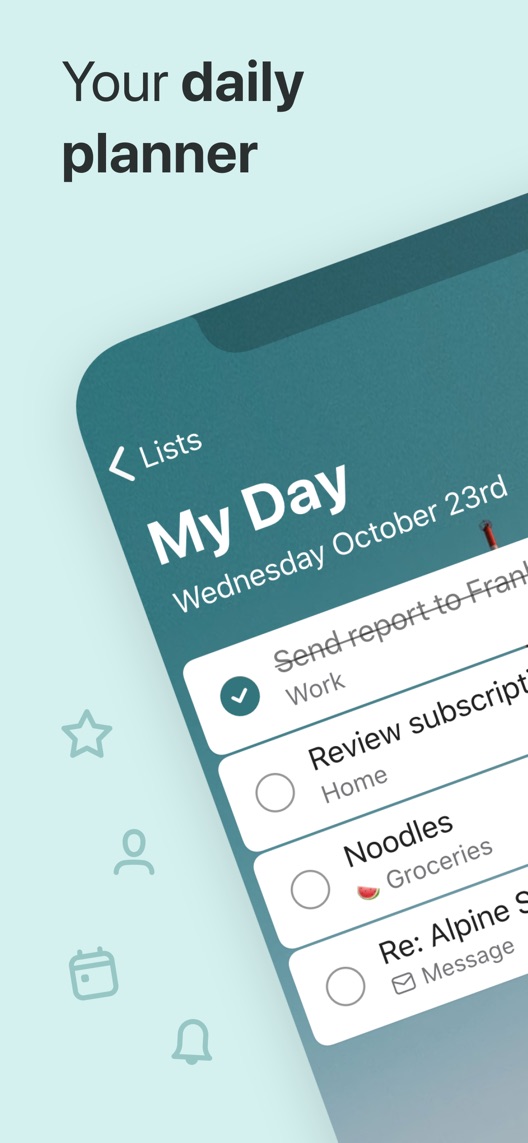
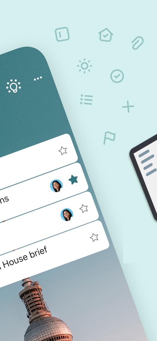
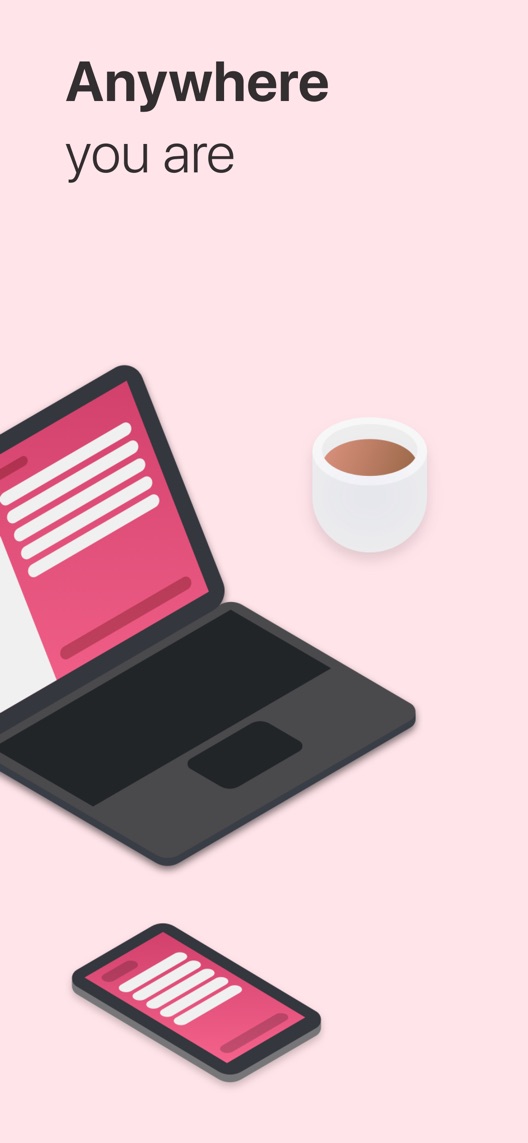
Microsoft To Do has a straightforward proposition: capture tasks and remember what matters. Its opening artwork spreads a daily list across two frames, then uses a device illustration to suggest access elsewhere. The content is relevant; the opportunity is to make the first useful workflow easier to see at store size.
One storefront, one language and a dated capture. This is an independent editorial audit, not a client case study.
Store & market
Apple App Store · United States
Language & device
en-US · iPhone
Captured
30 September 2026
Creative reviewed
First 3 still screenshots; video and other devices excluded
Observed app name · 15/30 characters
Microsoft To Do
Observed subtitle · 29/30 characters
Capture Tasks & Set Reminders
Open the source listing ↗. Public text cannot reveal the private keyword field, search volumes, rankings or conversion rates. The recommendations below are proposals to validate.
Three things worth your attention
01
The first pair is one composition.
What I saw. The opening shows part of My Day; the second continues the tilted list and surrounding icons.
My read. The pair communicates a daily planner, but individual task text is cropped and the continuation has no independent explanatory headline.
What I’d do. Keep both original panels together as control and build a complete alternative pair rather than reordering fragments.
02
The visible list mixes useful everyday contexts.
What I saw. The opening contains work, home, groceries and message-related entries.
My read. This makes the product feel broader than an office-only task system. It does not explain how a task moves from capture into today’s priorities.
What I’d do. Show one realistic capture-and-selection example using the current mobile interface.
03
Cross-device access is suggested, not demonstrated.
What I saw. The third frame shows a laptop and phone illustration under a location-independent message.
My read. The concept is easy to understand, but an illustration cannot prove sync timing, account compatibility or offline behaviour.
What I’d do. Verify the current cross-device journey before presenting the same task on two devices as proof.
The screenshot teardown
The original creative is preserved. Numbered notes sit beside each frame so observations and recommendations stay separate.
Frame 01
The list mixes several personal and work-related tasks, including a completed item.
The daily-planning job is recognisable, but the crop hides parts of the task text and how entries were chosen.
Test idea: Propose a current, readable day-plan screen connected to an actual capture step.
Figure 1. First three still screenshots from the US iPhone listing, captured 30 September 2026. Creative belongs to the app publisher and is reproduced for analysis. Publisher claims inside screenshots are not independently verified.
Any.do names lists, planning, reminders, calendars and tasks.
The lesson: The category vocabulary is crowded. A short real workflow can differentiate the experience more credibly than another broad productivity promise.
Figure 2. US listing names and subtitles captured 30 September 2026. These are positioning comparisons, not ranking or revenue comparisons.
The keyword questions I’d investigate
Intent candidates grounded in the listing—not fabricated search-volume or difficulty scores.
to do list / task reminders
Visitor’s job: Capture something to do and remember it later.
Evidence: The subtitle names task capture and reminders; the opening shows a task list.
Decision: Verify the current capture and reminder steps before claiming a specific input method or automatic scheduling capability.
daily planner / daily priorities
Visitor’s job: Choose a manageable set of tasks for today.
Evidence: The opening centres on My Day and mixes tasks from several contexts.
Decision: Research how newcomers distinguish a daily list from a calendar or time-blocking planner.
shared list / cross-device tasks
Visitor’s job: Use tasks across people or devices.
Evidence: People icons appear in the opening pair and the third frame depicts a laptop and phone.
Decision: Treat these as capabilities to verify in the current product, not proof of unrestricted sharing, instant sync or offline parity.
Proposed copy for discussion. These are not current listing fields or tested winners.
Observed listing
Microsoft To Do
Capture Tasks & Set Reminders
Proposed alternative
Microsoft To Do
Plan your day. Remember tasks.
Name 15/30 · Subtitle 30/30 characters
Figure 3. A metadata alternative to review against the current listing.
Keep the Microsoft identity and connect day planning to remembering tasks. The proposed copy mirrors the visible daily list without promising calendar functions or a particular integration.
The tradeoff: The current subtitle explicitly names task capture and setting reminders. The alternative is more outcome-oriented but less literal about those features, so test comprehension and query relevance before adopting it.
A three-frame creative brief
Proposed frame 01
Get the task out of your head
Show: A verified current mobile task-entry screen with one fictional everyday example.
Make the first action obvious rather than relying on an already-populated list.
Proposed frame 02
Choose what matters today
Show: The same task appearing in a verified My Day workflow, with readable surrounding context.
Connect capture to a day plan without implying automatic prioritisation that has not been verified.
Proposed frame 03
Pick it up on another device
Show: Authentic current interfaces showing that same task under the required account setup.
Demonstrate continuation only after testing the actual sync and access conditions.
Figure 4. A proposed storyboard, not a fabricated screenshot or a launched treatment. Validate features and access before production.
What three reviewers can teach us
The selected accounts span 2019–2024 and focus on capture, cross-device use and list organisation. They are historical motivation and comprehension leads. They do not demonstrate current feature availability, sync reliability or measured productivity gains.
Sample: 3 selected accounts from 8 displayed reviews. Dates: 16 October 2019–13 July 2024. No sentiment percentage is calculated.
27 May 2021 · 5/5 stars
“thoughts organized”
A May 2021 reviewer described capturing many kinds of tasks and using a personal emoji organisation method.
What I’d investigate: Use the capture motivation as a research lead; the reviewer’s custom system and productivity claims are not built-in feature guarantees.
An October 2019 reviewer valued cross-platform use and also requested features and reported a date issue.
What I’d investigate: Verify present behaviour independently. Historical requests and claims about sync do not establish today’s capabilities or defects.
The current artwork begins with the result, not the action that produces it.
Deliverable: A current mobile walkthrough from entering a task to selecting it for the day.
Product verification
02
Replace the pair as a unit
The second image is a continuation, not an independent starting point.
Deliverable: A two-frame capture-and-day-plan alternative with readable task text.
Focused creative production
03
Make cross-device proof concrete
The current third frame relies on illustration.
Deliverable: A checked same-task continuation example with documented account and sync requirements.
Product and creative review
One test worth running
Does a capture-to-My-Day opening pair improve conversion compared with the current panoramic daily-list pair?
Audience
Eligible US English iPhone default-page visitors, interpreted alongside work, personal and existing Microsoft-account intentions.
Control
The complete existing first-two-frame composition, with the device illustration and all later frames unchanged.
Treatment
Replace the opening pair with verified task-entry and My Day screens showing one connected example; keep metadata, access messages and later creative fixed.
Method
Check workflow accuracy and newcomer comprehension, then use eligible App Store product page optimization. This compares complete two-frame narratives, not a single typography or crop adjustment.
Primary measure
Platform-reported download conversion for eligible randomized traffic.
Guardrails
In separate research check that people do not infer a calendar, automatic prioritisation or unrestricted collaboration beyond the verified product.
Decision rule
Define a meaningful effect and sample plan from actual baseline traffic. Retain control if inconclusive; downloads do not establish completed tasks, daily retention or productivity improvement.
What could muddy the result
Microsoft ecosystem campaigns, work-versus-personal acquisition, app feature changes and the share of existing-account users can affect interpretation.
Getting there. The listing shows a recognisable daily task list and keeps a calm visual style. However, the second still mainly completes the opening composition, and the cross-device frame is an illustration rather than a demonstrated continuation of a task. A complete capture-to-day-plan story could use the same space more effectively.
Level 1
Yeah. It really does!
The basics need a serious rethink.
Level 2
I hope no agency is getting paid for this.
Too many obvious things have been left unfinished.
Level 3
The app deserves better.
There is a useful product here. The listing needs to show it.
Level 4
Fine. If ‘fine’ is the goal.
The essentials are there, but there is little to get excited about.
Level 5Microsoft To Do is here
Getting there. Keep going.
Good ideas, with a few important gaps still to close.
Level 6
Solid. Put the pitchfork down.
A strong foundation. Look for specific improvements, not a complete restart.
Level 7
Whoever did this knows their stuff.
Clear positioning, thoughtful choices and very few loose ends.
Level 8
Okay, now you’re showing off.
An unusually clear, convincing storefront worth learning from.
An editorial verdict on the captured storefront, not a measured ASO score or an assessment of an agency’s private work.
Your ASO assignment
Document how a new task reaches the daily plan in your actual mobile product.
Keep connected screenshot artwork intact when constructing a control.
Verify same-task continuation before replacing device illustrations with a cross-device promise.
No private analytics, search-rank dataset or internal keyword field was supplied. Review quotations are short excerpts; explanations are our summaries. App names and screenshots belong to their respective owners. We are not affiliated with Microsoft To Do. Read our editorial methodology.