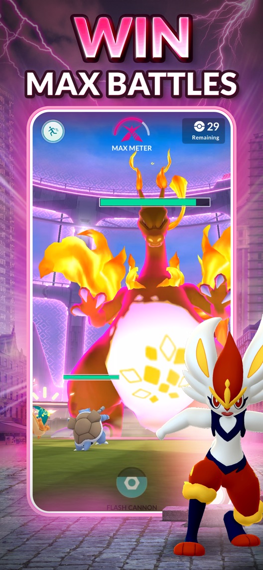
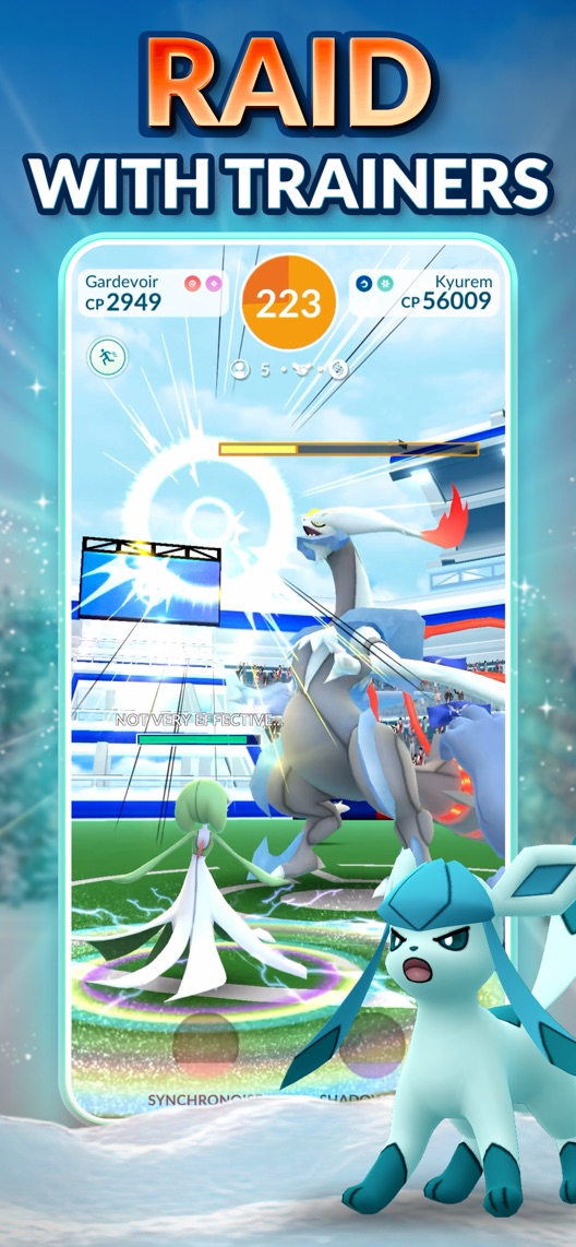
Pokémon GO opens with its tenth-anniversary branding and Twilight Trails artwork, then moves straight into Max Battles and raids. For someone who already knows the game, that is a recognisable invitation back. For someone considering a first install, the first three stills spend more effort on the season and advanced activities than on explaining what they will do first.
One storefront, one language and a dated capture. This is an independent editorial audit, not a client case study.
Store & market
Apple App Store · United States
Language & device
en-US · iPhone
Captured
30 September 2026
Creative reviewed
First 3 still screenshots; video and other devices excluded
Observed app name · 10/30 characters
Pokémon GO
Observed subtitle · 30/30 characters
Epic AR adventure & online RPG
Open the source listing ↗. Public text cannot reveal the private keyword field, search volumes, rankings or conversion rates. The recommendations below are proposals to validate.
Three things worth your attention
01
The opening is campaign artwork.
What I saw. The first frame contains anniversary and Twilight Trails branding in an illustrated autumn scene, without a visible game interface.
My read. It can make an established game feel timely, but the name of a season does not explain the beginner action.
What I’d do. Compare a verified first-encounter concept within the same campaign window, preserving the seasonal context.
02
Two battle formats follow immediately.
What I saw. The second frame promotes Max Battles and the third says Raid with Trainers, both with battle interfaces.
My read. The sequence provides depth for experienced players while asking new visitors to understand different activities before seeing the basic discovery loop.
What I’d do. Research whether first-time prospects can explain the game from these three frames.
03
The access conditions are outside the image.
What I saw. The battle examples show opponents, meters and timers, but do not explain participation requirements.
My read. A screenshot cannot establish which activities a new account can immediately join, or what is local, remote or time-limited.
What I’d do. Verify current eligibility and access before promising an immediate raid or event experience.
The screenshot teardown
The original creative is preserved. Numbered notes sit beside each frame so observations and recommendations stay separate.
Frame 01
The opening communicates a dated seasonal campaign rather than a live game screen.
That is useful for recognition and return intent, but leaves a newcomer’s first task implicit.
Test idea: Keep this campaign as the control and verify the event window before testing a product-led replacement.
Figure 1. First three still screenshots from the US iPhone listing, captured 30 September 2026. Creative belongs to the app publisher and is reproduced for analysis. Publisher claims inside screenshots are not independently verified.
Pikmin Bloom names walking, step counting and collecting.
The lesson: Its activity language makes the everyday action explicit. Pokémon GO can explain its own exploration loop without implying the two games have identical mechanics.
Ingress invites exploration and hacking the planet.
The lesson: Real-world exploration is adjacent competitive territory. Demonstrate the actual player action rather than relying only on an AR category label.
Pokémon TCG Pocket explicitly describes Pokémon cards on mobile.
The lesson: This is a same-franchise alternative with a different collecting format, not a location-game equivalent. Make Pokémon GO’s particular experience legible.
Figure 2. US listing names and subtitles captured 30 September 2026. These are positioning comparisons, not ranking or revenue comparisons.
The keyword questions I’d investigate
Intent candidates grounded in the listing—not fabricated search-volume or difficulty scores.
Pokémon game / Pokémon GO
Visitor’s job: Find a specific franchise experience or return to this game.
Evidence: The name and anniversary creative strongly support brand intent.
Decision: Separate new-install and returning-player research instead of assuming both groups need the same opening.
AR adventure / exploration game
Visitor’s job: Understand how play connects with the surrounding world.
Evidence: The observed subtitle names AR adventure, while the first three stills emphasise campaign art and battles.
Decision: Verify and demonstrate the current beginner exploration and encounter flow; do not invent search demand.
Pokémon raids / Max Battles
Visitor’s job: Participate in a known battle activity.
Evidence: These features are explicitly named in frames two and three.
Decision: Research them as experienced-player intentions and verify access, timing and any relevant requirements.
Proposed copy for discussion. These are not current listing fields or tested winners.
Observed listing
Pokémon GO
Epic AR adventure & online RPG
Proposed alternative
Pokémon GO
Explore. Catch. Battle.
Name 10/30 · Subtitle 23/30 characters
Figure 3. A metadata alternative to review against the current listing.
Keep the franchise name and describe a short activity sequence instead of relying on category abbreviations. The copy is a proposal requiring current beginner-flow verification before adoption.
The tradeoff: It removes the explicit AR and online RPG terms and omits the seasonal message. Simpler activity language may not improve relevant discovery or appeal to established players.
A three-frame creative brief
Proposed frame 01
Find your next Pokémon
Show: A verified current map-to-encounter example with seasonal branding and an authentic possible game state.
Explain the entry action while keeping the campaign recognisable.
Proposed frame 02
Make the catch
Show: A current capture interaction and its real result, without promising a rare encounter or success.
Complete a small playable loop before introducing advanced activities.
Proposed frame 03
Discover the next challenge
Show: A verified battle-entry screen with accurate eligibility and event context.
Connect the beginner action to deeper play without pretending every activity is immediately available.
Figure 4. A proposed storyboard, not a fabricated screenshot or a launched treatment. Validate features and access before production.
What three reviewers can teach us
Three accounts from 2021–2023 were selected for franchise motivation, battle expectations and social participation. Several passages request features rather than describe available ones. Historical prices, broad player-sentiment claims and personal health benefits are not adopted as current facts.
Sample: 3 selected accounts from 8 displayed reviews. Dates: 6 December 2021–29 May 2023. No sentiment percentage is calculated.
29 May 2023 · 4/5 stars
“raid invites”
A May 2023 reviewer loved the franchise experience but objected to remote-raid and storage pricing changes.
What I’d investigate: Treat price and participation concerns as historical research leads; the quoted amounts and company claims are not current verified facts.
A February 2022 account praised the game while proposing alternative battle mechanics and exploration features.
What I’d investigate: Feature requests are not descriptions of implemented gameplay. Verify the current loop before using any suggested mechanic in creative.
Seasonal artwork and two advanced activities dominate the opening.
Deliverable: One verified first-encounter creative concept within the same season.
Gameplay and creative work
02
Separate new and returning needs
Feature names mean different things to different visitors.
Deliverable: A comprehension study with both familiarity groups.
Research required
03
Verify battle access
The images do not establish participation requirements.
Deliverable: A dated eligibility sheet for the featured activities.
Required product check
One test worth running
Does a first-encounter opening improve newcomer understanding and download conversion during the current seasonal campaign?
Audience
Eligible US English iPhone default-page traffic, with separate comprehension research among new and returning players.
Control
The current anniversary and Twilight Trails opening while that campaign remains valid.
Treatment
Replace only frame one with a verified map-to-encounter concept carrying the same seasonal context; keep the battle frames, metadata and later assets fixed.
Method
Verify the game state and eligibility, then use eligible App Store product page optimization. This compares complete opening concepts and cannot isolate the effect of one headline.
Primary measure
Platform-reported download conversion for eligible randomized traffic.
Guardrails
Newcomers should understand the first action without expecting an immediate rare encounter, guaranteed win or unrestricted battle access. Retention requires separate valid measurement.
Decision rule
Set useful effect, required sample and the end date from actual baseline traffic before launch. Keep control if inconclusive and end the test before the seasonal context expires.
What could muddy the result
Events, returning-player campaigns, local play opportunities and game updates may change the result.
Getting there. The campaign is visually distinctive and the battle frames show game interfaces. The opportunity is to explain the entry experience before relying on franchise and feature familiarity. A seasonal capture does not establish the year-round creative strategy, and this audit has no evidence of conversion or retention performance.
Level 1
Yeah. It really does!
The basics need a serious rethink.
Level 2
I hope no agency is getting paid for this.
Too many obvious things have been left unfinished.
Level 3
The app deserves better.
There is a useful product here. The listing needs to show it.
Level 4
Fine. If ‘fine’ is the goal.
The essentials are there, but there is little to get excited about.
Level 5Pokémon GO is here
Getting there. Keep going.
Good ideas, with a few important gaps still to close.
Level 6
Solid. Put the pitchfork down.
A strong foundation. Look for specific improvements, not a complete restart.
Level 7
Whoever did this knows their stuff.
Clear positioning, thoughtful choices and very few loose ends.
Level 8
Okay, now you’re showing off.
An unusually clear, convincing storefront worth learning from.
An editorial verdict on the captured storefront, not a measured ASO score or an assessment of an agency’s private work.
Your ASO assignment
Record the current first exploration, encounter and capture sequence.
List the access requirements for each battle activity pictured.
Brief one seasonal opening that explains an action a new player can actually take.
No private analytics, search-rank dataset or internal keyword field was supplied. Review quotations are short excerpts; explanations are our summaries. App names and screenshots belong to their respective owners. We are not affiliated with Pokémon GO. Read our editorial methodology.