Todoist’s screenshots do something many listings miss: they show the work happening. The next question is whether a first-time visitor understands the clever bits as quickly as an existing user does.
One storefront, one language and a dated capture. This is an independent editorial audit, not a client case study.
Store & market
Apple App Store · United States
Language & device
en-US · iPhone
Captured
30 September 2026
Creative reviewed
First 3 still screenshots; video and other devices excluded
Observed app name · 30/30 characters
Todoist: To Do List & Calendar
Observed subtitle · 24/30 characters
Task manager & Reminders
Open the source listing ↗. Public text cannot reveal the private keyword field, search volumes, rankings or conversion rates. The recommendations below are proposals to validate.
Three things worth your attention
01
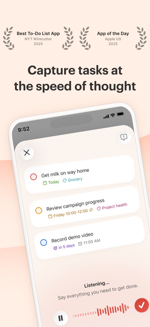
The first frame demonstrates capture.
What I saw. Screenshot one shows a listening state and example tasks with dates and labels.
My read. The interface supports the speed proposition. It also raises practical questions about input methods and availability that a headline alone cannot answer.
What I’d do. Verify which shown capture features are available to the intended plan, device and language before reusing this creative.
02
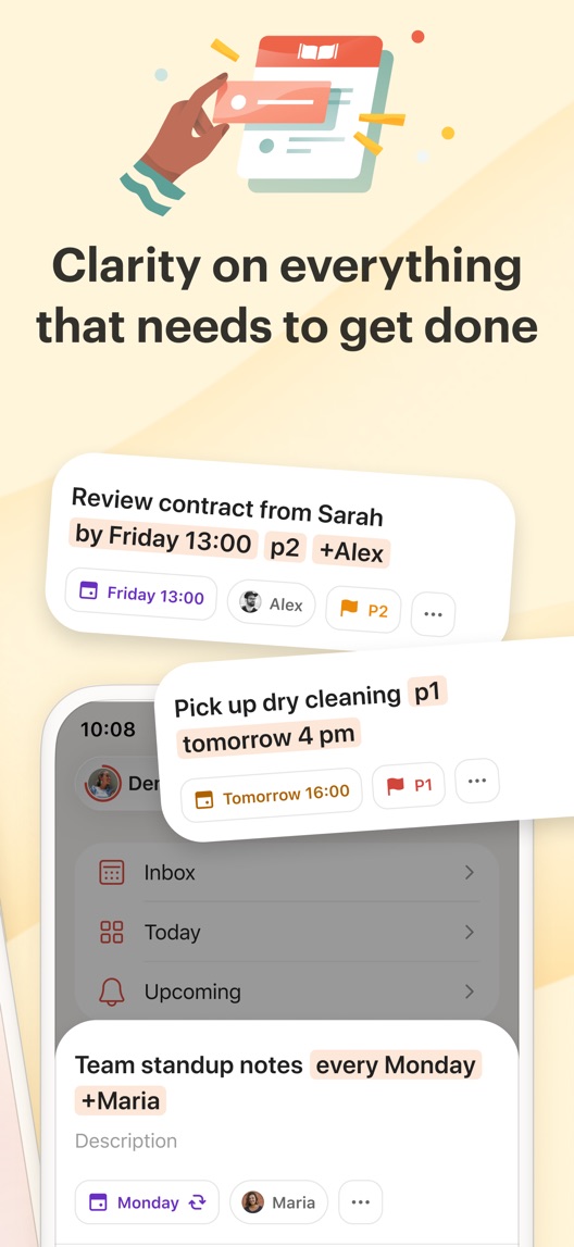
The second frame makes parsing visible.
What I saw. Typed phrases are broken into dates, priority markers, projects and people.
My read. This is concrete feature proof. Newcomers may still need one simpler example before they can decode the notation.
What I’d do. Test one uncluttered input-to-task example rather than introducing more feature badges.
03
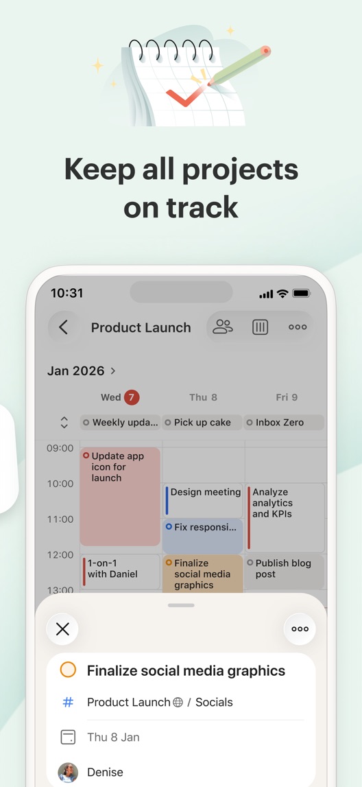
The third frame earns the calendar claim.
What I saw. The title includes calendar, and the third screenshot shows a calendar-like planning view and task detail.
My read. The metadata promise has visual support. The challenge is clarifying who gets this view and how it helps a specific day.
What I’d do. Keep the visual proof and confirm plan access; avoid implying every shown workflow is included for every account.
The screenshot teardown
The original creative is preserved. Numbered notes sit beside each frame so observations and recommendations stay separate.
Frame 01
Capture is shown as an action with recognizable task examples.
This is more persuasive than an abstract claim about being productive because the mechanism is visible.
Test idea: Keep the demonstration; verify the exact input feature and entitlement before testing alternate copy.
Figure 1. First three still screenshots from the US iPhone listing, captured 30 September 2026. Creative belongs to the app publisher and is reproduced for analysis. Publisher claims inside screenshots are not independently verified.
Microsoft To Do emphasizes capture and reminders in its subtitle.
The lesson: Fast capture is a shared job. The demonstration must show why Todoist’s approach feels useful, without making an unsupported superiority claim.
Figure 2. US listing names and subtitles captured 30 September 2026. These are positioning comparisons, not ranking or revenue comparisons.
The keyword questions I’d investigate
Intent candidates grounded in the listing—not fabricated search-volume or difficulty scores.
to do list / task manager
Visitor’s job: Capture and organize work that needs doing.
Evidence: Both metadata fields and the first two frames support task management.
Proposed copy for discussion. These are not current listing fields or tested winners.
Observed listing
Todoist: To Do List & Calendar
Task manager & Reminders
Proposed alternative
Todoist: To Do List & Calendar
Capture tasks. Plan your day.
Name 30/30 · Subtitle 29/30 characters
Figure 3. A metadata alternative to review against the current listing.
The candidate retains the specific category name while changing the subtitle from feature nouns to a simple sequence of jobs.
The tradeoff: It removes the explicit reminders term. Review search evidence and the private keyword field before adopting it; do not assume the more natural sentence will rank better.
A three-frame creative brief
Proposed frame 01
Get the task out of your head
Show: One verified capture action with a short real task example.
Start with a familiar problem and an immediate action.
Proposed frame 02
Turn a thought into a plan
Show: One phrase turning into a date and a task, with no unexplained notation.
Make the parsing benefit legible to a newcomer.
Proposed frame 03
See what fits into today
Show: A current planning view with the relevant plan access clearly indicated.
Connect a calendar feature with a practical decision.
Figure 4. A proposed storyboard, not a fabricated screenshot or a launched treatment. Validate features and access before production.
What three reviewers can teach us
Three of the eight displayed reviews were selected to compare setup value, unpredictable work and everyday task organization. Their text is summarized individually; no frequency or market-wide satisfaction claim is inferred.
Sample: 3 selected accounts from 8 displayed reviews. Dates: 11 May 2024–16 August 2026. No sentiment percentage is calculated.
16 August 2026 · 5/5 stars
“takes a bit”
The reviewer values recurring reminders and flexible task views after an initial setup period.
What I’d investigate: Show the first useful outcome without pretending there is no learning curve.
The visual proof is good, but several symbols compete for attention.
Deliverable: A single input-to-result creative concept with a verified task.
Moderate creative effort
02
Map feature access
Voice-style capture and calendar views may create account expectations.
Deliverable: An approved device, language and plan checklist for every shown feature.
Product verification
03
Test a job-led subtitle
The title already explains the category.
Deliverable: A reviewed subtitle candidate with its lost keyword cue documented.
Metadata research
One test worth running
Does a simpler parsing demonstration improve understanding and then conversion?
Audience
First-time US English iPhone task-app shoppers in a comprehension study; eligible product-page traffic for a later store test.
Control
The current second screenshot with several parsing examples.
Treatment
One verified input phrase and its resulting scheduled task; retain the visual identity and other frames.
Method
First ask participants to explain what the feature does without coaching. If the concept is understood and product-accurate, run an eligible screenshot experiment in App Store product page optimization.
Primary measure
For the study, unaided explanation of the input-to-result behavior; for the store test, platform-reported download conversion. Keep the two results separate.
Guardrails
Monitor expectations about plan access and input availability. Do not select a concept that wins attention by implying unsupported features.
Decision rule
Predefine the comprehension rubric and study recruitment. Size the later conversion test from actual baseline traffic, with a practical effect threshold and inconclusive outcome allowed.
What could muddy the result
A feature release or plan change can change whether the proposed creative is truthful; verify again before launch.
Whoever did this knows their stuff. The first three frames connect capture, structured tasks and calendar planning with real interface proof. I would refine audience clarity and explain unfamiliar controls, rather than replace this with generic productivity promises.
Level 1
Yeah. It really does!
The basics need a serious rethink.
Level 2
I hope no agency is getting paid for this.
Too many obvious things have been left unfinished.
Level 3
The app deserves better.
There is a useful product here. The listing needs to show it.
Level 4
Fine. If ‘fine’ is the goal.
The essentials are there, but there is little to get excited about.
Level 5
Getting there. Keep going.
Good ideas, with a few important gaps still to close.
Level 6
Solid. Put the pitchfork down.
A strong foundation. Look for specific improvements, not a complete restart.
Level 7Todoist is here
Whoever did this knows their stuff.
Clear positioning, thoughtful choices and very few loose ends.
Level 8
Okay, now you’re showing off.
An unusually clear, convincing storefront worth learning from.
An editorial verdict on the captured storefront, not a measured ASO score or an assessment of an agency’s private work.
Your ASO assignment
Pick one clever feature that a new user may not understand.
Draw its input and output using one realistic example.
Ask someone unfamiliar with the app to explain the screenshot before writing more copy.
No private analytics, search-rank dataset or internal keyword field was supplied. Review quotations are short excerpts; explanations are our summaries. App names and screenshots belong to their respective owners. We are not affiliated with Todoist. Read our editorial methodology.